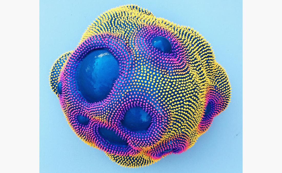
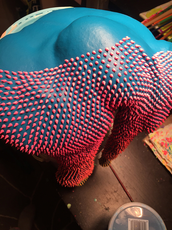
Dan Lam
From designboom.com:
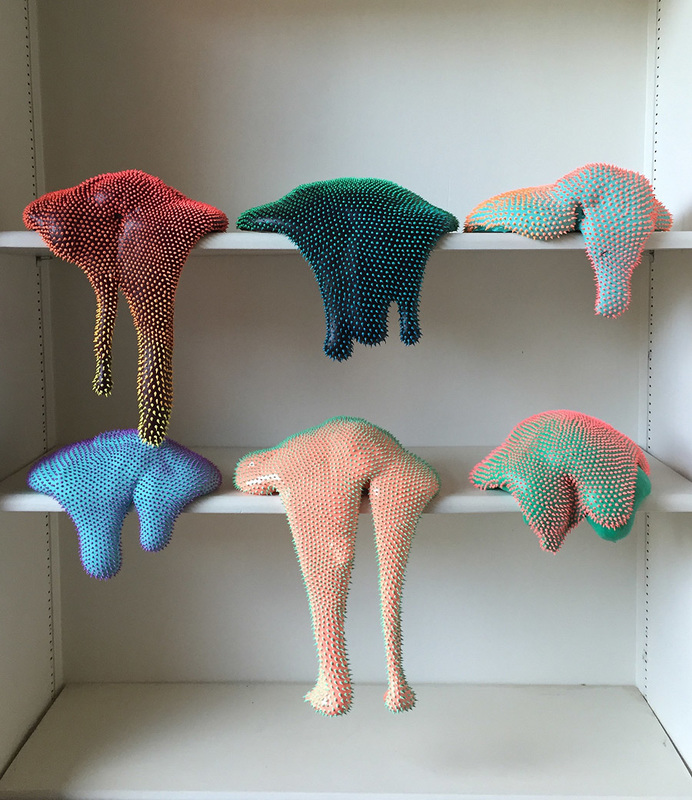
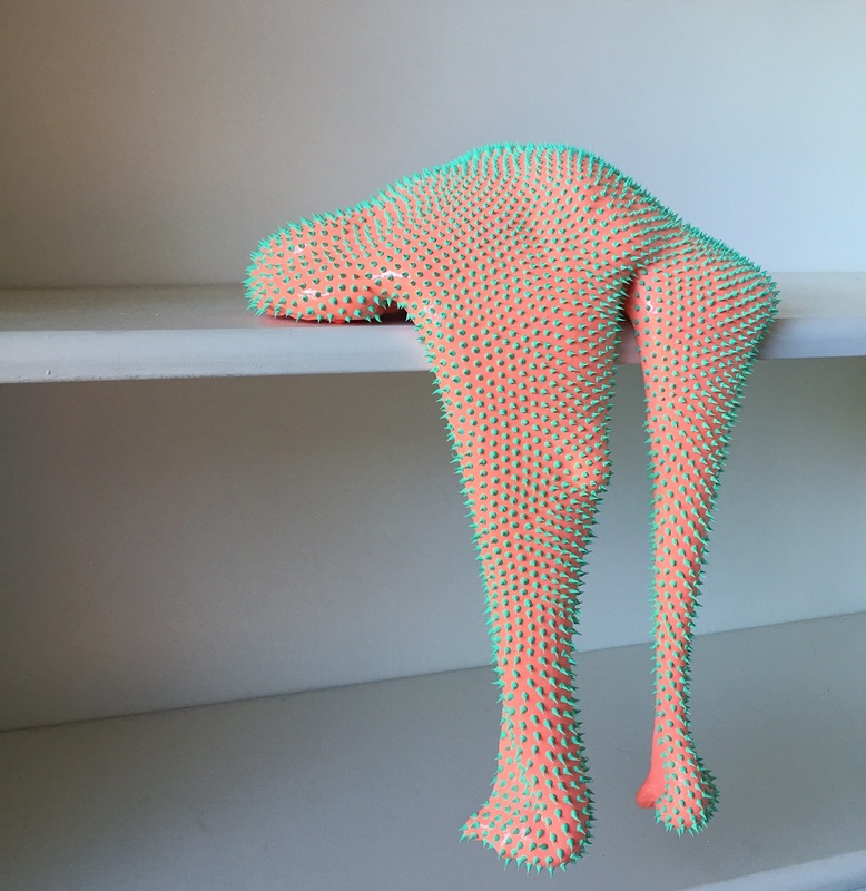
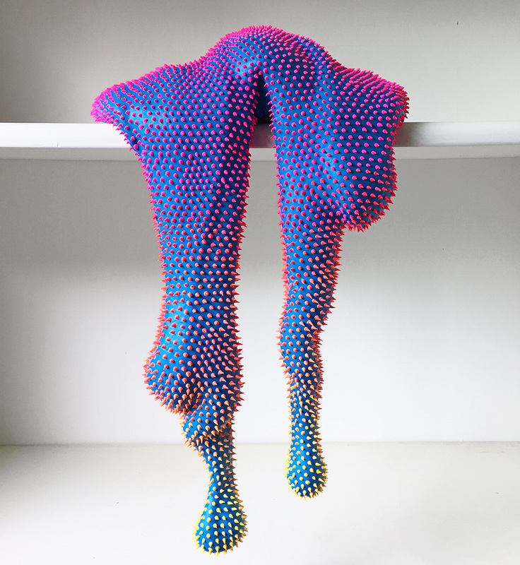
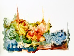
"Artist Dan Lam has formed a series of vibrant, free-standing ‘drippy sculptures’ that resemble exotic organic matter seemingly sourced from another planet. placed on shelves or mounted on walls, the neon-hued artworks form elongated, stretched shapes that ooze off the edges of these surfaces...while these seductive objects are just begging to be touched, held, and closely examined, their uneasy spikes form a dual sensation that both invites and repels viewers at the same time."
Three words: I. LOVE. THESE. The drippy spontaneity of form, the spiky, almost furry quality they possess, and the bright colors in combinations you wouldn't expect make me want to go see them in person. The article I read also detailed Lam's process, and to me it seems almost meditative, doing the same thing over and over and over again with set steps that allow the material to take on its own unique qualities. If you, too, think these are awesome and want to read more, here is the article: http://www.designboom.com/art/dan-lam-drippy-sculptures-04-18-2016/
From designboom.com:
"Artist Dan Lam has formed a series of vibrant, free-standing ‘drippy sculptures’ that resemble exotic organic matter seemingly sourced from another planet. placed on shelves or mounted on walls, the neon-hued artworks form elongated, stretched shapes that ooze off the edges of these surfaces...while these seductive objects are just begging to be touched, held, and closely examined, their uneasy spikes form a dual sensation that both invites and repels viewers at the same time."
Three words: I. LOVE. THESE. The drippy spontaneity of form, the spiky, almost furry quality they possess, and the bright colors in combinations you wouldn't expect make me want to go see them in person. The article I read also detailed Lam's process, and to me it seems almost meditative, doing the same thing over and over and over again with set steps that allow the material to take on its own unique qualities. If you, too, think these are awesome and want to read more, here is the article: http://www.designboom.com/art/dan-lam-drippy-sculptures-04-18-2016/
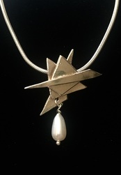
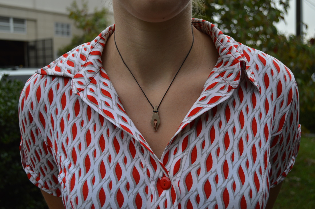
"Drip" Pendant Critique
5 . 23 . 2016 - 5 . 29 . 2016
Here is the pendant I made. I'm particularly proud of the texture of the silver on this one, it's so soft and almost velvety. I love the simplicity of the piece and how it mimics my watercolor forms. I also love the suspense of the drip and I think I captured it in silver as well. Silverwork is small in nature, but very big on design.
"Drip" Pendant
5 . 16 . 2016 - 5 . 22 . 2016
This week I started a new project! I am making a pendant that resembles my drippy forms that I create when I paint. I think it's going to be more geometric, but I want to keep it simple and beautiful, to let the silver shine. I think I'll also include a gemstone or pearl of some kind, so we'll see how that unfolds. Happy with what I have so far! Pictures to come once it's out of the kiln and assembled.
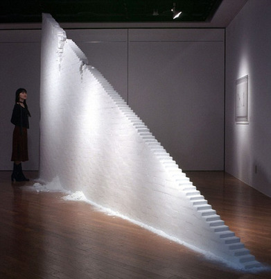
Motoi Yamamoto
Title of Work: Utsusemi
From http://www.mymodernmet.com/profiles/blogs/motoi-yamamoto-utsusemi :
“Salt has a special place in the death rituals of Japan, and is often handed out to people at the end of funerals, so they can sprinkle it on themselves to ward off evil.“ While the material holds great personal significance for Yamamoto, who had to come to terms with the tragic death of his sister at a young age, this piece reflects on the devastating effects of earthquakes.
It is more than a simple stationary piece. The work, though sculptural in its structure, has an interactive element to it. Blocks of salt are stacked atop each other to form a narrow flight of stairs that crumble at the presence of a simulated earthquake. At once, the piece echoes architectural ruin as well as the pouring of salt for the lives lost in the aftermath of the natural disaster that is so prevalent in Japan.”
I came across this piece and was taken by the meaning of the work, especially since we have been talking about art engaged in political commentary. Not only does this artist have a personal connection to the work, but it is "interactive" with the earth, and comments on the earthquakes prevalent in the area. It is beautiful to me that someone could make such a bold statement so peacefully, singly by using blocks of salt, especially since salt plays such a significant role in traditional Japanese rituals and customs. Stunning piece!
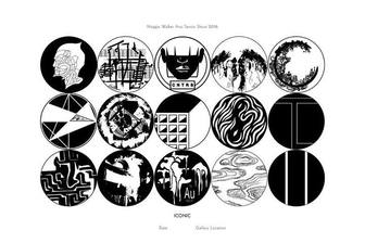
Iconic - Senior Show Planning
5 . 9 . 2016 - 5 . 15 . 2016
This week really has been magical - getting to walk by my solo show and hearing all the wonderful comments both as a "fly on the wall" as I walk by from people I hardly know, but also from some of my closest friends who didn't know what I've truly been up to in art class until now. It makes me so excited to display my work yet again for the end of the year senior show, and so I began planning what pieces I'd really like to include, and how best to display my work. I'm still worried about the security of the gallery, especially because of the area it's in and how expensive my materials are. But I'm working through it. More to come soon!
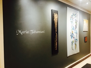
Organic - Solo Senior Show Opening
5 . 2 . 2016 - 5 . 8 . 2016
Well, it seems that all of Maggie Walker got sick this week. After being sick and staying home at the beginning of this week, I came after school and hung my art show. I LOVE how it turned out, and on Thursday, I was so proud to show it off to my favorite teachers and mentors over the years, my friends, and my family. I was so shocked at the size of the crowd I was able to bring, and I was even more honored that so many of them were so taken by my art. It was honestly one of the best feelings to hear how much people loved my watercolors and other pieces, because when I create, I create for myself, so having other people respond so well to it just took my breath away. Honestly I feel as though the opening was my graduation party, and I am so pleased to have had the chance to show my art to everyone I am so close to. We took "field trips" in two of my classes to go see my work, which was also really special. It's been a wonderful week :)
Art Engaged In Political Commentary
Connection, Quarter 4
In a world that is ever-changing, it is no wonder that artists choose to respond to the aspects of culture that insight the world to change. Politics is often the most prevalent manifestation of these changes, and thus, propaganda, and protest art as an artist's response are highly common. But, can art actually be engaged in political commentary independent of those two forms, instead taking on the role of "fomenting change?" How do specific artists view their relationship with politics? In the article "Talking Politics, 2008", six artists were chosen for an interview that answers these questions and more, and their answers are definitely worth noting.
First, the artists who responded seemed to agree that art can play any role you so choose as the artist. Laylah Ali, an artist who uses graphic paintings to mesh recognizable cultural types rather intimately, says "there seems to be a respectable amount of art that is bearing witness," but Mel Chin, an artist who uses various mediums to provide witty commentary, says that "art has been an avenue to both [bearing witness and fomenting change.]" The artists interestingly saw their role in relationship to politics as allowing their art to be the place for their political questions (Laylah Ali), or a place where they are able to "exorcise [their] own anxieties" as was the case for Enrique Chagoya, an artist who creates work he deems highly satirical. The artists also seemed to agree that esthetics and art of social change do not conflict, though Laylah Ali suggested that a possible counterargument could be about what constitutes propaganda, which she says depends on the context of the work a great deal. This is something that one of my classmates, Willa, discussed in her post from earlier in the year on the return of Social Realism. She felt that bringing back the Socialist artwork is not a problem when the audience understands the context, and that the art in question will actually teach today's generation more about the past through the beautiful paintings of a dark time in European history. She said "I think it is important to educate people about it what it meant at the time. If people want to look at the art in galleries and enjoy it in their homes, I do not think it is a problem as long as they understand the context. I think it is not a problem as long as it is a celebration of the artist’s talent and the beauty of the work rather than a celebration or promotion of the way Russia was under Stalin."
The artists in the interview felt that activism has always been viable. Thus, they agreed that art can indeed insight political change, or it can work to be the change in both the political and art worlds. Even in my own art, the organic and the natural I am drawn to as an artist could also play a role in directing attention to climate change or the importance of caring for our surroundings. Depending on how my audience interprets my work, even my art and I could have an effect on the direction our world may be heading in!
Willa's awesome website with more great insight into propaganda art is: http://willaportfolio.weebly.com/blog
Preparing For My First Solo Show!
4 . 25 . 2016 - 5 . 1 . 2016
This week we started preparing for my solo senior art show, which will go up next week in the art hall! Ever since freshmen year, I have walked down the art hallway and envisioned my work on those very walls, and has always been very special since it is something only the Senior Art 5s get to do. We made invitation cards for my opening, and I got some help painting the wall 18% grey (thanks Catherine, Taylor, and Julia! :D ) 18% grey has been my favorite color ever since I was introduced to it in photo. It is the color a black/white photograph should be equivalent to when swirled if the right lighting is used! I'm so excited to see my work go up on the walls, I think it will be awesome!
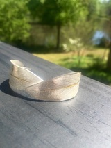
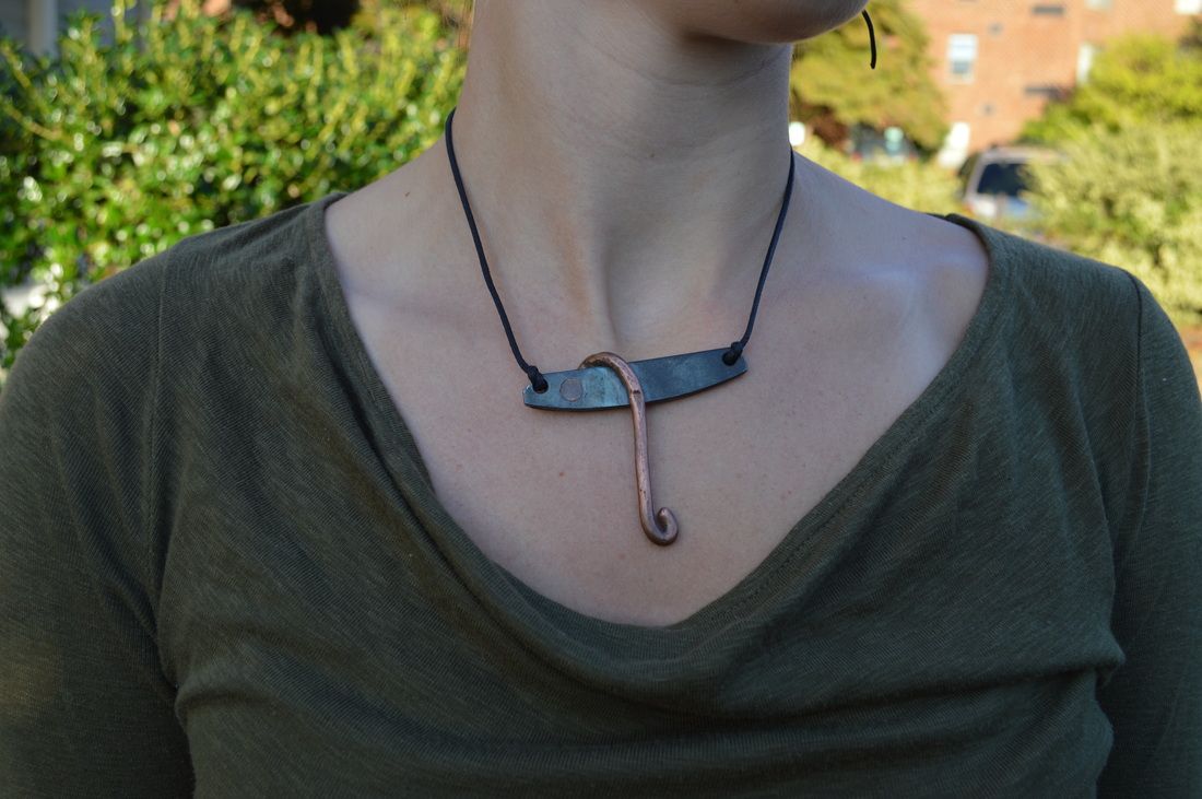
Sage Cuff Surprise
4 . 18 . 2016 - 4 . 24 . 2016
This week we critiqued our home projects, and as such I finally got to wear and reveal my surprise.....24k gold! This was my first time working with 24k gold leaf and my first experience using the kuem boo technique to chemically bond the gold leaf to the silver in a difficult but rewarding process. I love how subtle it is, yet how elegant. Very, very proud.
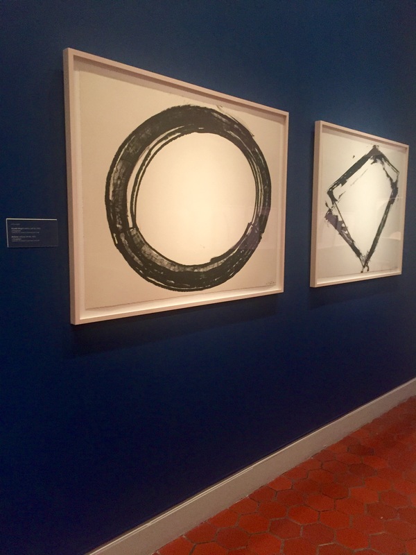
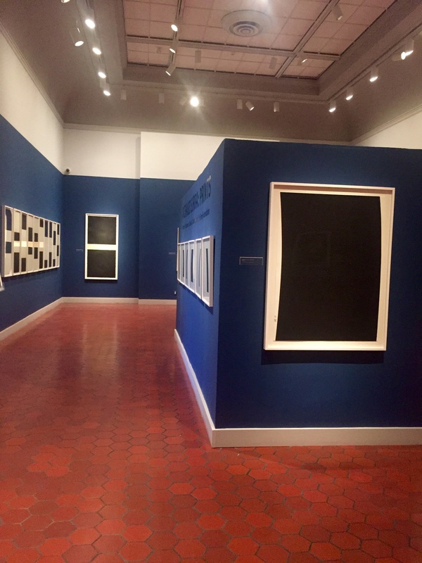
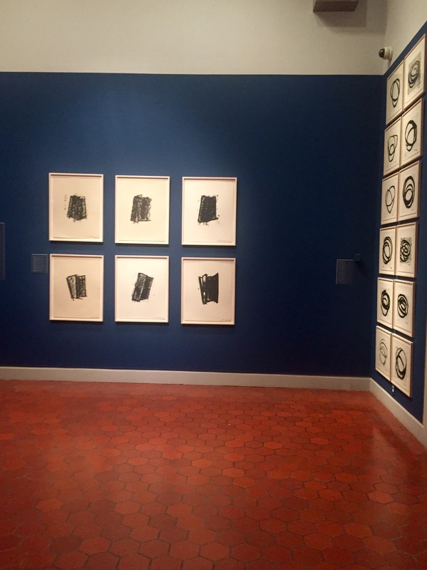
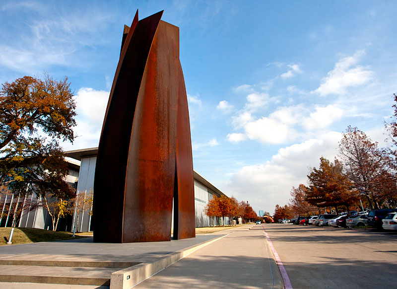
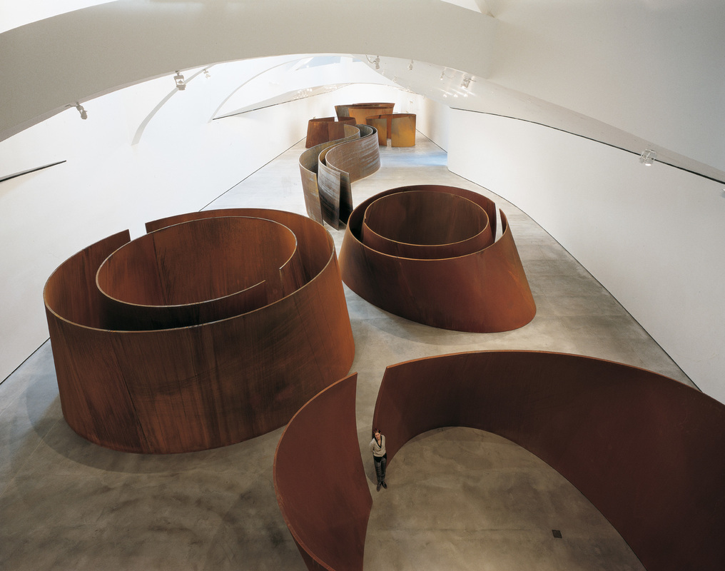
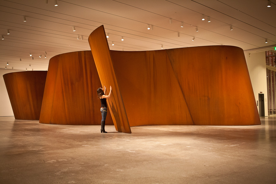
The Fralin Museum of Art - Richard Serra: Prints
Experience Quarter 4
My dad and I decided to take a walk through the Fralin Museum of Art while at UVA once more. While inside, we came across this exhibit by Richard Serra, and the simplicity of the whole exhibit really struck me. After getting home, I did a little research on Serra and his work, and I was blown away by what I found:
Richard Serra is actually most known for his large scale metallic sculptures (which I have included pictures of below the exhibit - the sculptures are amazing!) but he also tried his hand at lithography and has been creating prints from 1972 through 2015 and beyond. The exhibit traced his progress in lithography. Apparently the prints are related to specific sculptural pieces he created as each print "function as sketches of the physical experience of the sculpture in relation to the body."
To read more about the exhibit, click here: http://www.virginia.edu/artmuseum/exhibition/serra
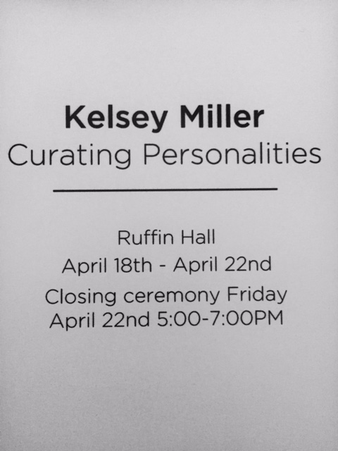
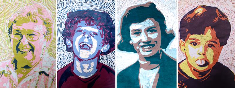
Kelsey Miller & Nick Watson
Awareness - Two Student Artists!
On my visits to UVA this week, I got to catch up with Kelsey Miller as she was putting together her final thesis exhibition show titled "Curating Personalities" which opens Monday, April 18th!! I was so in love with what she has done with printmaking, curating her mom's photographs of family and family friends. We have been so close for so long and I really hope I get a chance to go to her closing ceremony, but for now, some of the pictures of her work are below for reference! She really is an amazing artist, and an amazing friend! :)
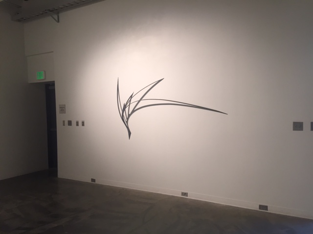
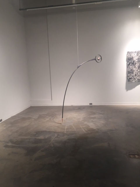
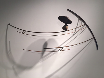
Kelsey then took me to see a student exhibit by a UVA fifth year Aunspaugh Fellow and Distinguished Major by the name of Nick Watson. Nick's work centers around the organic and the natural, using "the raw and elemental materials of earth and industry, with an emphasis on line, tension, and balance" to create his work. I love his use of metals and the contrast between polished and unpolished or rusted materials, along with his use of rocks to create suspense in his pieces. I especially loved his pieces and couldn't help but notice how similar our work is because of our fondness of metals and for the environment. Pictures of some of his works are below as well!
Kelsey's work:
Awareness - Two Student Artists!
On my visits to UVA this week, I got to catch up with Kelsey Miller as she was putting together her final thesis exhibition show titled "Curating Personalities" which opens Monday, April 18th!! I was so in love with what she has done with printmaking, curating her mom's photographs of family and family friends. We have been so close for so long and I really hope I get a chance to go to her closing ceremony, but for now, some of the pictures of her work are below for reference! She really is an amazing artist, and an amazing friend! :)
Kelsey then took me to see a student exhibit by a UVA fifth year Aunspaugh Fellow and Distinguished Major by the name of Nick Watson. Nick's work centers around the organic and the natural, using "the raw and elemental materials of earth and industry, with an emphasis on line, tension, and balance" to create his work. I love his use of metals and the contrast between polished and unpolished or rusted materials, along with his use of rocks to create suspense in his pieces. I especially loved his pieces and couldn't help but notice how similar our work is because of our fondness of metals and for the environment. Pictures of some of his works are below as well!
Kelsey's work:
Nick's work:
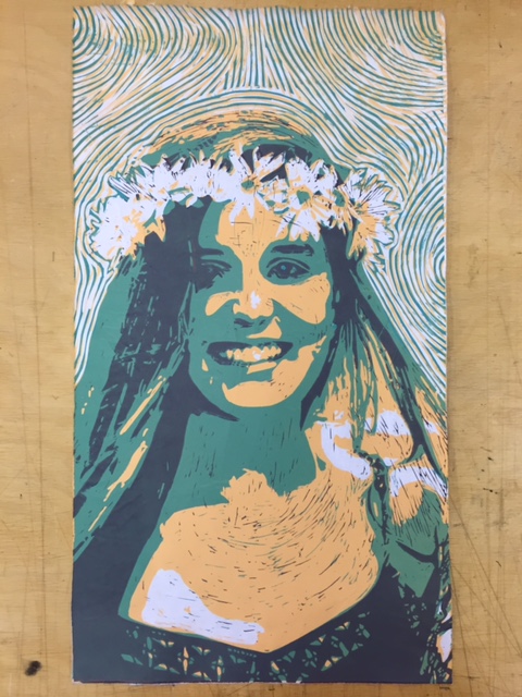
Ophelia
4 . 11 . 2016 - 4 . 17 . 2016
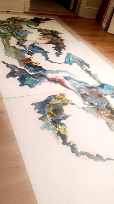
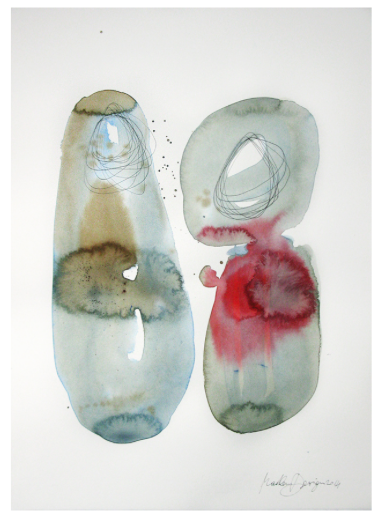
Though I wasn't in class the rest of the week because I was on college visits, I did have the opportunity to attend critiques at the beginning of the week. I am so, so, so proud of how this piece turned out! It's the biggest watercolor I've done, and I LOVE the scale! Below is a gallery of my progress. I would work on it in phases, and I am really happy with how I chose to resolve it in the end.
4 . 11 . 2016 - 4 . 17 . 2016
Though I wasn't in class the rest of the week because I was on college visits, I did have the opportunity to attend critiques at the beginning of the week. I am so, so, so proud of how this piece turned out! It's the biggest watercolor I've done, and I LOVE the scale! Below is a gallery of my progress. I would work on it in phases, and I am really happy with how I chose to resolve it in the end.
Home Project - Process
4 . 3 . 2016 - 4 . 10 . 2016
This week is the first week back from break, and I have been waiting for one surprise thing to come in the mail before I can start. This is a sneak preview about what I am expecting to arrive: Au! I'm really excited about adding a new dimension to this next piece!!! Hopefully what I ordered will come soon - crossing my fingers it's au-round the corner! It's going to be au-mazing! (Catch my drift?!)
I'll post a picture of the surprise and my progress once it arrives and I can get started.
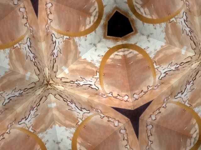
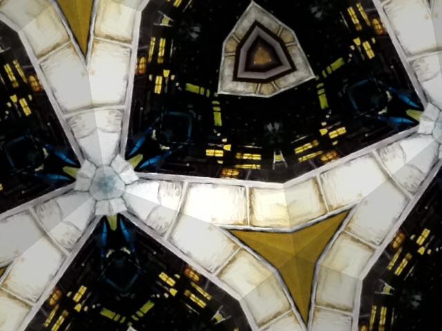
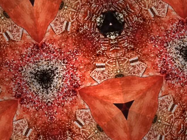
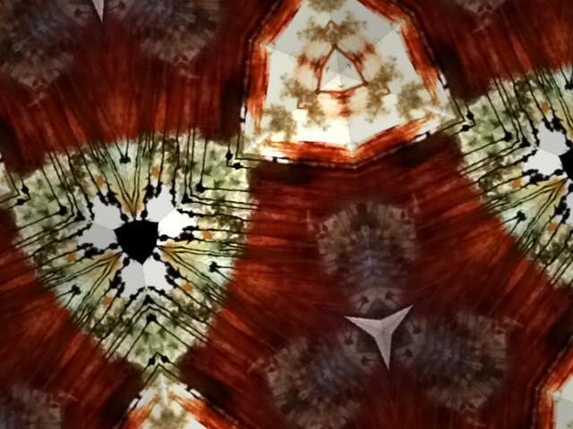
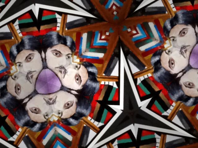
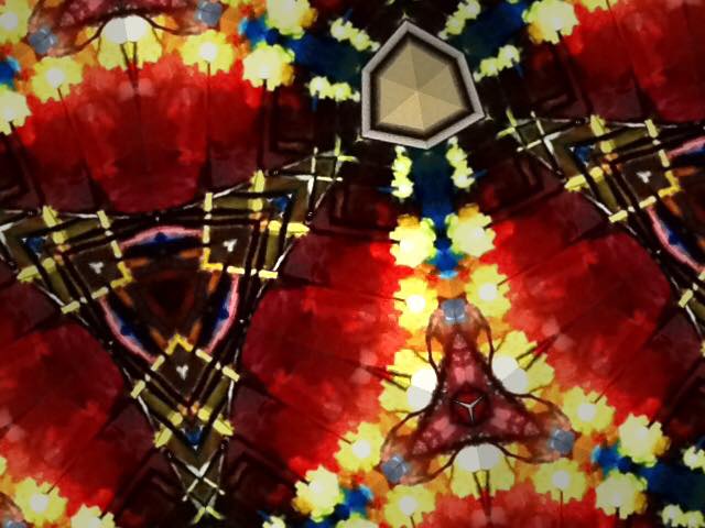
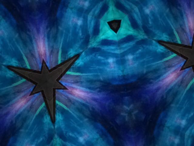
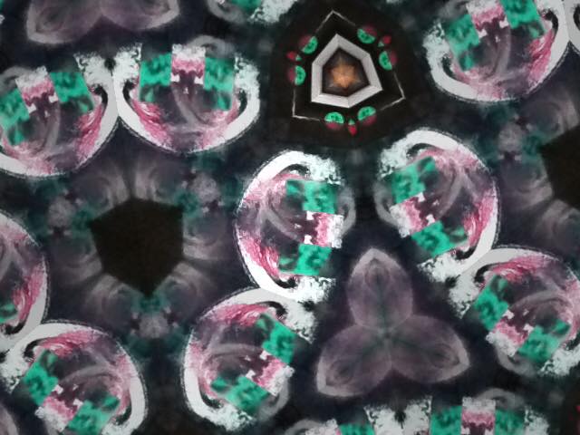
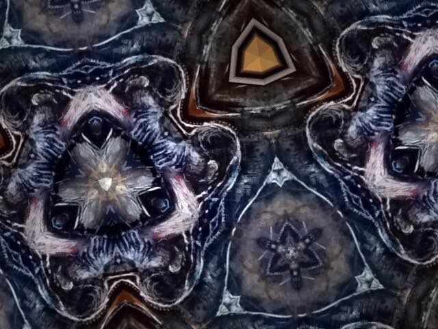
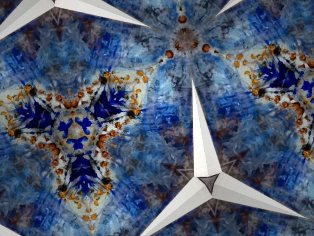
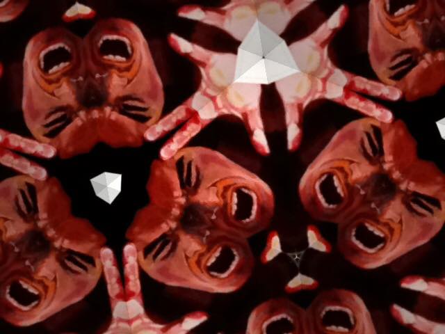
Kaleidoscope - Possible Senior Show Theme Idea
We seniors have been talking a lot about the senior show and I was inspired by the the idea of trying to bring unity to our super big group like Alex and Patrick want to do, and that got me thinking about a kaleidoscope theme. Here's why:
1. Kaleidoscopes combine images and create new ones from them. Everyone's art is so unique to who they are, but if someone looked through a kaleidoscope at any one of our bodies of work, or even combined two different people's work, it would create new art that's as unique as we are. However, looking at all the kaleidoscopes together, there's a common thread running through them that unites all our bodies of work together!
2. The cards and posters could have images similar to the ones I'm attaching (I tested it out with Mac Photobooth and images from the websites I could find of art 4/5 seniors -- see below!) but these kaleidoscope images could be our unique "tattoos" in that we'd have a symbol made from each of our bodies of work (we could make temporary tattoos from these like Patrick said too maybe?) The posters could actually all be different and I think that would only help draw interest because people walking through RVA would come across a slightly different poster every time with a new kaleidoscope image on it.
3. Jimmy could combine some of our art together (??) into a new kaleidoscope which could be really cool!
4. We could have people create images by looking at our art through real kaleidoscopes we'd have there! (Decorations!!) and we can get dressed however we want which could either be themed toward this or not. It adds an interactive dimension to the show which would be super fun!
Ophelia
3 . 22 . 2016 - 3 . 28 - 2016
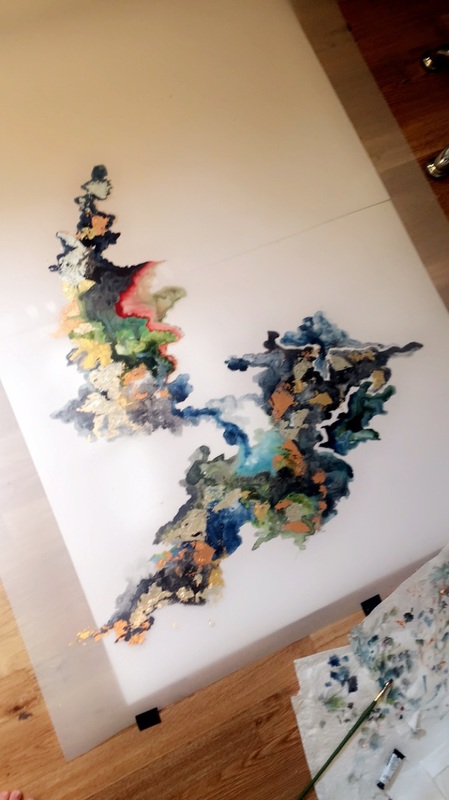
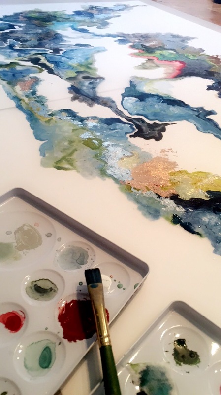
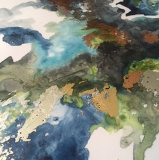
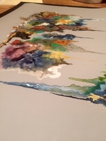
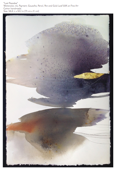
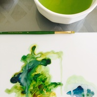
This week has been a studio week for us. I've been working at home because my next piece is an even bigger watercolor creation. It still looks a lot like the paintings I've been doing which I'm happy about because I really am building a small series, and I've realized I really like the blue-green-gold combo. I think I'll be adding pinks and purples to this one, but we'll see. Painting the larger piece has definitely been an adjustment, and I'm trying a couple new and different things with this piece as well, but I'm pretty happy with it so far. I'll post more full pictures once it dries enough and I can take a good picture of the whole thing, but for now here's a close up shot of some of the colors!
Here is the song I've been listening to while creating this piece. It's titled Ophelia, and it is by the Lumineers.
3 . 22 . 2016 - 3 . 28 - 2016
This week has been a studio week for us. I've been working at home because my next piece is an even bigger watercolor creation. It still looks a lot like the paintings I've been doing which I'm happy about because I really am building a small series, and I've realized I really like the blue-green-gold combo. I think I'll be adding pinks and purples to this one, but we'll see. Painting the larger piece has definitely been an adjustment, and I'm trying a couple new and different things with this piece as well, but I'm pretty happy with it so far. I'll post more full pictures once it dries enough and I can take a good picture of the whole thing, but for now here's a close up shot of some of the colors!
Here is the song I've been listening to while creating this piece. It's titled Ophelia, and it is by the Lumineers.
Home Project
3 . 14 . 2016 - 3 . 21. 2016
I've been thinking about making a new piece of jewelry for a while now and I think that the home project would be the perfect reason to get started. I'm hoping to try a little something different, like I did with the last ring I made, but this time push the metals (plural!!) in a new way. I've been designing this week...more to come soon!
Walking in Richmond
Glave Kocen Gallery and Reynolds Gallery
3 . 9 . 2016
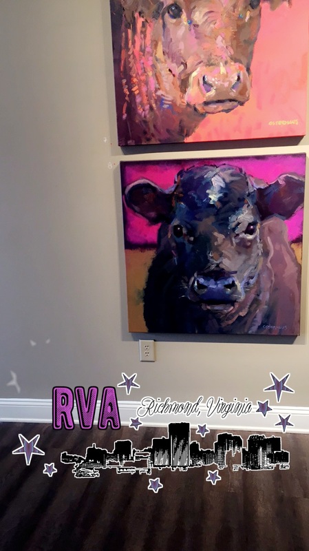
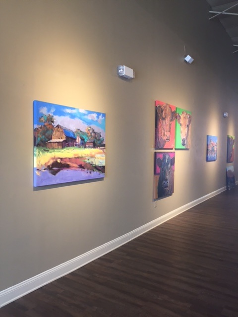
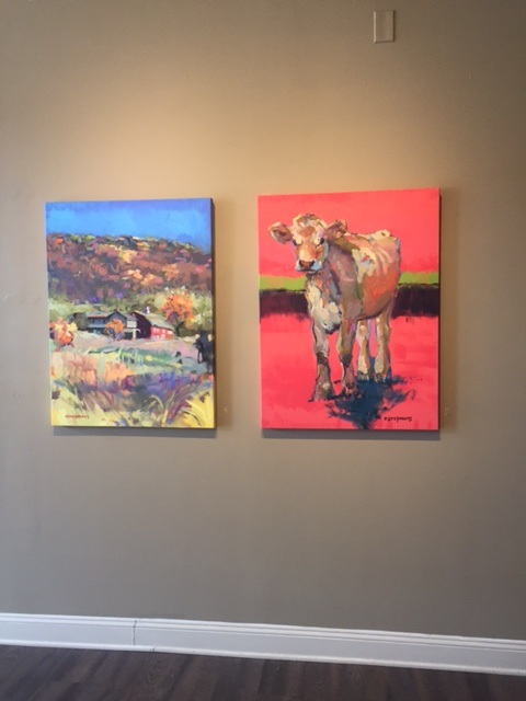
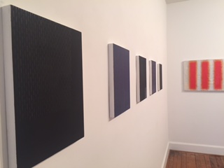
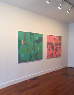
It was a beautiful day this Wednesday and so naturally we went walking! The exhibits were both phenomenal for completely different reasons. At Glave Kocen, we saw an exhibit by artist Greg Osterhaus, who paints the most beautiful cows. The way he works the paint and combines outrageous colors really works for me, and I love the final product. The vibrance of the space because of the work he displayed in the gallery was awesome. Plus, we got to visit with the gallery owner's dogs, which was pretty cool. At Reynolds, we saw a variation of art by different artists, but the main exhibit was by artist Jill Moser. Her use of buffing on the surface of the canvases to get a really waxy, glossy finish, combined with the very subtle metallic elements she added really made me happy. Overall, it was a really great walk, and a really nice day too!
Glave Kocen Gallery and Reynolds Gallery
3 . 9 . 2016
It was a beautiful day this Wednesday and so naturally we went walking! The exhibits were both phenomenal for completely different reasons. At Glave Kocen, we saw an exhibit by artist Greg Osterhaus, who paints the most beautiful cows. The way he works the paint and combines outrageous colors really works for me, and I love the final product. The vibrance of the space because of the work he displayed in the gallery was awesome. Plus, we got to visit with the gallery owner's dogs, which was pretty cool. At Reynolds, we saw a variation of art by different artists, but the main exhibit was by artist Jill Moser. Her use of buffing on the surface of the canvases to get a really waxy, glossy finish, combined with the very subtle metallic elements she added really made me happy. Overall, it was a really great walk, and a really nice day too!
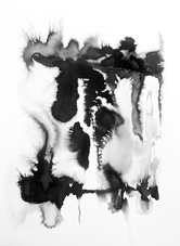
Youth Art Month Exhibit
3 . 7 . 2016 - 3. 13 . 2016
This week was the opening of our Youth Art Month Exhibit which goes up every year in March. I chose to display my latest piece, the Emotion, along with the two earlier ink paintings I'd done, which I titled Viscosity and Fluidity. As the exhibit has gone up, I've been getting a lot of compliments on my piece "The Emotion," and honestly I've been so honored that so many people are so intrigued by it. I'm starting to think about my senior exhibit downstairs in the art hallway which hopefully will be going up soon, as well as the senior show at the end of the year. Both are so exciting -- I've been waiting so long and they're finally almost here!
Critique Week - The Emotion
2 . 29 . 2016 - 3 . 6 . 2016
I am so happy with how this piece turned out! I've loved mixing metals into the paintings I've started to create a series from. I learned a lot from working on a bigger surface this time, but I'd like my next piece to be bigger still! I think an increase in size will really allow for my viewers to go up close and look at the details in how the colors interact with each other, the metal, and the duralar. Excited for what is to come!
The Emotion
2 . 22 . 2016 - 2 . 28 . 2016
I'm starting to put the piece together, beginning with adding metallic elements with metal foils. I really like the way that the paint and the metals are beginning to interact, and I'm excited to continue the piece and allowing the shapes/colors to combine and form on their own. This is truly spontaneous, and I love the result so far. The song has been a wonderful inspiration. More pictures to come soon!
The Emotion
2. 15 . 2016 - 2 . 21 . 2016
I've been listening to a song called The Emotion, and really inspires me. It's super wonderful creativity music. When I listen to the song, I see the ocean that I love and the colors of the sea. I think for my next piece, I will try to play off of the song, using it as the basis for my color scheme and playing it on loop throughout the creation of the piece. I am much more free and able to create when I am by the ocean in Pensacola, so I'm hopeful that listening to this song will bring with it the same feelings of being by the sea!
Here's the link to the song by a fellow Scholastics national medalist, artist and musician BØRNS!
Plaza and Projects!
2 . 8 . 2016 - 2 . 14 . 2016
This week we took a walk to Plaza to get supplies for our next couple projects. I am starting to think about what to do next, and I think I might go back to the duralar and try something a little bigger this time. I took the week to plan what I'd like to accomplish with this next piece, and I'm excited to get started!
Critiques and Presentations
2. 1 . 2016 - 2 . 7 . 2016
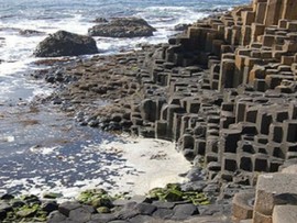
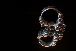
This week we critiqued our last project, and I was super proud to be able to show the class my ring! It was really great to hear how much everyone liked it, and I was totally excited to hear it compared to the formations of columnar basalt which occur naturally in certain parts of the world. Without really trying, my ring took on a "nature" quality and I love that, because it means I truly am drawn to certain things when creating art, whether I'm completely consious of it or not. We also shared our artist interview presentations, and I was very, very proud of being able to share my cousin with the class!
2. 1 . 2016 - 2 . 7 . 2016
This week we critiqued our last project, and I was super proud to be able to show the class my ring! It was really great to hear how much everyone liked it, and I was totally excited to hear it compared to the formations of columnar basalt which occur naturally in certain parts of the world. Without really trying, my ring took on a "nature" quality and I love that, because it means I truly am drawn to certain things when creating art, whether I'm completely consious of it or not. We also shared our artist interview presentations, and I was very, very proud of being able to share my cousin with the class!
Propoganda and Socialist Realism
Connect, Quarter 3
For centuries artists have used their art to persuade their viewers. As such, artistic persuasion was, and continues to be especially important to political leaders so that they may gain a following and secure power. In Socialist Russia for example, pro-Stalin artists furthered the socialist movement through "Socialist Realism," works which included realistic images "for and about workers and depict an idealized version of everyday life." This movement was quite popular until the collapse of Soviet Russia, when Socialist Realism art was shunned and sold for practically nothing. No one wanted art that marked them with a tie with the previous dictatorship. However, the article Champions of Socialist Realism are seeking to restore it to what they see as its rightful place in Russian art history..., comments on the return of Socialist Realism works to museums and collectors exhibits in order to display history and the beautiful art that came along side it. As propaganda, Socialist Realist art had a shelf-life, but as art, it appears to live on forever.
In another article, titled Mass executions, slavery... and copyright infringement: ISIS stole artist's photo and used it as propaganda to recruit new members via Twitter, ISIS stole an artist's image in order to appropriate it for use as a recruitment poster in an appalling attempt to garner support and power. Artist Brian McCarty developed a body of work based on anti-war sentiments, documenting "children's experiences of war." Ironically, one of these works was taken by ISIS, slightly altered, and used to promote joining the terrorist organization and furthering the war and terrors in the Middle East. Anti-war propaganda thus became its exact opposite, transformed silently and without credit, of course. While this is certainly not the worst that this terrorist group has done to any one person, I can only imagine what McCarty must feel. He says: "It took some days to process and I’ve grown more angry and more outraged not at the theft but at the corruption of the message." If I were in his shoes, this blatant act of infringement on one's intellectual property would make me feel the same way, for a long, long time.
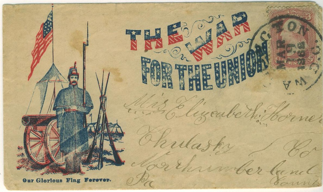
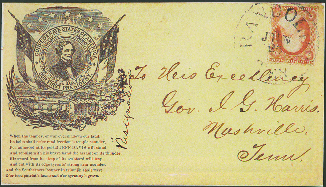
As I was looking for other recent examples of artistic propaganda, I actually happened upon a National Geographic article published last December titled Civil War Envelopes Are Works of Art—And Propaganda, detailing a series of envelopes designed in the early 1860s. When envelopes were first invented due to an effort to decrease postal rates, 10,000 designs were printed. Envelopes were printed in both the Union states and throughout the Confederacy, and as such, the designs ranged from "a couple of Union flags and a motto [added] to a campaign portrait of Abraham Lincoln," to depictions of the new Confederate flag, with stars hurriedly scratched into the printing plates for each new state that succeeded. Envelopes quickly became a form of advertising - a form of propaganda - for everything from advertising candidates in the Election of 1860 to taking a stance on the Civil War. It's truly amazing to me to think that something that gets so easily thrown away today was once created to display so many pieces of artistic propaganda. Maybe we should start looking at various ways we can leave our artistic mark on the world in small ways just as they did more than a century ago with one envelope at a time.
*To view the National Geographic article, click here: http://news.nationalgeographic.com/2015/12/151210-civil-war-envelopes-art-propaganda-artifacts/
Connect, Quarter 3
For centuries artists have used their art to persuade their viewers. As such, artistic persuasion was, and continues to be especially important to political leaders so that they may gain a following and secure power. In Socialist Russia for example, pro-Stalin artists furthered the socialist movement through "Socialist Realism," works which included realistic images "for and about workers and depict an idealized version of everyday life." This movement was quite popular until the collapse of Soviet Russia, when Socialist Realism art was shunned and sold for practically nothing. No one wanted art that marked them with a tie with the previous dictatorship. However, the article Champions of Socialist Realism are seeking to restore it to what they see as its rightful place in Russian art history..., comments on the return of Socialist Realism works to museums and collectors exhibits in order to display history and the beautiful art that came along side it. As propaganda, Socialist Realist art had a shelf-life, but as art, it appears to live on forever.
In another article, titled Mass executions, slavery... and copyright infringement: ISIS stole artist's photo and used it as propaganda to recruit new members via Twitter, ISIS stole an artist's image in order to appropriate it for use as a recruitment poster in an appalling attempt to garner support and power. Artist Brian McCarty developed a body of work based on anti-war sentiments, documenting "children's experiences of war." Ironically, one of these works was taken by ISIS, slightly altered, and used to promote joining the terrorist organization and furthering the war and terrors in the Middle East. Anti-war propaganda thus became its exact opposite, transformed silently and without credit, of course. While this is certainly not the worst that this terrorist group has done to any one person, I can only imagine what McCarty must feel. He says: "It took some days to process and I’ve grown more angry and more outraged not at the theft but at the corruption of the message." If I were in his shoes, this blatant act of infringement on one's intellectual property would make me feel the same way, for a long, long time.
As I was looking for other recent examples of artistic propaganda, I actually happened upon a National Geographic article published last December titled Civil War Envelopes Are Works of Art—And Propaganda, detailing a series of envelopes designed in the early 1860s. When envelopes were first invented due to an effort to decrease postal rates, 10,000 designs were printed. Envelopes were printed in both the Union states and throughout the Confederacy, and as such, the designs ranged from "a couple of Union flags and a motto [added] to a campaign portrait of Abraham Lincoln," to depictions of the new Confederate flag, with stars hurriedly scratched into the printing plates for each new state that succeeded. Envelopes quickly became a form of advertising - a form of propaganda - for everything from advertising candidates in the Election of 1860 to taking a stance on the Civil War. It's truly amazing to me to think that something that gets so easily thrown away today was once created to display so many pieces of artistic propaganda. Maybe we should start looking at various ways we can leave our artistic mark on the world in small ways just as they did more than a century ago with one envelope at a time.
*To view the National Geographic article, click here: http://news.nationalgeographic.com/2015/12/151210-civil-war-envelopes-art-propaganda-artifacts/
Eilya Tahamtani [Process]
1 . 18 . 2016 - 1 . 24 . 2016
This week I finished my work with editing and finalizing my artist interview. Over Winter Break, I had the chance to interview my cousin Eilya Tahamtani, which truly was a wonderful experience for me! I think the world of him and I admire both his passion for art and his outlook on life. I am so proud to know him and I am so happy that I finally had the chance to speak with him in person (well, on Skype). I was so amazed by his knowledge of art history and his understanding of the world, and it was refreshing to hear such a pure perspective on art and on life. Honestly, I was really amazed to find that I share so many of his philosophies and his artistic inspirations, and I learned that it must be a connection we share on a cellular level - family is just so cool.
I am so excited to be able to share this interview in class one day soon!
Below are a few of his latest works from Placebo - a show where he displayed his Ten Commandments.
Balancing Act [Process]
1 . 11 . 2016 - 1 . 17 . 2016
This week, I am regrouping after having finished my newest ring! One of the best things anyone can do is take something that is very difficult and make it look easy - and that is what I feel I've done with this piece. The fully assembled ring does not show the times that it crumbled on me, or the trials and tribulations inherent in the design, but perseverance and tenacity really paid off. Pieces like this one always make me realize just how much I love making jewelry and pushing the limits of the silver, despite all the difficulties I may encounter in the process.
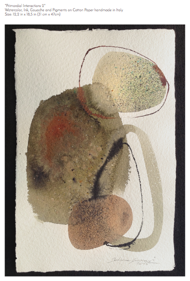
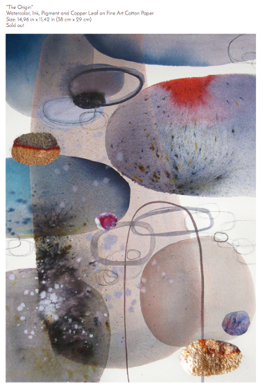
Sabrina Garrasi [Awareness]
sabrinagarrasi.com
First, her Artist Statement:
"Sabrina Garrasi is an italian artist. Her artworks are immensely evocative: each subject will suggest a metaphysical dimension of the universe and life.Water, pigments, shape, space, and light. Through the dynamic energies the visual elements take the life. The process of her work is an event with a extraordinarily unpredictable outcome as a dreamlike. Dark and light, warm and cool, hard and soft, chaos and and tranquility have a direct influence on artist's thoughts and the"spiritual disposition" of the visual elements are intimately related with the her interior universe.Art is her spiritual practice. The painting is the representation of her essence."
I stumbled upon Sabrina's work in the way that I most often stumble upon art I love -- Tumblr. After looking through her website and reading her artist statement, I was mesmerized by the way that she too felt her work was a "representation of her essence," and the fact that she too enjoys the spontaneity of form. The idea that both Sabrina and I, as artists, are captivated by similar concepts while making work that is very different (and executed very differently) just proves that artists truly have the freedom to interpret the world as they uniquely wish. No two artists see the world in exactly the same way, and I think that in itself is beautiful.
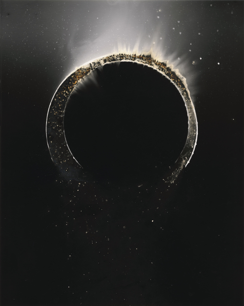
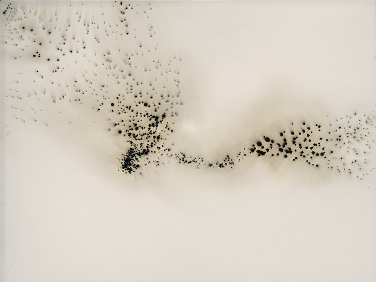
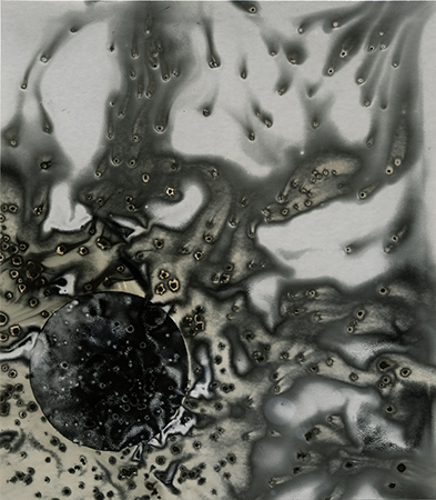
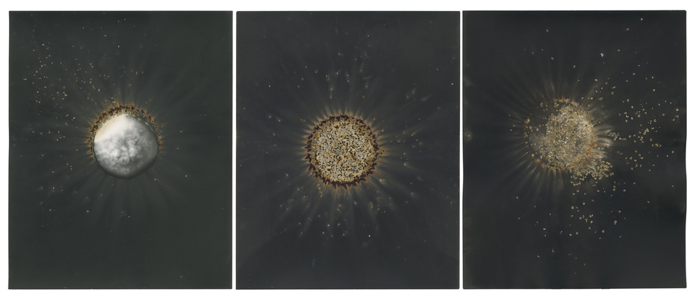
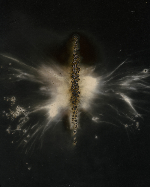
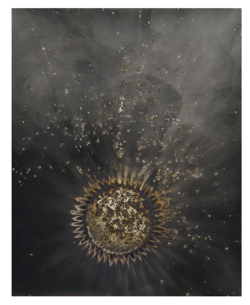
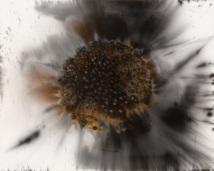
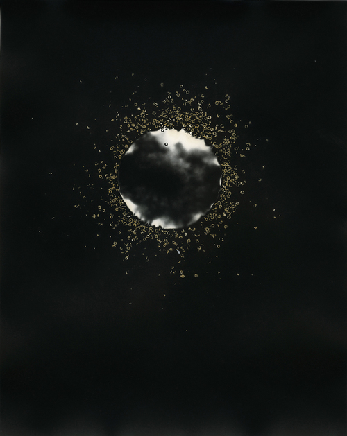
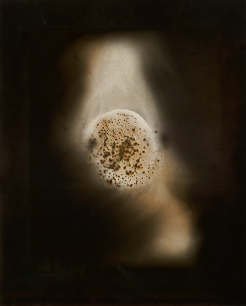
Christopher Colville [Awareness]
http://christophercolville.com
"Christopher Colville is an artist working to push the boundaries of the photographic medium in both experimental and traditional forms."
As an assistant professor at Arizona State and photo editor at Prompt Press, Christopher Colville uses his free time to push photography and to explore his passions and create gorgeous and evocative images. I love the way his pieces are so expressive. They are almost like little worlds within themselves, yet they all work beautifully as a collection. Colville melded traditional photography processes with art seamlessly!! It was so hard to narrow down the works I loved to display below, but here are nine of my all-time favorites.
Balancing Act [Process]
1 . 4 . 2016 - 1 . 10 . 2016
For the next project, I am returning to jewelry. The ring I designed is daunting and requires many little pieces of fired fine silver to be carefully balanced on top of one another. I will be posting more as the project progresses, but for now I am excited for the challenge that awaits me.
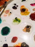
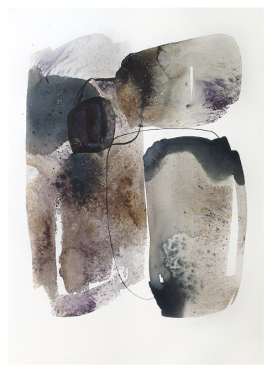
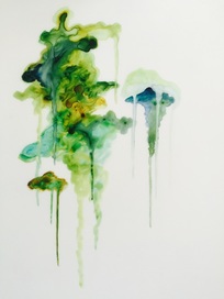
Critique Week - Spontaneity in Watercolor [Process]
12 . 14 . 2015 - 12 . 20 . 2015
I so thoroughly enjoyed exploring a newer medium this critique! While these pieces are truly spontaneous, I enjoy how much of my unique artistic mark is a part of them as well. I am especially proud of the choices of color in the piece to the left, since many of my pieces often lend themselves to darker colors and metallic hues. I am loving the new techniques I've developed in watercolor and I'm looking forward to exploring them further!
Inspired by the Pain and Suffering of War...
Connect, Quarter 2
The article Horror Is a Constant, As Artists Depict War, published by the New York Times, serves as a reminder that war has been and continues to be a gruesome and barbaric tactic used to obtain power and inflict pain. By juxtaposing art created by Francisco De Goya which depict scenes from 18th Century battles with other artists depictions of war from the 19th and 20th Century, we can begin to see what the artists were trying to convey by showing us that the horrors of war do not change. These renditions of wars past help us to see the costs involved in war over time as well. The 19th century artists it appears initially tried to make sense of the wars and their horrors by largely focusing on the heroic nature of war as some works depicting Napoleon depict him as an exalted general on his white horse. But like any good story, there are many sides and what we know about a story depends on who tells it and what point of view they have. Thus other paintings from the time showcase Napoleon with wounded soldiers and horses exhausted from war. Once the 20th century works appear, we see that war with more modern weaponry does not necessarily mean that the resulting suffering is depicted any differently despite that they serve to document the wars and the methods of war at the time. The exhausted and the weak are often the focus of such work, and perhaps the artists use this view as a reminder that war is not ever the answer to violence no matter what century we might look at.
If we look at how Art is often used as a release mechanism for pain, for suffering, or for anger towards a subject, we see also that war often inspires art which is thus made as a reaction to it, whether the art comes from someone immediately affected by the war or by someone who is watching the effects of the war from the outside. Today, it is quite hard to tell the difference between peace time and war time, with so many battles being fought every day all around the world. As such, many of today's artists are using their unique talents to add to the ongoing conversations worldwide and to help heal the wounds created by war.
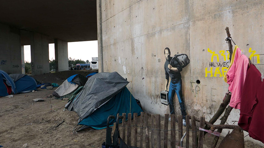
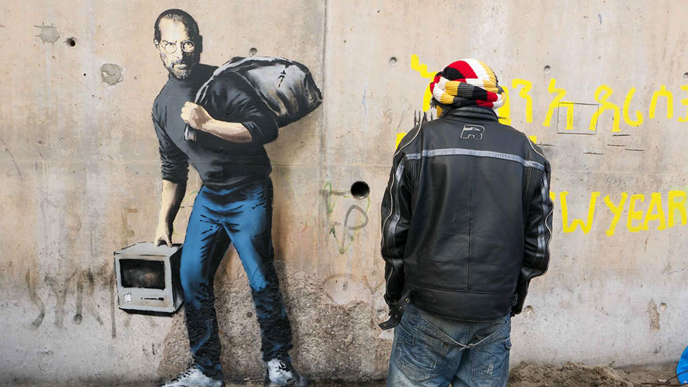
One such artist who was recently was featured on www.thisiscolossal.com commented on the struggle Syrian refugees are facing right now. New York graffiti artist Banksy paid a visit to the Jungle Refugee Camp in Calais, France, where he painted a graffiti portrait of Steve Jobs. In true Banksy style, he commented on Job's identity as the son of a Syrian migrant. This small gesture by Bansky adds greatly to the argument agains the anti-refugee conversation as a result of the war in Syria, helping to demonstrate how important the humanitarian effort to save these refugees is. No one knows the future contributions that any one person will make to society, and judging a person based on their plight, race, or country of origin is just as wrong in war time as it is in peace time. Banksy's piece provides that glaring example of one man who's origins could have been judged, but instead, was lucky enough to have seen his life's work become the products so many of us admire and use every day (and on which I currently type this response).
Connect, Quarter 2
The article Horror Is a Constant, As Artists Depict War, published by the New York Times, serves as a reminder that war has been and continues to be a gruesome and barbaric tactic used to obtain power and inflict pain. By juxtaposing art created by Francisco De Goya which depict scenes from 18th Century battles with other artists depictions of war from the 19th and 20th Century, we can begin to see what the artists were trying to convey by showing us that the horrors of war do not change. These renditions of wars past help us to see the costs involved in war over time as well. The 19th century artists it appears initially tried to make sense of the wars and their horrors by largely focusing on the heroic nature of war as some works depicting Napoleon depict him as an exalted general on his white horse. But like any good story, there are many sides and what we know about a story depends on who tells it and what point of view they have. Thus other paintings from the time showcase Napoleon with wounded soldiers and horses exhausted from war. Once the 20th century works appear, we see that war with more modern weaponry does not necessarily mean that the resulting suffering is depicted any differently despite that they serve to document the wars and the methods of war at the time. The exhausted and the weak are often the focus of such work, and perhaps the artists use this view as a reminder that war is not ever the answer to violence no matter what century we might look at.
If we look at how Art is often used as a release mechanism for pain, for suffering, or for anger towards a subject, we see also that war often inspires art which is thus made as a reaction to it, whether the art comes from someone immediately affected by the war or by someone who is watching the effects of the war from the outside. Today, it is quite hard to tell the difference between peace time and war time, with so many battles being fought every day all around the world. As such, many of today's artists are using their unique talents to add to the ongoing conversations worldwide and to help heal the wounds created by war.
One such artist who was recently was featured on www.thisiscolossal.com commented on the struggle Syrian refugees are facing right now. New York graffiti artist Banksy paid a visit to the Jungle Refugee Camp in Calais, France, where he painted a graffiti portrait of Steve Jobs. In true Banksy style, he commented on Job's identity as the son of a Syrian migrant. This small gesture by Bansky adds greatly to the argument agains the anti-refugee conversation as a result of the war in Syria, helping to demonstrate how important the humanitarian effort to save these refugees is. No one knows the future contributions that any one person will make to society, and judging a person based on their plight, race, or country of origin is just as wrong in war time as it is in peace time. Banksy's piece provides that glaring example of one man who's origins could have been judged, but instead, was lucky enough to have seen his life's work become the products so many of us admire and use every day (and on which I currently type this response).
Spontaneity in Watercolors [Process]
12 . 7 . 2015 - 12 . 13 . 2015
This piece is titled "Oceanic." The first of my watercolor works, it reminds me so much of the Pensacola, Florida ocean waters I love and have displayed in my personal opening photograph at the top of each page of this site. Just as the ocean allows me to breathe and to relax, this piece too evokes that same feeling in me. I am proud to have captured the essence of a place that I love with the spontaneity and abstraction which is so prevalent in my work. That the subject and composition of this piece came through me rather subconsciously truly proves that my work is a true reflection of who I am and what I love most.
Spontaneity in Watercolor [Process]
11 . 30 . 2015 - 12 . 6 . 2015
For this next project, I have decided to continue my exploration into paint and ink-related spontaneity with watercolors! I am really enjoying painting, and I feel the pieces I will create will truly add to my body of work. I am drawn to the suspense of the "drip" as a form, and in my work, I am continuing to delve into the many ways that "drip" manifests itself.
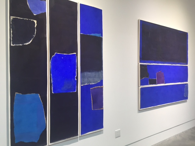
Walking in Richmond [Experience]
11 . 16 . 2015 - 11 . 22 . 2015
*No process for this week - Document Day and Walking Field Trip*
Wednesday, we went to the Glavé Kocen Gallery and the Page Bond Gallery for two exhibits and twice the fun! They were very different, but equally enjoyable. I really loved the intensity of the blue the artist, Charlotte Culot, achieved in the exhibit at Page Bond, titled "A Pulsing Heart, Paradise Is Now." The scale of her work along with this high color intensity was also very impressive. I love walking field trips, and wasn't disappointed in the least!
Critiques in Ink [Process]
11 . 9 . 2015 - 11 . 15 . 2015
Home Project, Quarter 1
After much thought, I decided that my previous plan for a home project was not what I wanted anymore. I love the diptych I created, and I feel it stands perfectly as a completed piece on its own. Thus, I have postponed mounting the tree as I had originally thought I might, and instead decided to explore expanding some of the work I do in my sketchbook. The piece to the left is one of two very meditative ink splotches I created which are an exploration in spontaneity, but this time on a larger scale. I absolutely loved working with the large watercolor paper, making sweeping hand movements to create my pieces as opposed to the small, controlled movements I make to create the smaller, yet similar, ink pieces in my sketchbook.
Exploring the Color White {Awareness]
Anna Fafaliou
Anna's work is all about white. White, she says, comes in many forms. "From minimalist to blankness, from abstraction to purification," Anna uses white to convey all that inspires her - most notably, "the notion of memory, identity, and visual perception."
I really respond to her minimalist approach, and I love her use of the purest color to allow the subtle metallic elements in her pieces to shine. I love that her art is clean and calming - that feeling for the viewer is what I, too, look to achieve in my work.
See her art below! More at: http://www.annafafaliou.com/home/4587657492
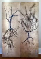
Rooted, Part III. [Process]
11 . 2 . 2015 - 11 . 8 . 2015
The piece is finished! As I worked to finish it, I began noticing and responding to the zen quality of the piece. The intricate patterns of the wood grain gleam as they are enhanced by the gold, and yet they remain in the background, allowing the viewer to truly focus on all the details in the cyprus roots themselves.
I am very proud of my new addition to my body of work!
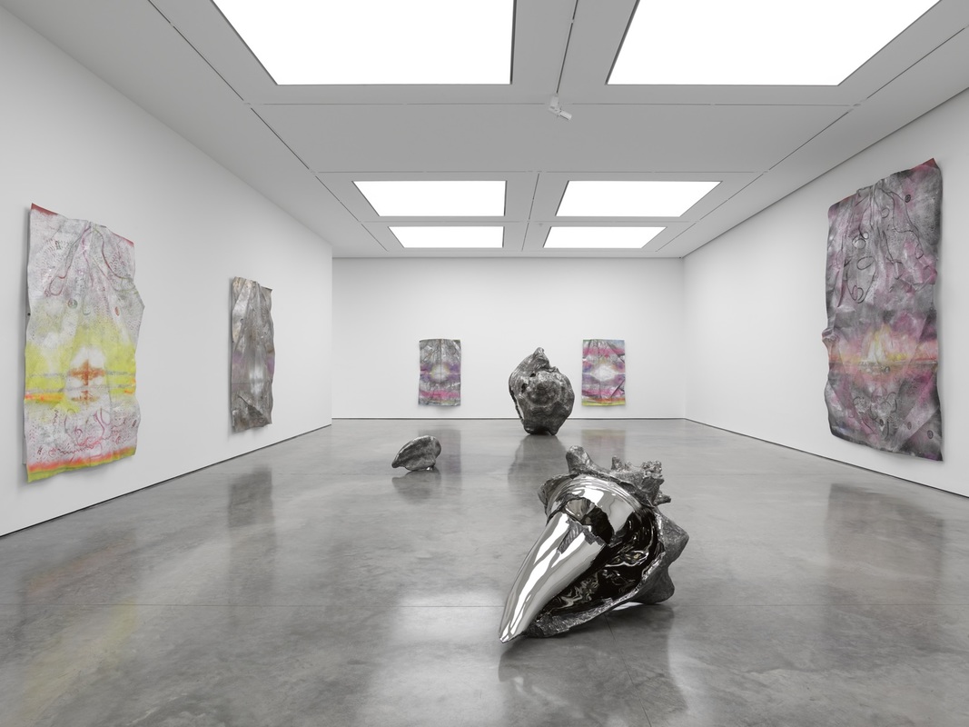
In the Spirit of Nature [Awareness]
Marc Quinn
http://marcquinn.com/studio/studio-diaries
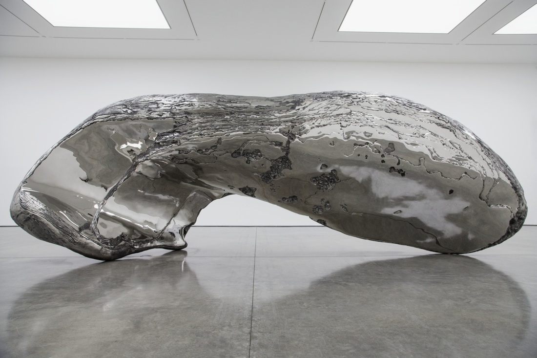
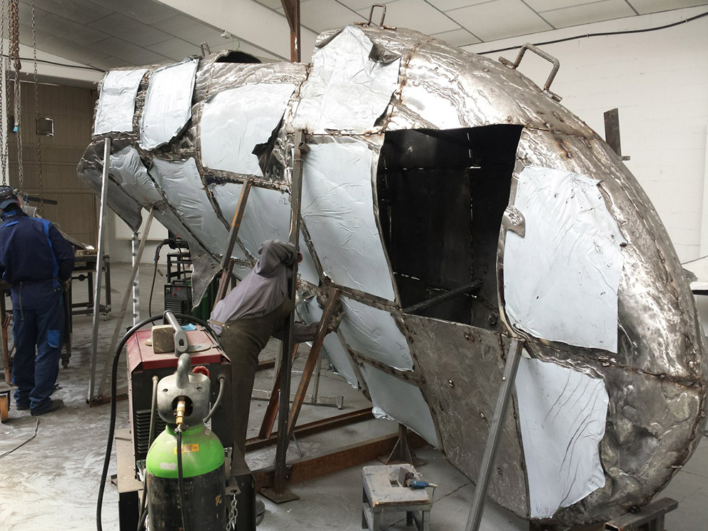
I stumbled upon Marc Quinn's work because of his grand-scale metallic sculptures. However, Marc Quinn's body of work includes so much more than that. His metallic sculptures explore nature and often are of shells or shell fragments he finds. Specifically, in his piece, "Frozen Wave," Quinn used 3D printing to capture exact details of a shell fragment he found and then, using a series of enlargement techniques, created the massive, stainless steel version seen below.
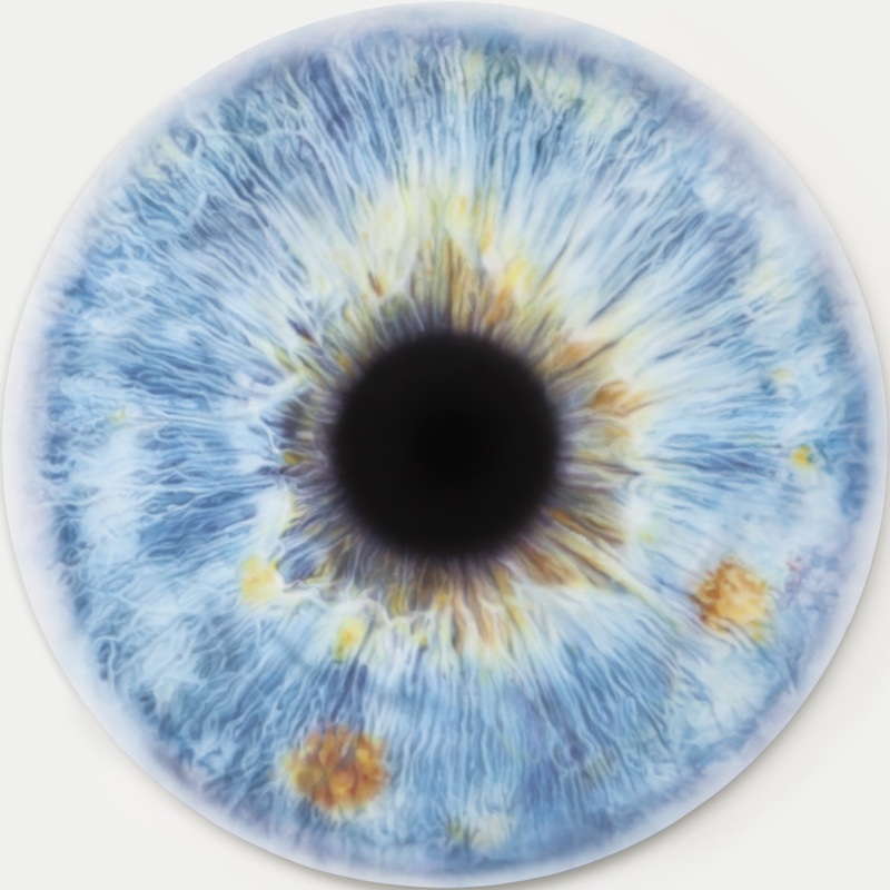
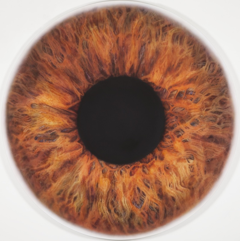
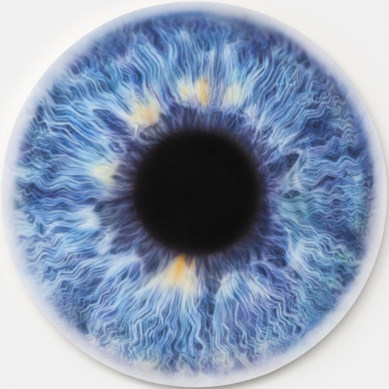
In another one of my favorite series' of his, Quinn did a series of three 2 meter square oil paintings he titled "We Share Our Chemistry With The Stars," in which he painted, in great detail on a very large scale using an airbrush technique, the eyes of three subjects who sat for him. The amount of detail and precision he achieved is unbelievable. The paintings are gorgeous.
I am truly amazed by his range of styles, mediums, and ideas. I definitely connect with his innate response to nature in my work and I especially connect with his love of the beauty of the sea and its components. I enjoyed researching and learning about his unique take on those themes as an artist!
Marc Quinn
http://marcquinn.com/studio/studio-diaries
I stumbled upon Marc Quinn's work because of his grand-scale metallic sculptures. However, Marc Quinn's body of work includes so much more than that. His metallic sculptures explore nature and often are of shells or shell fragments he finds. Specifically, in his piece, "Frozen Wave," Quinn used 3D printing to capture exact details of a shell fragment he found and then, using a series of enlargement techniques, created the massive, stainless steel version seen below.
In another one of my favorite series' of his, Quinn did a series of three 2 meter square oil paintings he titled "We Share Our Chemistry With The Stars," in which he painted, in great detail on a very large scale using an airbrush technique, the eyes of three subjects who sat for him. The amount of detail and precision he achieved is unbelievable. The paintings are gorgeous.
I am truly amazed by his range of styles, mediums, and ideas. I definitely connect with his innate response to nature in my work and I especially connect with his love of the beauty of the sea and its components. I enjoyed researching and learning about his unique take on those themes as an artist!
Rooted, Part II... [Process]
10 . 26 . 2015 - 11 . 1 . 2015
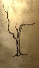
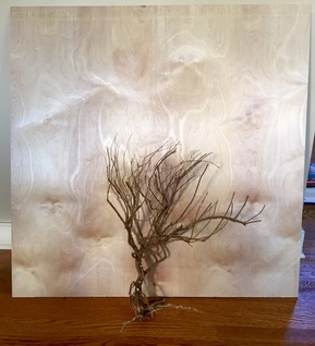
I've begun what will be a tryptich which will combine both my school and my home projects for this part of the quarter. The tryptich will include my real tree mounted and intertwined into the middle of the three panels, while my drawings of these trees will be included on the two side panels. Thus, this week, I've been working on developing the side two panels, slightly guilding them (you can never have too much metal in your work, right?) and then drawing on them in order to bring out my distictive line quality. I've made great progress and I'm really proud of the drawings I've done on the boards so far. Can't wait to see it all come together!
Also, I've begun to put my home project together! See the picture below for more! Super excited about it...I really think the tryptich is going to turn out exactly as I hope it will!
10 . 26 . 2015 - 11 . 1 . 2015
I've begun what will be a tryptich which will combine both my school and my home projects for this part of the quarter. The tryptich will include my real tree mounted and intertwined into the middle of the three panels, while my drawings of these trees will be included on the two side panels. Thus, this week, I've been working on developing the side two panels, slightly guilding them (you can never have too much metal in your work, right?) and then drawing on them in order to bring out my distictive line quality. I've made great progress and I'm really proud of the drawings I've done on the boards so far. Can't wait to see it all come together!
Also, I've begun to put my home project together! See the picture below for more! Super excited about it...I really think the tryptich is going to turn out exactly as I hope it will!
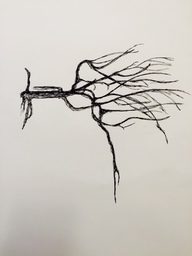
Rooted, Part I... [Process]
10 . 19 . 2015 - 10 . 25 . 2015
This week, I drew many, many sketches of the tree and other trees, noticing that I was developing a new mark as I did so. There's a very distinct something about my line quality that I absolutely love, so I'm very excited to hopefully translate that onto my final piece as well. It's been great to draw as well, so I think I might want to incorporate some direct drawing into the project I'll be doing. Posted to the left is my very favorite of the sketches I did this week. You can see how the line quality I've been developing has added shading and enhanced form, while being loose enough to suggest a ruggeddness of the bark of the tree so characteristic of the real life version. I'll finalize my project plan this weekend then, and then I'll be ready to formally get started on it on Monday!
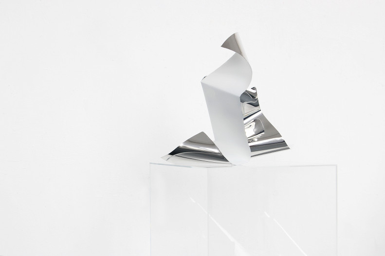
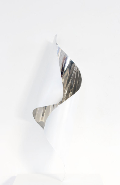
Walking In Richmond [Experience]
Visual Arts Center: Hoss Haley - YIELD
10 . 12 . 2015
From his website:
"For decades the scrap yard has been a major source of raw material and inspiration. I go a couple of times a week, and I usually arrive with a shopping list in mind: a specific part for a machine I’m building or a particular type of metal I need for a sculpture I’m making. At the same time I try to be aware of what I’m not looking for. I’ve learned that materials that I might initially deem undesirable can actually be worth trying, so I occasionally pick up something to test in the studio. Once in a while something has unexpected potential and can influence what I make as well as how I make it.
Over time I’ve learned that the scrap yard is also a great meter for what’s going on in the world, both economically and socially. When I first started going to the Asheville scrap yard in the late 90s, there was a lot of industrial waste: drops from manufacturing, machinery from the dying textile industry, etc. The building boom of the early 2000s brought a great deal of structural steel. Then, almost over night, the influx of structural steel slowed to a trickle, but the demand for recycled steel remained high. Today the yard is mostly filled with consumer castoffs, especially appliances. As the consumer demand for cheaper products increases, the quality of the products decreases, as does the life span of the goods. The efficiency of recycling must increase to meet the volume.
“The White Series” is the direct result of my regular visits to the scrap yard. At first, I started dragging washing machines back to my studio because there were just so many of them, and the material interested me. I developed a quick process for stripping the metal from the machines, and then started forming the metal in my hydraulic press to experiment with form. I liked the way the metal crumpled under the pressure of the press; it reminded me of paper. I started thinking about how we tend to buy things with little thought of the future. We can buy appliances and electronics so cheaply that when they break, we toss them and go get new ones. It is like writing on a piece of paper, changing your mind, wadding it up, tossing it away, and starting again. This flippant gesture became the subject of Wads. I began making more and more of the crumpled forms letting them collect in my studio the way crumpled paper collects around a trash bin or the washing machines were collecting in the scrap yard. Then I began to compose them. The final composition, Cycle, became a way to exaggerate the idea of “tossing away” and to demonstrate the precariousness of this act. In the end there was a satisfying moment in the process when the castoffs became commentary."
--------
I personally really enjoyed this visit! Seeing how another artist used metals was fantastic - I especially admired some of his more organic forms made from such creud elements like scraps from old washing machines and car hoods. It's wonderful to see yet another artist daring to be unique and truly himself! The exhibit was gorgeous! That's why I always love walking in Richmond!
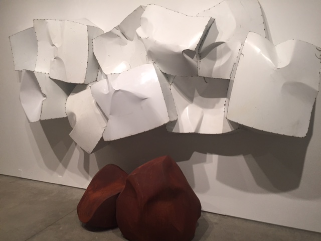
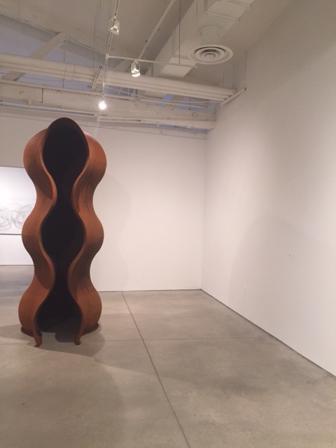
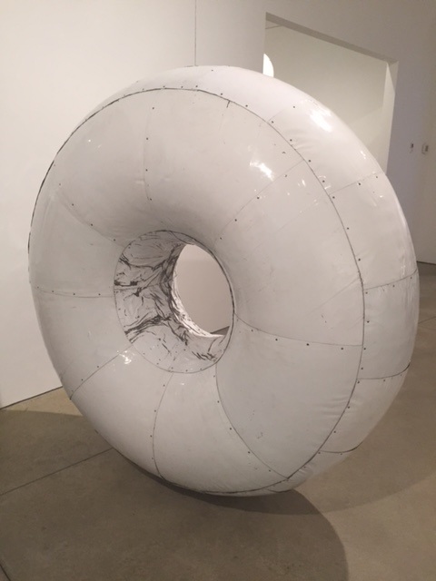
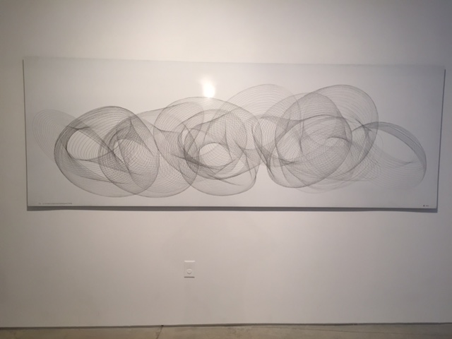
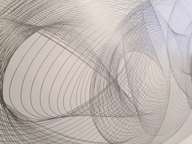
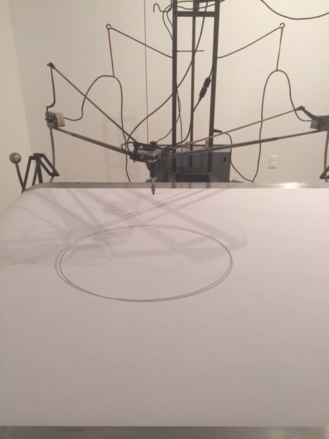
New Week, New Project [Process]
10 . 12 . 2015 - 10 . 18 . 2015
For my next project, I am again inspired by nature. I believe I will be exploring wall sculpture with this next piece using a small, bare tree I pulled out of the ground from my backyard after we had noticed it had died. Having a whole tree intact really excites me, and I see a lot of possiblities in it! Brainstorming this week thus has been very productive. I'm going to do some sketches of the tree next week and see where I go from there!
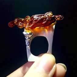
Just Me and My Jewelry, Part III [Process]
10 . 5 . 2015 - 10 . 11 . 2015
The ring is done! Wow, am I super proud of the way it turned out (thank you Jewelry Gods!) and I am even more proud of its connection to my body of work. The "drip" I added to the piece, while requiring multiple firings, really accomplished the overall aesthetic and created the calm suspense I so adore exploring in my art. The juxtapositon of the shiny silver against the more "white" silver (silver where the individual silver particles are standing on their edges like christmas trees instead of laying down and creating that classic shine we all know and love) on the ring really adds to the whole piece, and the "white" silver allows for a gorgeous reflection of light I was hoping I'd achieve from the resin onto the ring itself. Very, very happy with the end product!
Protest Art [Connect]
Connect, Quarter 1
Art is often created in response to that which is happening around the artist. Thus, it is natural that protest art has emerged throughout history as a response to that which artists found that prompted them to speak out in their society. Protest art is nothing new. In fact, many of these artists are well known, though they may not have thought of themselves as protest artists at the time. Piacasso protested WWII when he made contraband sculptures out of the remains of metal statues of Hitler, and his painting Guernica which showcased the horrors of war protested the very process by which we as countries sometimes attempt to resolve our differences. Ai Wei Wei has protested the Chinese government with many of his pieces, which we as a class discussed in depth last year. And currently, there continue to be more artists tackling today's issues.
The "Tools for Action" show by the Eclectic Electric Collective (2012) caught my attention with its large street presence and evocative message. Large inflatable cobblestones sit in the streets, protecting strikers in Barcelona, Spain while also mimiking a small weapon used in the riots around Barcelona and around the world. This small symbol of a greater dissatisfaction with the status quo reminds viewers to speak out, and make their voices heard, all the while giving them, literally, a means of protection if they choose to do so. In a sense, by creating a beautiful street sculpture with a potent message and general utility, these artists have killed two birds with one....dare I say it, (cobble)stone.
The Guerrilla Girls have tackled the debate on feminism and women's rights head on with their posters that double as a sort of pop art. Through their art, the Girls emphasize the inequalities between women and their male counterparts in the art arena, with quotes like "Less than 4% of the artists in the Modern Art sections [of the Met. Museum] are women, but 76% of the nudes are female," or "You're seeing less than half the picture, without the vision of women artists or artists of color." Thus, in a small gallery setting, the Girls have managed to make their captive audience question the inequalities in museums they have toured or will be touring, all the while also questioning the broader inequalities women are facing in the art world especially. The Girls are reaching an audience who may not have agreed with them before they stumbled upon a piece or pieces of the Guerrilla Girls' art that day, but through the Guerilla Girls exhibit, this audience will at least have the opportunity to think about the protest the Girls are taking part in.
Finally, I stumbled upon an artile on an art installation located in Bristol, England, rather sweetly yet boldly protesting the use of single serve plastic containers and the devestating effects waste like this can have on our world and the animals who live here with us. The Cod Steaks design and model-making firm created two giant, 30-foot long whales which are both surrounded by waves made entirely out of plastic bottles collected from what was left behind following the Bath Marathon and Monument 10K races in Bristol this year (see the pictures below!). The total? 70,000 water bottles. So, the Cod Steaks firm invited people to visit the installation and to pledge to ditch the use of single-serve plastic water bottles while they were there. Not only did these artists protest an environmental hazard, they decided to kickstart a real movement of change through their exhibition. Too cool.
If you want to read the article on the whale installation, click here: https://www.takepart.com/article/2015/08/30/see-whales-swimming-ocean-of-70000-plastic-water-bottles
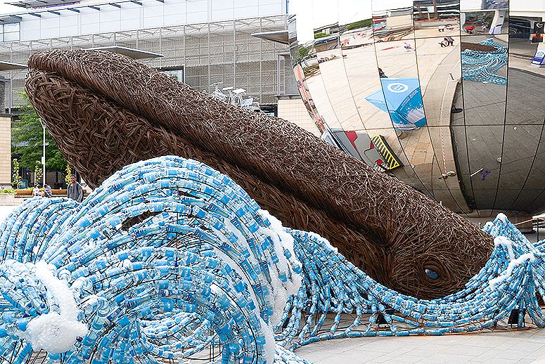
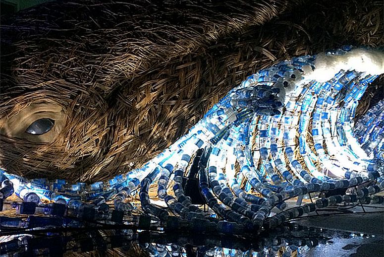
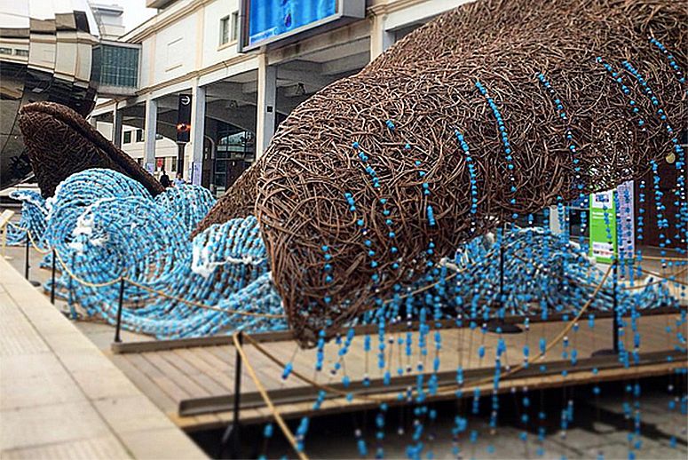
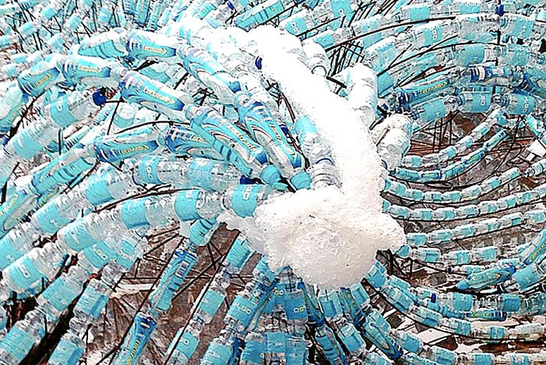
Just Me and My Jewelry, Part II [Process]
9 . 28 . 2015 - 10 . 4. 2015
When creativity strikes, sometimes you just gotta go with it. I sat down to make my ring this week! Jewelry is always a complex process - from having to account for ring resizing to the delicate time balance I have to achieve when working with the silver I use, to being able to create the exact shape that will fit into the natural gap in the resin I have chosen to use for this project, after it has all been fired and resized. I am really happy with how the ring has turned out, and as of this post I am putting it into the kiln to fire! Crossing my fingers the jewelry gods are in my favor and all my careful calculations, measurements, and craftsmenship transform this silver into the ring of rings! Opening the kiln is always like Christmas morning :) The anticipation has definitely made this week a lot more exciting!
Just Me and My Jewelry, Part I [Process]
9 . 21 . 2015 - 9 . 27 . 2015
This week we've been brainstorming for our first class project. Over the weekend, I stumbled upon some tree sap that had collected on a tree in my front yard, and feeling a stroke of inspiration, I decided I'd pick off all the resin I could see. Now, I have lots of resin which I am leaving out to harden over the next week or so as I play with ideas for a jewelry piece. I love how this resin includes the organic forms I have been drawn to and creating in my art for the past year, and I am excited to use it as a natural element in my jewelry. I think I can continue my idea of juxtaposing the organic with the more sculpturally rigid, and thus this week I have been working out ring ideas that might best accomplish that goal!
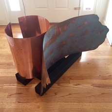
Critiquin'... [Process]
9. 14 . 15 - 9 . 20 . 2015
Both last week and this week we have been diving headfirst into critiques on our summer projects. I am very proud of my project, made to juxtapose the spontaneous with the controlled, the rigid with the organic, and the natural with that which has been tampered, came together in a wonderful free standing floor sculpture crafted out of copper sheeting, some of which had been rather forcefully patinaed over the past 3 months. I have gotten super great feedback from everyone -- they all love my aesthetic, my craft, and my unique talent with the material I love most (metals!). It has been wonderful getting to know all the Art IVs and their artistic interests as well. Looking forward to beginning our first in class project!

Senior Year!! [Process]
9 . 8 . 2015 - 9 . 13 . 2015
When I walked in to Art II the first day, for my first class as a freshmen at Maggie Walker I don't think I quite knew just how absolutely wonderful this journey was truly going to be. I certainly didn't think it would fly by as it has...this week, walking the halls as a senior for the first time, has been surreal. By the end of the year, we the six lovely ladies of Art V will have completed our senior art show, and will be walking, capped and gowned, with our diplomas in hand, towards our futures. It is amazing to think I'll be leaving the place I've called home for the past four years, but I am excited to see what this year has in store and will savor every last minute of it. I have a feeling it will be legendary.
Can't wait for a wonderful final year of art! I just know we'll have a great time. :)
(the picture on the left was added on 10/16/2015 -- senior field day was a blast! #RE16N )
Shoes That Break The Silence [Awareness]
Antonio Gonzales Paucar - Tumblr Treasure!
This is an installation made of 1000+ dead flies that have been painstakingly strung on nylon. I think it's so awesome that someone would have the patience and imagination to do this! Even though its so unlike anything I'd ever do, I actually really love it!
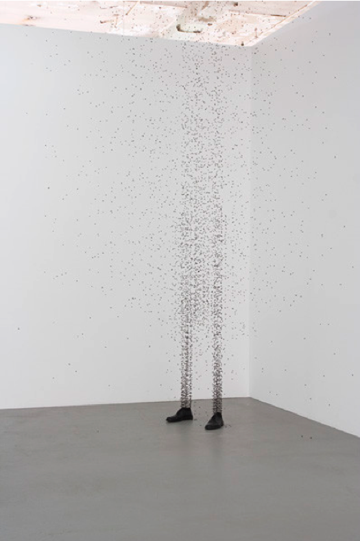
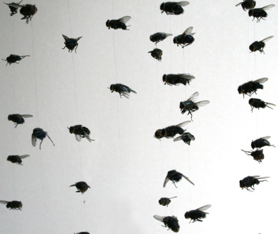
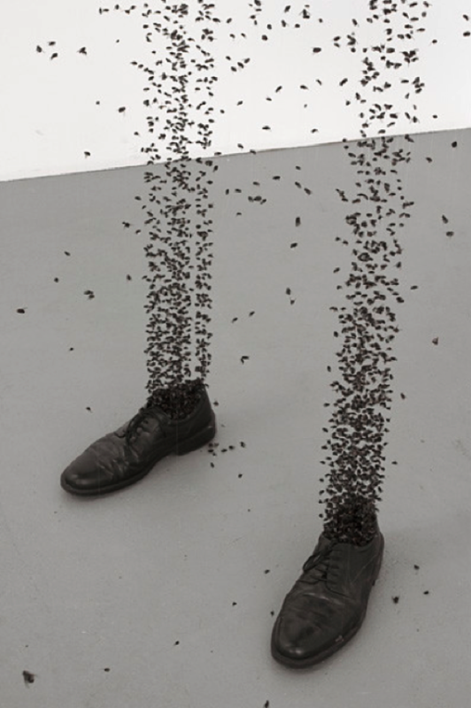
Beginning Again... [Process]
4 . 13 . 2015 - 4 . 19 . 2015
This week we're beginning anew once again. And with every new project comes another trip to Home Depot. We had to go to several (and one Lowe's) but I finally found another gorgeous piece of wood I'm excited to begin working on. I think I'll be trying a similar approach to my last one to start building a small series, but I want to enhance this one by allowing it to truly shine. I recently learned about how artists sometimes use a bright color on the back of a painting to create a glow around their art when it is hung close to a white wall. I think the idea is fascinating, and I'd love to play with it! I'll be posting pictures as it progresses!
Walking in Princeton!! [Experience]
The Princeton Art Museum, Princeton NJ
4 . 6 . 2015 - 4 . 12 . 2015
This week was Spring Break, and my family and I decided to go on a trip to Princeton, NJ to begin my college search! I want to visit a range of different schools up and down the East Coast, and Princeton was stop #1. We spent three full days there, and one morning while we were on campus we visited the art museum! I really enjoyed the time we spent there. My favoirte piece by far was the first piece on your right as you walk into the museum (second picture below) titled "August 6, 1945". It was made of blocks of wood that had been assembled and charred, with a steel accent. The piece is a map of Dresden, which made it all the more intriguing. I really adored the artist's use of wood and metal (which I also explore in my work!!!! how cool is that?!) and I also was drawn to the piece because of its overall rich quality.
The museum was also home to an entire wing dedicated to ancient Persian and Greek art and sculptures, along with a section of Eastern Orthodox iconography, which were all stunning. Lastly, the chapel housed some gorgeous stained glass, which I definitely admired because I know the dedication and time it takes to complete a process as complex as that is. Overall, it was a great, great experience! And who knows, if it's the right fit, maybe one day I'll be returning to pay Princeton and the art museum another visit!
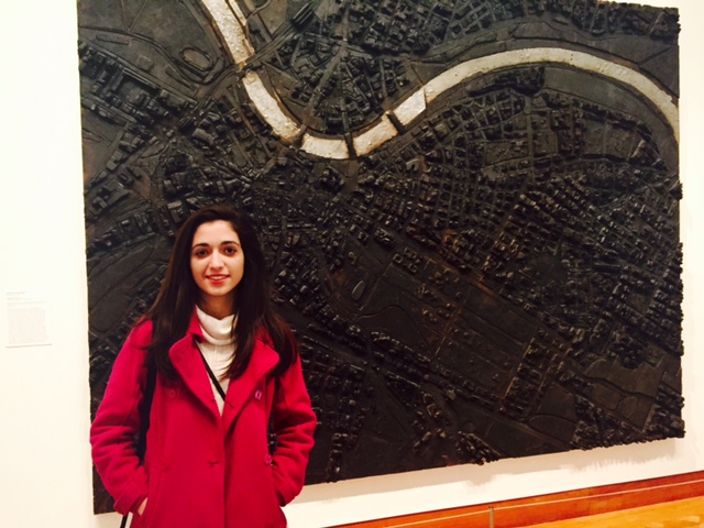
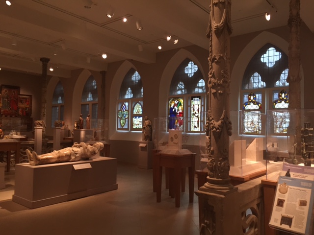
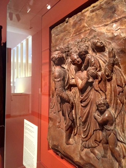
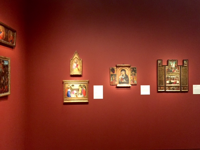
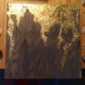
Enhancing the Beauty of Natural Wood - Part 3 [Process]
3 . 30 . 2015 - 4 . 5 . 2015
It's done! This week I worked a lot on adding both the leafing and the accent color on the sides. The leafing did just what I wanted, so I'm super proud of that. The sides I finally painted a soft cream color, which brings out the grey and the gold perfectly. I tried many different colors for my "zips" around the edges of the painting, and I learned that the rules and considerations of figure ground relationships definitely still apply. Ultimately the cream was the right choice.
Proud! :)
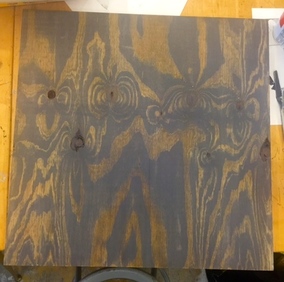
Enhancing the Beauty of Natural Wood - Part 2 [Process]
3 . 23 . 2015 - 3 . 29 . 2015
This week I've been working on bringing out the natural beauty of the wood by tinting it. I decided on a grey tint, because I think it'll contrast nicely with the gold leafing I plan to add to the piece next week. The glaze I made brought out the patterns in the wood just like I wanted it to, so I'm very happy. The piece of wood just keeps getting more and more beautiful in my eyes -- don't you love when something spontaneous turns into such an awesome idea as it progresses?
Art by Eden Some [Awareness]
As I was scrolling through tumblr I stumbled upon the work of Chinese artist, Eden Some. These are some of my favorites of his works! They're gorgeously simple yet elegant, and organized yet chaotic, and both juxtapositions are what I strive for in my own work as well. Love, love, love!!!
Here is his portfolio: https://www.behance.net/edensome
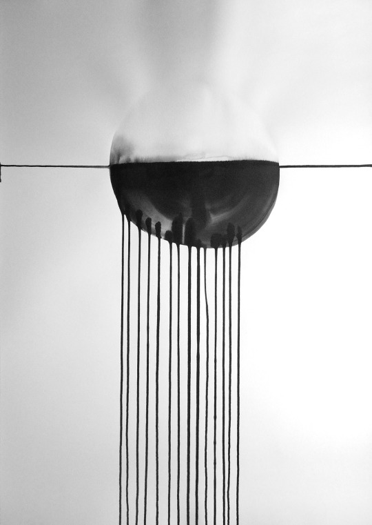
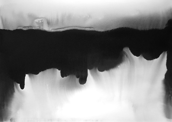
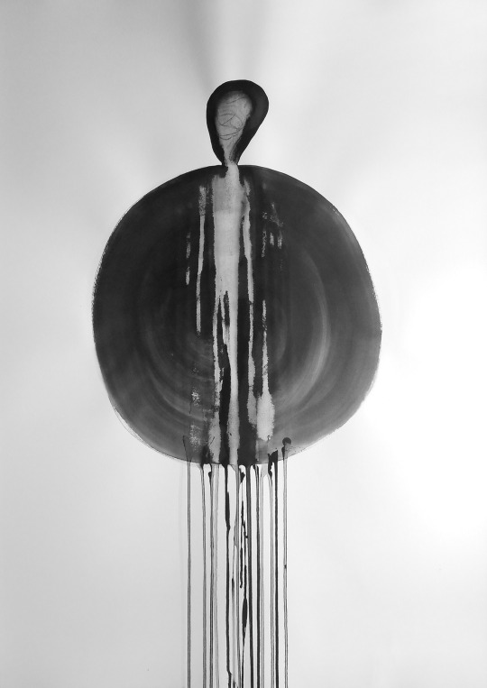
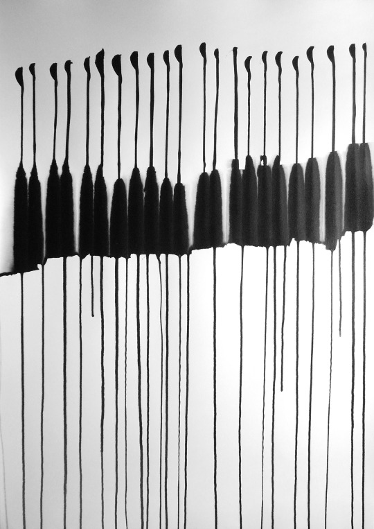
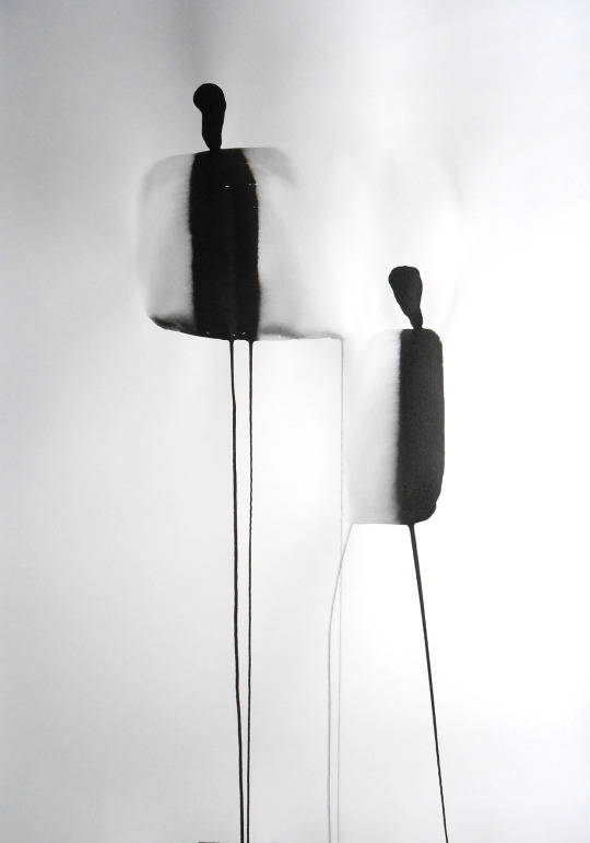
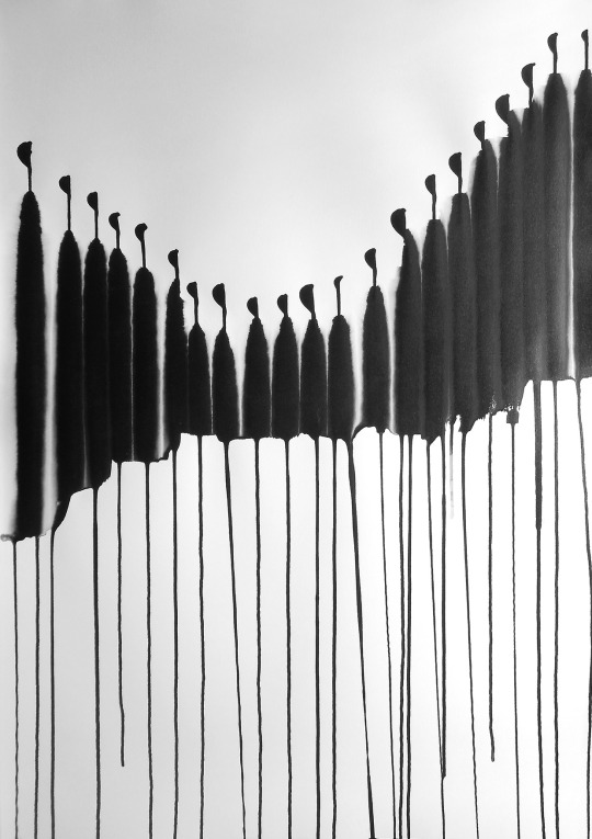
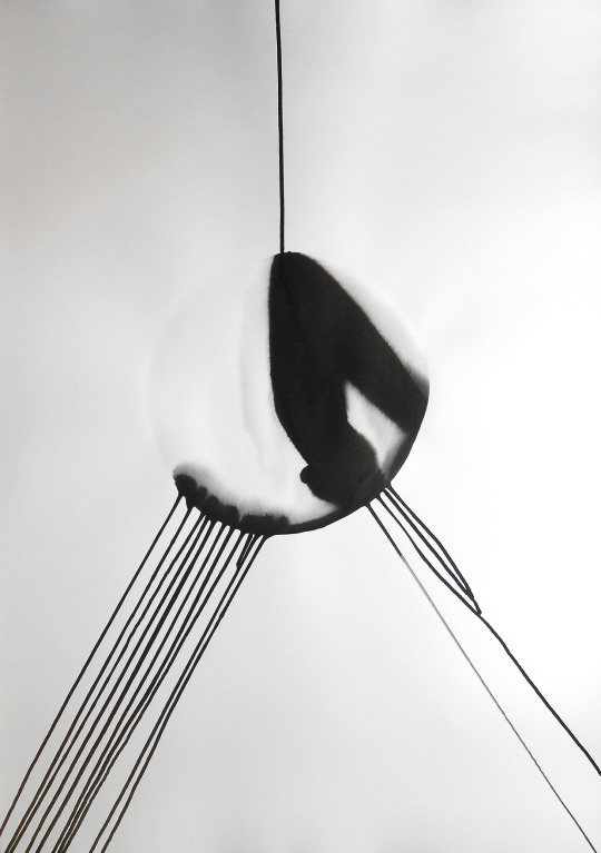
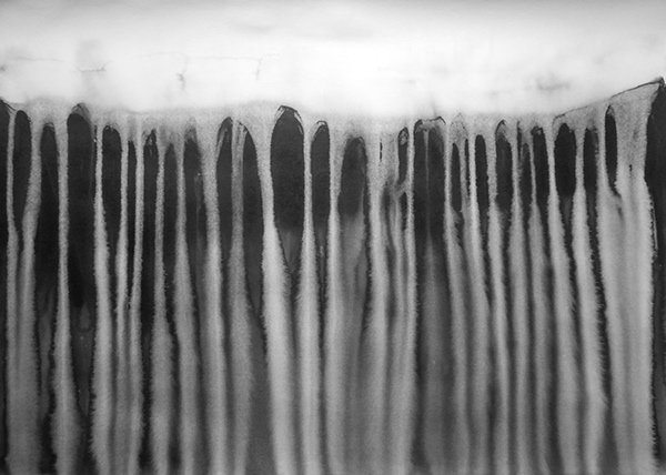
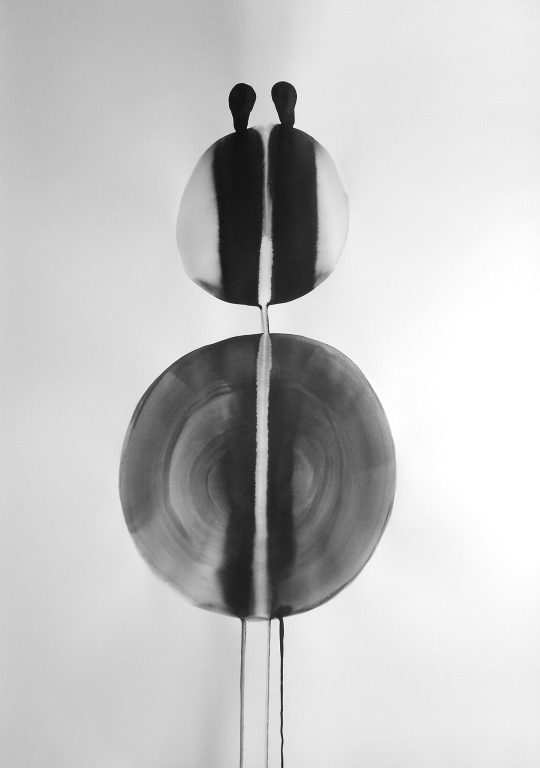
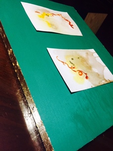
Stains [Process]
3 . 16 . 2015 - 3 . 22 . 2015
Home project critiques came this week. I've been experimenting more with the themes from my last piece Polaroid, and the idea of making mistakes look purposeful and beautiful. This piece is an exploration of another kind of mistake people make everyday -- the mistake of staining your clothes. I used balsamic vinegar, oil, sriracha, and saffron to stain pieces of watercolor paper, and mounted them in order to give them more purpose and to enhance their beauty. I added my touch of metal both on the sides and in the stains themselves, where the metal I added reacted with the stains to produce a green/teal tint around the metal, which I magnified with my choice of color on the board. I don't know that stains are a concept I'll pursue for a series, but this was a fun attempt at pushing my boundaries and exploring a different idea!
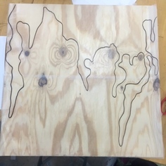
Enhancing the Beauty of Natural Wood - Part 1 [Process]
3 . 9 . 2015 - 3 . 15 . 2015
Well, my moment of inspiration came! I can't believe it, I was so happy. We went to Home Depot, and I just couldn't leave this piece of wood there. It was too beautiful! The wood grain made me so happy, and I'd like to try to enhance it in any way that I can. I drew this pattern on a piece of wax paper overtop of the wood around my favorite knots and patterns in the grain, and I'm actually leaning towards using it. I think the close outline of the most prominent pieces of the wood grain will enhance them nicely...metal, here we come!
Critique Week! [Process]
3 . 2 . 2015 - 3 . 8 . 2015
This week we've continued critiques. I'm already thinking about my next project...I think I'll be going to Home Depot later in the week to buy some wood.
Hoping for a moment of inspiration!
3 . 2 . 2015 - 3 . 8 . 2015
This week we've continued critiques. I'm already thinking about my next project...I think I'll be going to Home Depot later in the week to buy some wood.
Hoping for a moment of inspiration!
Connect Response - Third Quarter "Quiz"
Patronage and Pillage
As artists, we all feel that patronage of the arts is important - if we didn’t, we wouldn’t be respecting ourselves or our work. Every artist wants their efforts and work to be recognized and supported, so it is natural that my classmates and I all had similar views on the role of patronage in arts in society. The patron, the scope of funding, and the question of when art becomes more or less important than other matters that need funding as well provoked some interesting discussions between all of us in class. As Ben clearly pointed out, it is important to recognize that if the government were the only patron of the arts, it could lead to censorship, so it is crucial to have private funding as well.
This censorship is a concern of mine also, because, as we saw last quarter, many governments do try to censor artists. In a country where we hold that freedom of speech as paramount, avoiding censorship is especially crucial to American artists like ourselves. Secondly, Willa commented that the “government not only has the responsibility to fund art, but also that it is in the country’s benefit to do so.” While I agree that it is in the government’s best interest to fund the arts, I don’t necessarily believe that the government carries the sole responsibility to fund them. By promoting art and funding artists and art programs, the government is promoting creativity and problem solving skills as well, which allows for the subsequent promotion of different viewpoints, and in turn can lead to invention and discovery. Also by funding the arts, the government ensures that our society’s culture can be furthered. Art plays an integral role in recording culture for generations into the future and we have seen this time and time again since the early days of cave paintings and hieroglyphics. However funding is just as much a gift from the government as it would be from any private patron as the Medicis were. In the article, "The Medicis: money, myth, and mystery," we read that the Medici family was “amongst the most renowned art patrons in history,” and specifically “the ultimate beneficiary of Medici patronage was Michaelangelo, who shared both the Medici instinct for making money and the Medici determination to ignore it” (The Medicis, 2) The Medicis are thus an example of phenomenal citizen patrons who saw the power of the arts and furthered arguably the greatest artist in history. That being said, I don’t believe we should place the burden of financing the arts solely on the people either as Alex asserted when she said “Ultimately, I believe that where there is separation of church and state there should also be the separation of art and state. Filtering funds through the government for the arts is inefficient…” It is important to me that there be a middle ground, and while there should always be a conscious effort to promote art and the creativity of a society, I don’t believe the burden should always be placed on any one or two major institutions alone. To me, it has to be a team effort, building a team that includes the artist, as well as the citizens, the corporations, and the government working together.
Patronage is deeply appreciated by all artists, whatever the form. Through our class discussions, however, I’ve found that different artists feel that different institutions should carry the main funding burden. Because we read such a variety of articles citing many different governmental patrons as well as many private patrons of the arts, it had never really occurred to me to prioritize one form of patronage over another. I stand by my idea of building a team, and investing all parts of society in the enhancement of our culture. It is my hope that building this team will provide all artists with an equal chance of success in finding a patron who admires the spirit of their work. As the Monsignor Gianfranco Ravasi said, “…art is part of the spirit” and all artists know that the spirit can do great things when it is set free to do so ("Church Gives Contemporary Art its Blessing", 2).
Want to see more??
You can see Ben’s full post at: http://benmattoon.weebly.com/blog
Willa’s blog post can be found here: http://willaportfolio.weebly.com/blog
Find Alex’s post at this link: http://alnormanart.weebly.com/blog
Patronage and Pillage [Connect]
Connect - Quarter 3
This nine-weeks we have been discussing both the patronage and the pillage of art. It's been really interesting actually, to see how the international community has affected art so drastically, both through patronage, or a lack thereof. I was especially intrigued by this week's reading which discussed the role of government funding in european arts, and how budget reductions in those countries have affected the art world. In contrast to the Medicis who funded the Renaissance movement, Europeans recently have had a lot of monetary difficulty with the Eurozone crisis. It got me thinking about what I learned through my intensive study of Picasso in middle school, and the lack of funding he experienced during WWII. During this time, Picasso resorted to unconventional materials, like wicker baskets, ceramic jugs, and palm fronds, among other things (see his piece "She-goat," which is housed at MOMA). Instead of being discouraged by the lack of materials and funding, Picasso found a way to continue to fuel his creativity, just as he did many years prior when he created the Cubist movement. Based on this knowledge of Picasso, I then wondered if a lack of government funding might fuel a new wave of creativity in art, taking it in a new direction that perhaps it would not have gone in if artists had everything they wished for at their disposal. Picasso's example of creativity despite the lack of resources shed a more positive light for me on the role of funding in the arts. Any lack of resources is something that seems so unfair for artists yet that's the beauty of art...there are no real limitations if art is your true passion. Never.
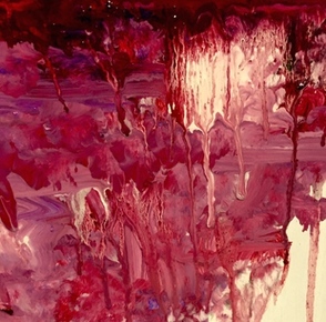
Painting "Polaroid," Part 2 [Process]
2 . 23 . 2015 - 3 . 1 . 2015
I finished up my painting this week. While I absolutely love how it turned out, I'd actually really like to cut some of the length off the bottom of the piece, because I think it's proportionally a little bit stronger if I do. However, I am very excited to do critiques and hang "Polaroid" among my other works in the Youth Art Month show!
To the left is a close-up of the more abstract portion of my piece.
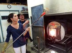
Walking (and working) in Richmond [Experience]
A trip to the Glass Spot - yay pARTnerships!
2 . 25 . 2015
While the Glass Spot may not be your typical gallery, the front entrance houses some amazing artwork. Chris' vases and bowls with intracate patterns line the walls, and then you get to walk further inside to try making some glass art of your own! Talk about an experience!!!! Throughout my first three weeks in class there, I have regained my skills in paperweight making, and I have learned so much about everything that goes into making even the smallest glass. It is absolutely incredible. Trying it for myself makes me marvel at the pieces in the entryway even more, every single time I'm there. I have been having so much fun, and I can't wait to continue the class there! :)
Tumblr Treasures [Awareness]
2 . 16 . 2015 - 2 . 22 . 2015
Snow Break, 2015
Artist and neuroscientist Greg Dunn focuses his work on the beauty of "the landscapes of the brain," and uses gold, ink, dye, and metal in his awesome, awesome work. Through my reading, I also learned Greg Dunn uses a technique called microetching to create very sophisticated details in his work. The delicate forms and the brilliant use of metals in his work to accent it are beautifully done. I love the subject of his work as well - very, very intelligent and interesting. This body of work is definitely a true "Tumblr Treasure!"
See more at: http://www.gregadunn.com
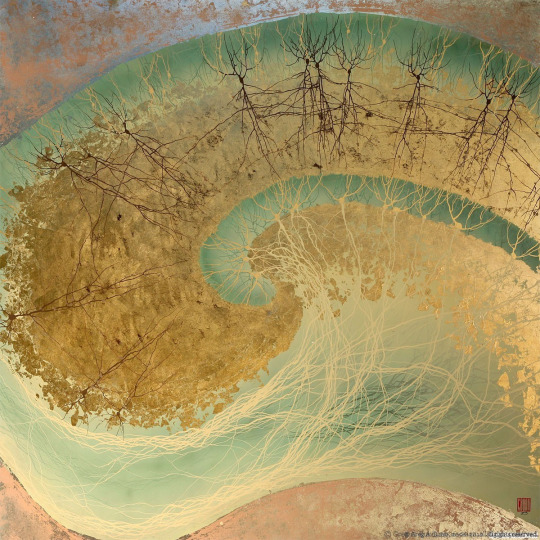
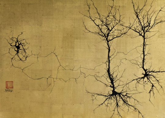
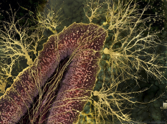
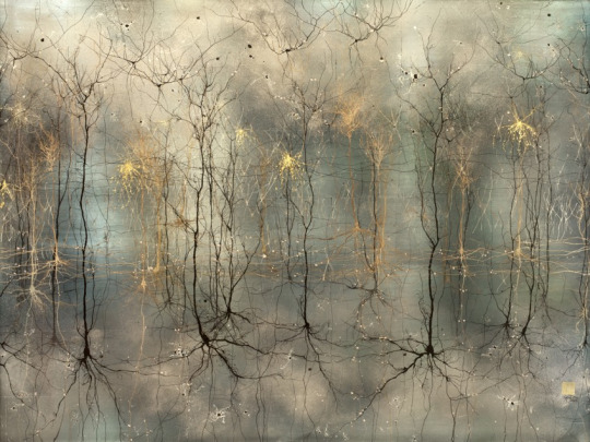
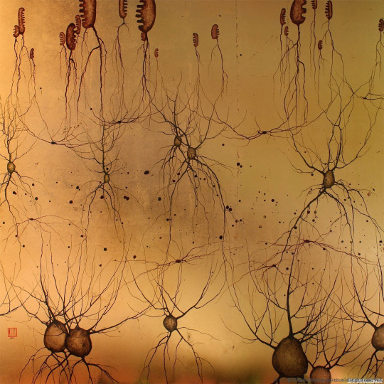
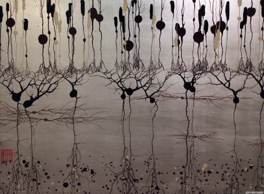
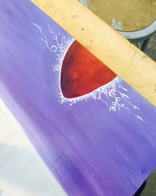
Painting "Polaroid," Part 1 [Process]
2 . 9 . 2015 - 2 . 15 . 2015
The painting process has begun! I chose a 2'x4' board on which I will be working, so I haven't done much to it yet, but I'm happy to be starting a painting that is so rich in color. I'm also excited to begin painting with a more spontaneous process, which I will be doing in order that I, too, make "mistakes" that others will find beautiful because they would think it was purposeful, just to show how easy it can be to change your focus and see everything in a positive light instead of being so hard on ourselves and focusing on the negative all the time.
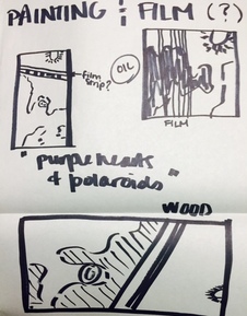
Planning "Polaroid" [Process]
1 . 29 . 2015 - 2 . 8 . 2015
Second semester here we come! This week, I began planning my next project, inspired by the beautiful mistakes that can be made in the photography developing process. Some of these "mistakes" include purple hearts, or spots on the film that can develop when processing which will render a portion of a roll useless, running in polaroid printing, which can occur if a polaroid camera is broken and can create absolutely amazing mini-abstracts, and reticulation, or a granulating of the photograph that can also occur in processing which takes on a very crystallized characteristic.Taking photo this year, I realized I have become drawn to these mistakes for their abstract qualities, and for their beauty -- despite them being something every photo student tries despirately to avoid. I want to showcase these mistakes in a beautiful way, so that others can see them and appreciate their beauty as much as I do.
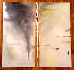
Walking the Line, Part 2 (Exams!) [Process]
1 . 19 . 2015 - 1 . 28 . 2015
Annnnddddd, it's finally that time of the year...the one week we all adore. Exam week. The week before exams is always crazy with exam review and finishing up the 9-weeks work, so I decided to combine these two weeks into one post.
Well, bad news is, I'm sick. So very sick. Good news is, last week I finished my painting! I am very happy with how it turned out, and I love the way the panels work together. I decided to accent the fine line we must walk by making it delecate and adding gold leaf to the small piece. It really does seem like the good/evil is tearing away at the delacate line, making it even harder to walk sometimes. It was a lot of fun to play with subtle colors, and guess what?! I learned I love oil paint, and I love painting on wood. Oil is much more sophisticated and versitile in sheen, texture and with blending. I think I might be doing another oil painting after this. But I think next time, I'm going to go bigger.
Cody Hooper & the Art of Sculptural Painting [Awareness]
Cody Hooper's use of metal leafing and/or metalic paints with sculptural elements give the "illusion of sculpted metal." It is awesome to see other artists using metal in their works to achieve that same sort of opulent quality. In Cody Hooper's case, he is mixing the bold with the delicate in a wonderful balance. Love it!
To see more: http://www.codyhooperart.com/sculptural-paintings-gold-leaf-silver-leaf-art-large-scale-classy-elegant-texas-santa-fe-dallas-abstract-artist-contemporary.html
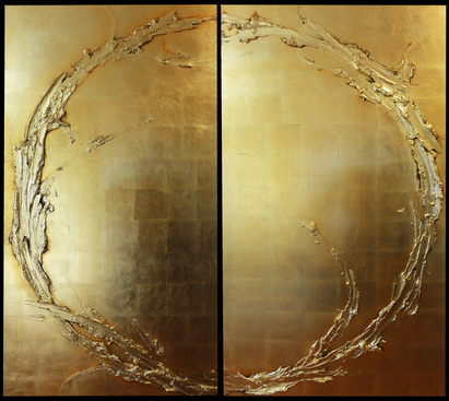
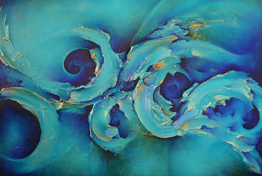
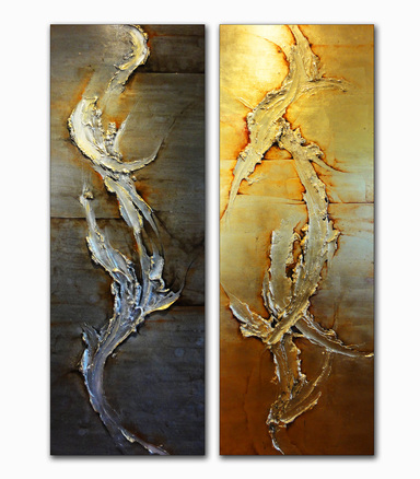
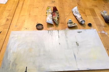
Walking the Line, Part 1 [Process]
1 . 12 . 2015 - 1 . 18 . 2015
First, an excerpt from an episode of my favorite television series of all time, The West Wing.
President Bartlet: You're are a wise and brilliant man, Toby.... did you mean what you said? My demons were shouting down the better angels in my brain?... You think that's what is stopping me from greatness?"
Toby: "Yes."
President Bartlet: "I suppose you're right."
Toby: "Tell you what, though, in a battle between a President's demons and his better angels, for the first time in a long while, I think we just might have ourselves a fair fight."
I am super excited to have started my first multi-panel piece! It's definitely a different experience when you are playing with the interaction of multiple boards and choosing how to display them. I know I am aiming for an abstract, very ethereal feel to this piece, and I will be exploring subtle value changes in both white and grey. Through this piece, I will be commenting on the dichotomy of good and evil, and the idea that sometimes we all have demons shouting down the better angels in our brains. But, somehow, we must find the strength to see the situation through a new lens, and to be conscious enough to overcome our demons so that our better angels may ultimately prevail. I think this inner struggle will play out as a great discussion art piece!
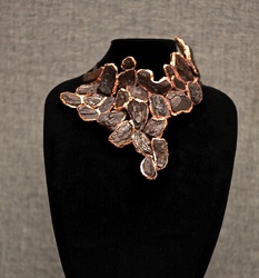
|
Woodland Requiem [Process]
1 . 5 . 2015 - 1 . 11 . 2015 Over break, I completed this piece, entitled Woodland Requiem. I am soooo beyond happy with how it turned out! I have been making more traditional jewelry for a while, but I wanted to take my jewelry to a whole new level by using more unorthodox "gems" to create a wearable work of art. Thus, I used mulch from my front yard, combined with the techniques I learned this summer to create my piece as a token of rememberence to the beauty of nature - beauty that is found all around us, if only we stop for a minute to look. |
Social Practice Art
Connect Essay - Quarter 2
Unlike the traditional artist, the artist who creates social practice art has the ability to clearly define how he or she wants the viewer to interact with it. In this way, the artist is clearly communicating with the viewer. I think in all forms of art, communication is key, but in social practice art, it becomes integral. In essence, the artist also creates for the viewers a kind of community interaction between people who otherwise might be very reserved and self-reflective, when looking at more traditional pieces. Rick Lowe's "Project Row Houses" for example, created an African American cultural hub and thus a sort of community. Interactive art can have many motivations, whether to create a community as "Project Row Houses" did, to comment on political and social issues, or just to be an outlet for people to get to know themselves or one another better. Olafur Eliasson, who I discovered earlier in the quarter and talked about in more detail further down on this blog, commented on both climate change and man's destruction of nature with his interactive art. Now, contrast that with the social practice art I have linked below, where a ball pit in the center of a big city acts as both art and a means of people getting to know each other better and to possibly create long lasting friendships. During a time when people are so self-interested and self-motivated, going about their daily lives in a bubble of social media of sorts with little interaction, this art has proved to be important in order to get people to stop and get to know their neighbors once again. One question I still have is whether social practice art should be considered more effective or equally effective as compared to traditional art. I believe that all comes back to communication. While traditional art may not be able to clearly articulate its point, it is effective in a different way - a more individual way, where each viewer can take from it what they want to. Social practice art I feel is more about the experience, and is effective in its own right in that it can clearly articulate the artist's point and stand alone without a statement as to the artist's purpose behind it. All in all, I believe social practice art is just another beautiful form of artistic expression, and is one which is becoming more and more necessary to allow for real interactions between people every single day.
The link to a video on "Take a Seat, Make a Friend," an interactive piece:
Final Breath : The Finished Piece -- A Comparison [Process]
Critique Week, and Preparations for Winter Break
12 . 8 . 2014 - 12 . 21 . 2014
Critique Week, and Preparations for Winter Break
12 . 8 . 2014 - 12 . 21 . 2014
|

|
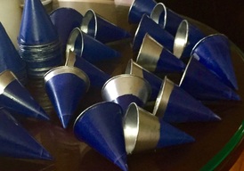
Installation Art: Part 4 [Process]
12 . 1 . 2014 - 12 . 7 . 2014
I have been continuing to spray my cups at home this week, and I have used class time to add the silver rims to the cones which are sprayed and dry. This week we were given a lot more in-class time to work, which I really, really appreciated. I am really excited to have more of our class time to work. Unfortunately, not realizing that we would get this much time, I didn't come properly prepared to use it. With this project I've definitely learned a lot about planning. I've learned that when you plan a project, you have to know all of the parameters under which you are planning, as well as the expectations for displaying the piece when it is done. With the time constraints I had, as well as the issue of set-up, clean-up, and storage of the 200 pieces, I changed my plan so that my class project would unfortunately be based at home. Had I known that our work time allowed would be changing, I may have been better prepared to use that time in class for this project. However because the size of the project changed as a result of the area selected to display it, I have had to buy more cups, paint and more chicken wire. I have also been working to problem solve how to attach the cups to the chicken wire such that it does not come apart. I'll have a lot of work to get done this weekend. Had I known that the scale of my piece would be so much larger than I anticipated when I had started, I would not have been as lacking in materials and design. Anyway, come Tuesday, I will be so excited to show off this new piece and to start another project. I can not wait to be able to take advantage of a full 90 minutes of class time. I am thankful to both my teachers for giving us this extra time to be creative :)

Walking in Richmond [Experience]
VMFA Exhibit: The Forbidden City
11. 25 . 2014
Today we had the pleasure and privledge of taking a small fieldtrip to the Virginia Museum of Fine Arts to see their current exhibit "The Forbidden City." It was incredible. The Forbidden City was an imperial city from the Chinese Ming and Qing dynasties. We got a glimpse into the art, the jewelry, the clothing, and the entertainment available for people at the time. It was awesome to be able to see the exhibit having learned so much about these two dynasties in Chinese history in our global class freshman year. What struck me most was the immaculate amount of detail they put into everything they touch. Being a very detail-oriented artist and jeweler myself, I appreciated the time and energy they spent on making their art so detailed and the precision they displayed with the byzantine qualities of their jewelry. Absolutely worth going and seeing again to spend more time in the exhibit. I'll have to take my family!
Installation Art: Part 3 [Process]
11 . 24 . 2014 - 11 . 30 . 2014
Unfortunately I got sick and stayed sick for all of Thanksgiving break. :( With the fever and upper respiratory issues I had, I did not accomplish as much as I would've liked to with my project but I did get to spray about 60 more cones, so that is progress. It has been much easier now that I have more time and less set-up to worry about, so I think I'll be using the class time we do get next week to work on adding the silver to the cones I have finished spraying.
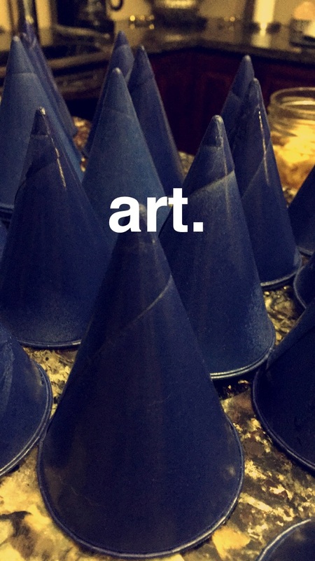
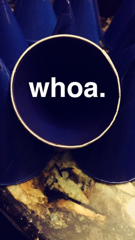
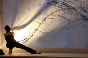
Awareness: Estonian Art [Awareness]
11 . 20 . 2014
Interview: http://estonianworld.com/people/new-york-based-artist-jaanika-peerna-appreciating-shades-grey/
I have been fascinated by the country of Estonia since early last year when we simulated the UN in global and I was one of Estonia's representatives for the simulation. So, today I decided to take look deeper into their culture, and I specifically wanted to know more about their art. I came across The Estonian Academy of Art, based in Tallinn, the capital, along with many of the country's famous artists. Estonian art is very unique and abstract, and I love it. I especially liked the work of Jaanika Peerna, an Estonian born artist based in New York who creates black and white abstracts that are absolutely gorgeous. I found an interview with her, and saw a section about artists who she feels inspire her. I was shocked to discover that she loves Olafur Eliasson, the Dutch artist I discovered on tumblr not too long ago! Seriously, how cool is that ?! Seeing her art, along with all the other Estonian art makes me even more fascinated by the country. I hope one day I'll be able to visit. It seems like a truly wonderful place.
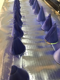
Installation Art: Part 2 [Process]
11 . 17 . 2014 - 11 . 23 . 2014
The cones came, and I've begun the process of painting them. I ordered 200 cups and I've found that spraying both the outside and the inside while allowing for drying time isn't the easiest process. The cups have to be sprayed one by one, because they are cones and thus I can't stand them up on their point to spray them, and the cold weather and wind is not allowing the spraypaint to stick nor the cups to dry quickly. I then went to see if I could use the chemistry department hoods to spray them indoors and I discovered that they were all being used for experiments. I did try to spray some of the cones inside, but the fumes seemed to bother the other artists. So, I've only sprayed about 30 this week. Never having done art which includes such a repetative, manufactured process before, I didn't realize how important every second would be to me. Set up and clean up has taken a lot of my time this week, and so the actual spraying, while allowing for drying time, hasn't gone as quickly as I had hoped. Instructional time makes our class time even shorter, and while I appreciate the lessons and motivational videos, it is very hard to also get a lot done because we only have 90 minutes as it is. As such, I think I'll be taking my cones and supplies home to begin an area in my garage where I can spray a lot of the cups without the worry of set-up, clean up, and no time restraints. Hopefully with the Thanksgiving holiday around the corner, I'll be able to spray a lot more!
Also, as this is my first instillation piece, I learned a little bit about the actual installation component of my work this week. Coach and I talked about a place to hang the piece, and we both really liked a stairwell from which you can view the piece from two levels (because, it in essence, is a corner of the building two stories tall). I am nervous because, with this new venue for housing my piece, we have changed the scale of the piece to be at least three times what I had originally planned. I hope I can get it all finished in time because the scope of the project and all that it entails is now much larger than what I had anticipated.
Awareness: Olafur Eliasson [Awareness]
11 . 13 . 2014
I love tumblr because every once in a while, I stumble upon the most amazing art. This was no exception. After having read the article on interactive art for tomorrow's discussion, I got on tumblr and stumbled upon the interactive works of Olafur Eliasson. In his art, Olafur "creates pieces which 'make the concerns of art relevant to society at large'...[and is] making the concerns of our societies and our impact on the Earth transparent through his work, and thus [is] presenting these concerns back to us through art." The pieces below are meant to be interactive. The first one, "Ice Watch" is made of twelve blocks of ice from Greenland which are set in front of City Hall in Copenhagen. The work is meant to melt and when people go up and touch the ice as they often are inclined to do, they help the melting process. Thus the work is meant to comment on climate change and our role in its progress. The second piece is titled "Riverbed" and is a comment on man's destruction of the natural world. Viewers are encouraged to walk through (and on top of) the piece made of dirt and rocks with a small river running through it. Inevitably, rocks and dirt will be kicked into the river, thus damaging it.
Eliasson's art is amazing and unique, and I love his approach to the social commentary he is trying to achieve.
11 . 10 . 2014 - 11 . 16 . 2014
Installation Art: Part 1 [Process]
11 . 3 . 2014 - 11 . 9 . 2014
This week was critique week for our pieces! I've begun thinking a lot about my next project, and I'm going to be branching off from my wood/metal to include even more processed forms of both. In my sketchbook, Coach commented that he would love to see some of them in 3D. While I never really intended for them to be more than a meditative art process, I actually really like the thought of making a three-dimensional version of one in particular. The blue and silver drawing I created I think would really lend itself to a three dimensional art piece. I am curious to see if the meditative qualities I found while making the two-dimensional piece continue to be present when I am creating the three-dimensional version. Anyways, I've ordered my supplies from Amazon so I can get started right away!
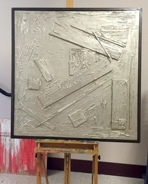
Urban Forestry (Construction Part 5) [Process]
10 . 27 . 2014 - 11 . 2 . 2014
I am more than excited to have finished my piece, entitled "Urban Forestry!" The last element I added to finish it off was a wood-colored frame which I made from 1'x2's and then spray-painted to get the color and contrast I wanted. The juxtaposition here is the very straight and thin brown line I created with the frame, as opposed to Testimony's very natural and jagged copper line which runs through the middle of the piece. I feel I have accomplished what I set out to create, and I am very proud of my finished product. I can not wait for the next piece, to be even more daring and to take more risks in order to bring out the beauty in nature and showcase the metals that I adore.
Construction Part 4 [Process]
10 . 20 . 2014 - 10 . 26 . 2014
This week, I added my metallic element to the piece with a metallic spray paint. Again as a juxtaposition to "Testimony," this metallic element is processed and manufactured, coming quite literally from a can, as opposed to the 100% real copper leaf I used to highlight the wood in my summer piece. I am very pleased with how this piece is turning out! I am on track to having it finished by next week's deadline. There is one more element to the piece I haven't quite finished yet, but I'll save that as a surprise.
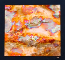
Dhyāna - Meditation in Art [Process]
10 . 13 . 2014 - 10 . 19 . 2014
My home project is complete!!!! I was very excited to experiment some more with the drawings I have been doing in my sketchbook this past 9-weeks. Very meditative in nature, my repetitive circle drawings bring out subtle contrasts in color, as I fill in some circles while I leave others blank. I decided to play some more with color and the meditative quality of my drawings using my favorite medium -- metal! The copper was the perfect choice for this piece, and I learned a lot about the science behind the color changes copper undergoes when heated in the process of creating my piece. It really reminds me of the iridescence I played with in my summer piece "Turbulence" as well. I can not wait to hang this piece in my house!
Below are some of my sketchbook pages, in order to better see the comparison between my home project and the work I have been doing in my sketchbook:
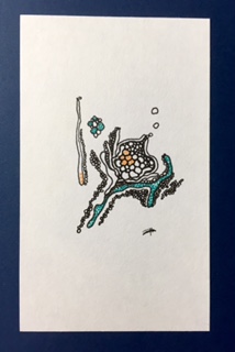
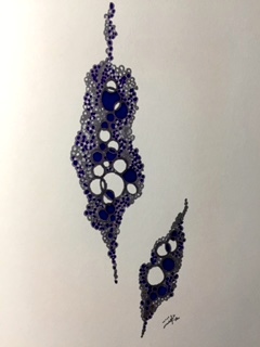
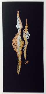

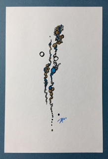
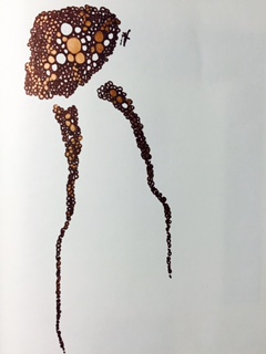
Construction Part 3 [Process]
10 . 6 . 2014 - 10 . 12 . 2014
This week I added the "fake bark" to my piece with joint compound. I intend this piece as a complete juxtaposition to the very natural piece I created with "Testimony," so the texture in this piece is all hand crafted yet it was made to have a very natural wood look, as opposed to Testimony's natural texture which comes from the natural wood elements themselves.
Censorship in Art [Connect]
Connect Essay - Quarter 1
This quarter, we have been discussing the role that censorship plays in art across the globe. Specifically, we have focused on Russia, China, and the U.S. As it is the wish of the governments of Russia and China to control what their people see and hear as an attempt to keep control over their people, the rate of censorship of art in those countries is also very high. Ai Weiwei's art for example was not offensive, nor vulgar, however it was censored because it pointed out an ugly truth about the condition of the people of China and their relationship with their government. This type of censorship is what I would call a censorship to the freedom of speech. Ai Weiwei used his art as his speech and his freedom to do so was taken away by censorship. This type of censorship affects the people more than the artist since the artist is able to share his art with the world in a different forum, as in Ai Weiwei's case, he was able to take his art showcasing his criticism of the Chinese government to other countries for exhibit. Pablo Picasso also found that he was stilted and censored by the occupation of France and the people were the ones left in the dark. This however did not stop Picasso, who used every means necessary to continue his art and his voice despite needing to do so clandestinely. Here in the United States, censorship took on a similar feel with the exhibition of Mapplethorpe's photography which depicted the underground images of homoeroticism and bondage. The discussion here however was not about the government shielding its people from freedom of speech but instead who should bear the burden of funding this expression of art. If the art exhibit is funded by the public, does not the public then decide what it considers art? In Mapplethorpe's case, the public was divided with many groups feeling that Mapplethorpe's images were vulgar and obscene and should not be paid for with public funds while others, particularly those in the art world and in the gay and lesbian communities, felt that his freedom of expression was being violated by a type of censorship.
3D Street Art! [Awareness]
I have always been fascinated by 3D art. Last year, I got to explore the mathematical concepts behind this art form in my VCU discrete mathematics class. Anamorphic art, as 3D art is also referred to, is the process of greatly distorting an image only to have it revealed either from a single vantage point or from a reflection on a mirrored surface. In my studies, I learned that there are two main types of anamorphs - planar anamorphs (like the street art below), and cylindrical mirror anamorphs, which are also absolutely amazing. I also learned how to calculate the points on the plane in order to distort the real image in a way that will allow it to morph into the 3D image when viewed from a certain angle (It involves calculus, and was a long process but really cool none the less! Especially since I love math - the fact that math and art, my two favorite things, are combined in 3D art is absolutely the coolest thing in the world.)
The street art depicted below are from an article I found today. They are beautifully done, and artistically masterful, while also maintaining a very realistic 3D quality. The snail on the bench was my personal favorite, as it shows both the 3D view of the art, and the work as it looks on the street as it was drawn - so you can see the process a little more clearly.
They are all amazing!
*For the full article, go to: http://www.brainjet.com/random/4086/15-unbelievable-3d-chalk-drawings?til=d-dy-4086#slide/16
Construction Part 2 [Process]
9 . 29 . 2014 - 10. 5 . 2014
Finally, finally, with weeks of patient planning and work, I have begun to assemble the piece! I am very happy with it so far, and I am carefully nailing in each of the pieces of wood. After this step is complete, the next step in the process will be to have a little fun with some joint compound. I can not wait to see it all finally come together the way I have envisioned it for so long. I can already see my summer piece and this one hanging side-by-side.
A Tumblr Treasure [Awareness]
Art by Lei Melia
I love Tumblr because I can always trust that I'll find something amazing and artistic while I'm scrolling through. When I found this post, I was blown away. The artist, Lia Melia uses powder pigments and solvents and bakes them onto aluminum or glass to create her "paintings", shown below. The rich colors, and the natural forms that take shape in each of her works are just gorgeous. I think it's fascinating that no two look exactly alike, and I am intrigued by the meditative quality of her process, as well as her work. They are so bright, yet so calming. Both the natural quality of her work and the high craft and polish she achieves so consistently is something I definitely try to accomplish with each piece I create.
Lei Melia's full portfolio is found at www.liamelia.com. Wow!!!
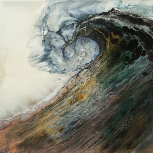
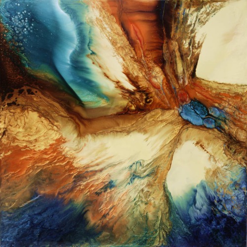
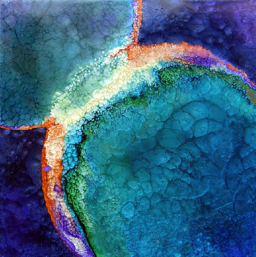
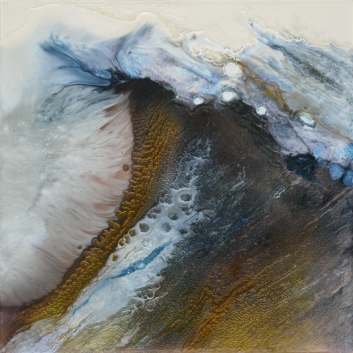
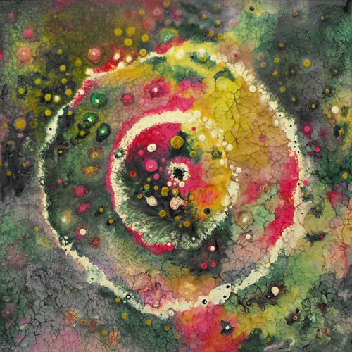
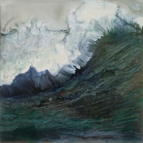
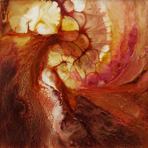
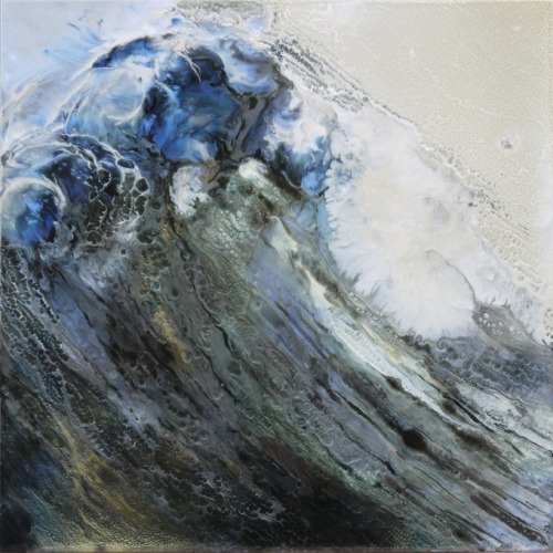
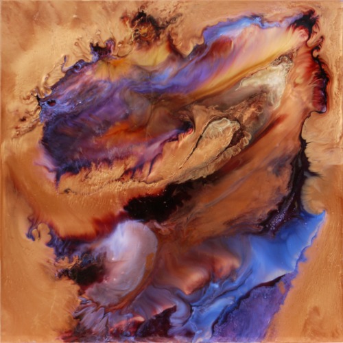
Construction Part 1 [Process]
9 . 22 . 2014 - 9 . 28 . 2014
I have chosen to combine a couple of the designs I drew last week into a final design for my project. So this week, I spent time measuring and cutting the balsa wood into the pieces I will be nailing down on the 3'x3' board. I also decided my piece needs to ultimately be deeper, more like a canvas, and as such I will be constructing a frame for my piece in order to give it a little more depth.
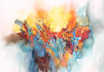
Frolicking in Fredericksburg [Process]
9 . 20 . 2014
Art First Gallery, Fredericksburg Va.
This weekend, while visiting family, we went to an art gallery. I got to see a lot of different art, but this particular piece caught my eye. It is a piece by Johnny Johnson, who just so happens to be a very good friend of the family. His work is stunning, and beautifully executed. He uses mostly watercolor - it is his favorite medium - but he does work in acrylics as well. I don't have to go far to see his work, my grandparents have quite a few of his pieces hanging in their home!
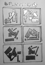
Designs, Designs! [Process]
9 . 15 . 2014 - 9 . 21 . 2014
For my first project, I have decided that I'll use processed wood (both balsa wood and a 3'x3' wood sheet from Lowe's) and metallic spray paint to explore the "processed" effects that both create. Because my summer project, Testimony, dealt with the natural textures and qualities of both metal and wood, and in the piece I superimposed them onto a processed background, here I have decided to attempt the reverse. I will explore the processed nature of both metal and wood, and superimpose the textures and qualities of natural wood onto it. I think it will create an exciting contrast between the two, and will really start to build one aspect of my portfolio.
This week, I drew some designs for the piece. I know I want it to maintain clean lines and geometric forms, so that the natural element I will be superimposing comes as a very stark contrast within the piece itself. I am already looking forward to building my piece, and I can already see it coming together before my eyes!
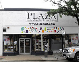
Walking in Richmond [Process]
9 . 8 . 2014 - 9 . 14 . 2014
Plaza Art
We finished critiques and, happily, we went on our first walking field trip of the year to get supplies for our first project! Plaza Art was so much fun, just to be able to walk around and explore. Art stores are so inspiring that way, you never know what you'll see that will be the spark for a beautiful piece! I was happy to get some white ink and paper for prints in the future before we headed back to school.
Junior Year! [Process]
9 . 2 . 2014 - 9 . 7 . 2014
It's finally junior year!!! The school year has started once again, and in true Maggie Walker fashion. With the huge workload, it's wonderful to be coming back to art class as well. We've already gotten our sketchbooks, and this week we started our class critiques of our summer projects. I am really proud of what I made this summer, and jumping in, I have some awesome ideas that I think will allow me to explore the differences between artificial and natural wood and metal. I'm more than excited to begin our first in class project!
Turbulence and Testimony
Artist Statement for the Dynamic Duo project
9 . 2 . 2014
Ever since I can remember, I have been attracted to the elements of the earth. I have always admired everything from precious metals, to stones and gemstones, to minerals and crystals, and to the brillant textures found in nature. In my work, I strive to combine the natural bounty given by mother nature with some form of metal so as to create a delicate balance that is often unexpected. My piece "Turbulence" is an exploration in subtlety, using precise colors of glass connected with copper to create the feeling of oceanic chaos.
I enjoyed working in copper so much that exploring copper using a different medium was a natural next step for me. In " Testimony ", the weathered wood I used was found on the beaches of Perdido Key, in Florida, at what looked to be the site of a demolished oceanfront house. Standing at the edge of the site with my back to the water, the rugged texture of the wood lying in the sand beckoned me forth. As it lay there, it symbolized the evident destruction that had taken place in that spot. Past the "No Trespassing" sign I also found pieces of cement, rusted bits of piping both large and small, broken kitchen tiles and parts of a weathered fence strewn about the beautiful, sugar-white sand. However, turning 180 degrees again to face the Gulf of Mexico, the feeling changed completely. It was calm. The emerald green waters were lapping at the edge of the peninsula, and one single cluster of sea oats blew gently in the breeze. I knew then and there that I wanted to convey the perpetual circle of life while also maintaining a sense of testimony to the storms we all weather.
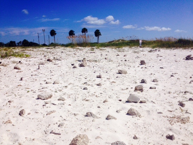
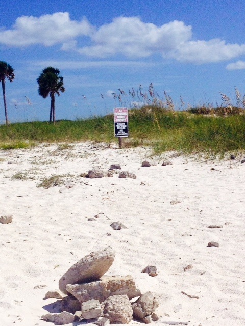
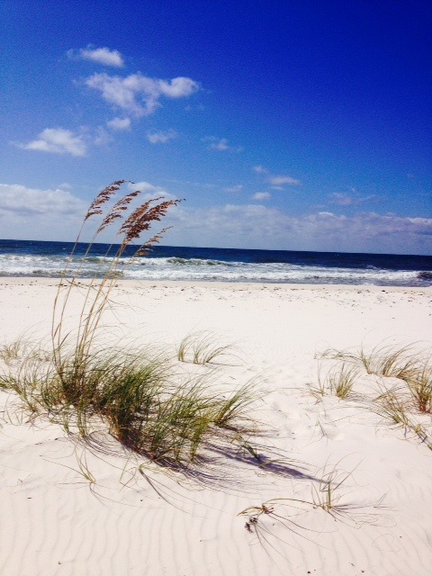
Artist Statement [Exam 2014]
6 . 12 . 2014
Literature is creativity with words, science is creativity with chemicals, math is creativity with numbers, and art is creativity with images. In my work, I strive to strike a balance between all forms of creativity, mixing metals and math in ways that produce powerful pieces. Like a mathematician, I have the courage to use precision and detail in order to "answer" any question posed. Like a scientist, I have the courage to play with the elements to create something new and unique for my viewer. And like a novelist, I have the courage to author a story in each piece I create. Unlike all three professions, I have the courage to intertwine all the disciplines into a perfection of art.
In my work, I enjoy using anything natural - metals, precious stones, glass, and natural pigments. In the contemporary world, where the elements are scarce yet all important, I want people to see the real beauty in all things natural. I am fond of experimenting with natural materials in all different forms, pushing their boundaries to create something truly unique. From gold foil and iconography, to large-scale metal sculptures, to glass pieces, to abstraction with stones, and everything in between, each of my pieces attempts to tell a story.
A story, a tale - from the most basic to the most metaphorical . That is what I hope resonates with my audience. It is my goal to cause people to think, to question, and to dream in a way they never would have dared to before. It is my goal for my work to resonate with all people from all different disciplines, because I believe that a common creativity connects us all, whatever your true passion may be.
Reflection [Exam 2014]
6 . 12 . 2014
This year, I have explored with many different media and a variety of techniques. I have learned so much about how critical proportions can be in a piece - from figure drawing, to the challenges posed when rendering a self portrait, to the techniques involved in portrait sculpture. I am now truly aware that proportion must be careful and exact. Because of this learning experience, I have seen myself grow tremendously this year, especially in sculpture with my portrait bust. I am so proud of how my final sculpture turned out. I have also experimented a lot with layering and depth this year, and I have found that it can be both physical and implied. Physical depth is beautiful, as I now am aware because of the many paper cuts I have done. Implied depth, through the use of imagery, form, and shadow, can be just as effective, however. It is really interesting to contrast the two as I have done this year in my sketchbook!
I believe there is always room for growth and improvement. Thus, I feel that I still have a ways to go in perfecting the techniques associated with proportions and depth. I would love to have the instinct to be able to build correct human proportions without the need for guides and tools, but I know that takes time. Next year, I will begin experimenting more with depth and layering in my own work, intertwining metallic elements with paint, sculpture, pen and ink, and more! I am looking forward to another great year of growth and wonderful learning experiences!
Influences [Exam 2014]
6. 12. 2014
I don't know that any particular artists have influenced me yet, as I am still in the process of exploring what draws me to others' works of art and what connects me, heart, mind and soul. That said, if I had to choose two artists whose works I respect and enjoy, I would choose Peter Carl Faberge and Pablo Picasso.
I've learned that I am happiest when I either work with the fruits of the earth: the precious metals, stones and minerals, or when I work in great detail on a very small scale no matter what the medium. When I do both, within the same piece of art, I am in total heaven. Faberge's tiny, intricate, elaborate and jeweled eggs appeal to my sense of opulence and detail. Unlike Faberge, my sculpture is not the only thing that I do in detail. I love detailed paper cuts, drawings, and paintings as well. I hope to be able to bring this opulence and high level of craft to every piece I touch, no matter the medium.
Picasso was a master of his craft. I admire his uniqueness, and I have always been drawn to it. I am inspired not only by his bright colors, but more so by his willingness to be unlike anyone else - to follow his passion even when those around him may not have agreed with everything he did. In that way, while I may not produce work in the same genre he does as I enjoy more detail in contrast to Picasso's raw shapes and forms, I hope that I too can remain a unique artist, a one of a kind in my field. I truly think that uniqueness adds a brilliant level of voice and artist mark that nothing else can, no matter how good you are in your genre.
Art is in my Blood [Awareness]
The works of Eliya Tahamtani II
Recently, my dad reconnected with his cousin through Facebook. His name is Eliya Tahamtani II, and, to our surprise, he is a famous Persian artist. Eliya's work comments on certain aspects of Persian society and culture as he sees them. His work is featured in many galleries, but he has not limited himself to the art scene. He has been commissioned often for movie posters and he has successfully tried his hand at directing movie trailers as well as music videos for many popular Persian actors and musicians. His detailed lines, very sparse use of very bold color, and his references to other famous works in order to make a statement really amaze me. I absolutely love what he does!
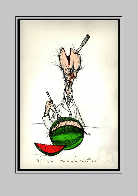
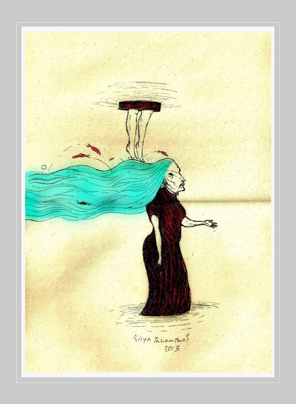
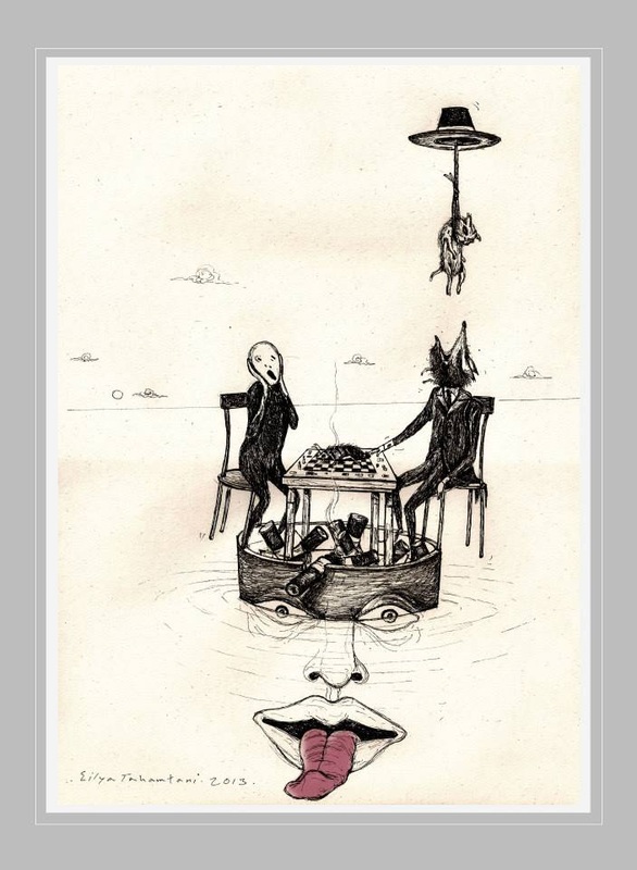
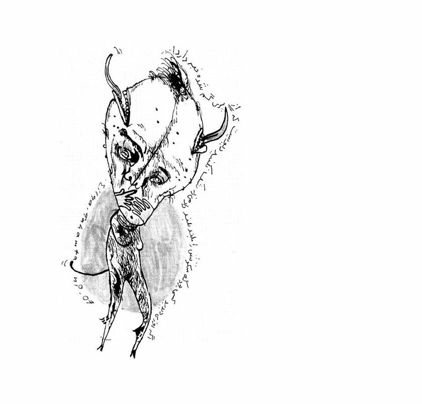
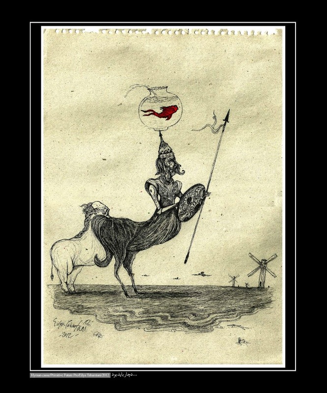
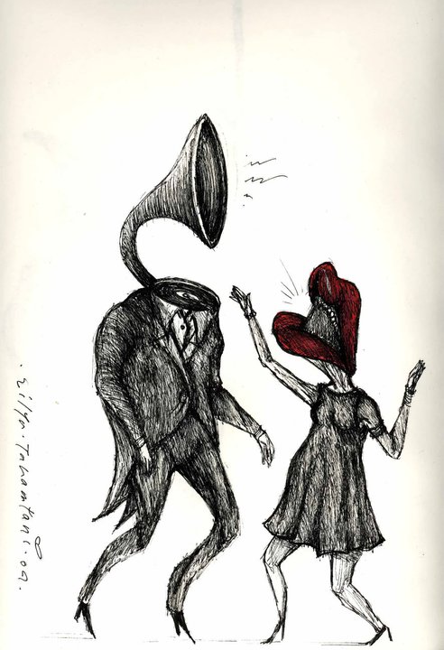
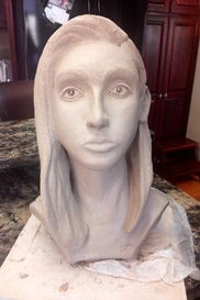
Me, Myself, and I [Process]
4 . 7 . 2014 - 4 . 13 . 2014
This week I was able to add hair to my sculpture, and I am so incredibly proud of how well the sculpture turned out. I will be hollowing it out before the week is over, and then I will start the drying process. I am so glad I took the time to correct the proportions, and now I feel like I would be able to do another one of someone else with all that I have learned!
Walking in Richmond [Experience]
4 . 10 . 2014
1708 Gallery and Quirk Gallery
Finally some beautiful weather! After the long winter we had, it was wonderful to get out and go walking!
We stopped first at 1708 Gallery on Broad street to take a look at the new instillation there titled "After Party" by Andrew Kozlowski. The exhibit was really well tailored to the space, and I thought it was a truly unique way to exhibit the printmaking skills that Kozlowski was so talented with.
A little insight into the exhibit from the gallery:
"Andrew Koslowski's drawings, prints, and installations present a deserted landscape populated with extinct plants, empty beer cans, remnants of environmental ruin, and art supplies. Collapsing hierarchies between intellectual, social, and artistic concerns, Koslowski offers an uncomfortably believable near-future -- right after the party got shut down."
Two doors down, we got to peak into Quirk Gallery, which also doubles as a very unique little shop. I loved the cases upon cases of handmade jewelry I got to see there - some truly unique designs! The exhibit there was called "Be Attitudes" by Amy Rice.
All in all, great end to the school day!
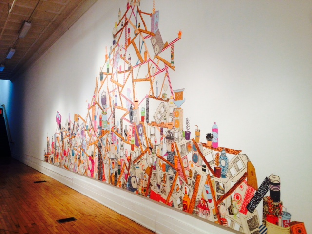
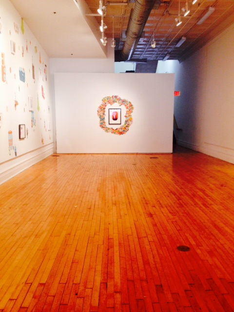
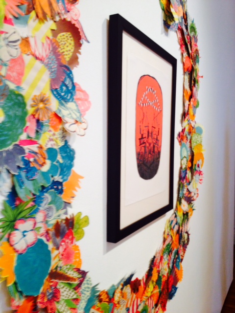
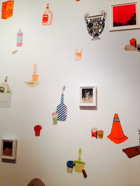
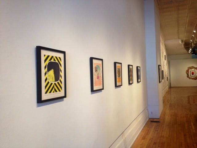
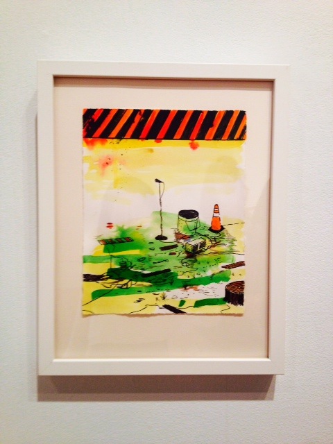
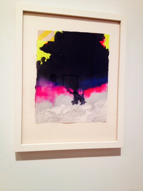
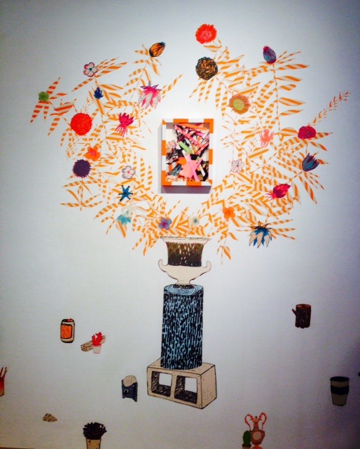
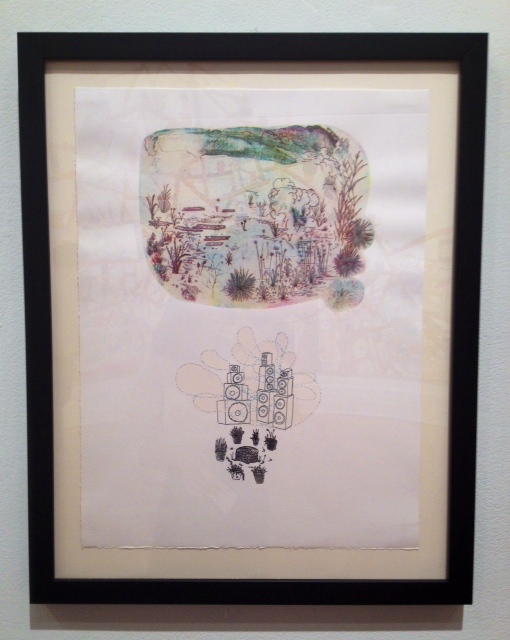
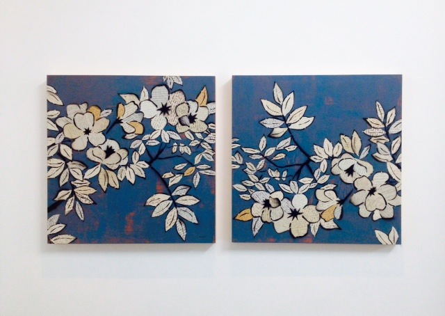
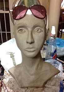
Me, Myself, and I : Proportions [Process]
3 . 31 . 2014 - 4 . 6 . 2014
I am so much happier with my sculpture now than I was last week! I have learned a vast amount about portrait sculpture, and I think it really shows!
When I took it home, I immediately tore off the hair and shoulders I had built, taking it back to the basic head and neck. First, I found that my head was tilted too far up and to the left, so I cut a couple slits under the chin to adjust it. Then, I read a lot about how to begin a portrait sculpture, and found that it is very common to use a pair of calipers to constantly check the proportions and make sure all the features are correctly sized. I made a makeshift pair of calipers using a wire clothes hanger which I cut up and a bolt which worked well to attach the two wire pieces together, and I began measuring. I found that my head needed more chin to be in proportion with my nose (which was actually perfectly sized to match my own nose). Then for the smaller features, I ended up buying another pair of calipers. After my head was the correct shape and size, I took out the eyes and eyebrows, and re-worked the mouth and ear once more. I watched youtube video after youtube video of others making portrait busts as well, and that helped tremendously to see how the delicate features were created. I am especially proud of the eyes that I sculpted, as I learned how to create the "sparkle" in the eye and how to place that sparkle so that it looks as if light is reflecting off the eyes from a certain direction. Lastly, I found that I had to really go back to what I know about sculpting techniques through my craft in PMC jewelry. I use fine and precise tools when creating my small and intricate jewelry pieces, and so I used those same tools to create this sculpture, even though it is so large in comparison to what I normally do. I found that using these tools helped me tremendously to attain a likeness.
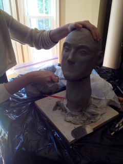
pARTnership - Last Class at the Visual Arts Center [Process]
4 . 3 . 2014
A photo gallery
4 . 3 . 2014
A photo gallery
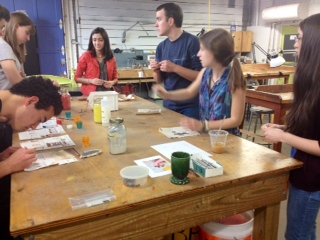
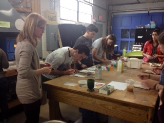
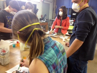
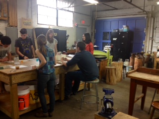
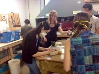
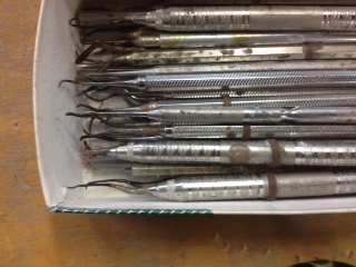
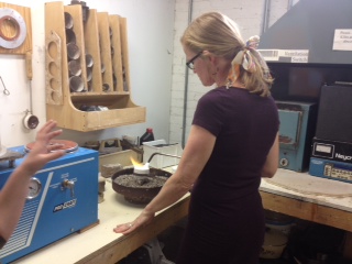
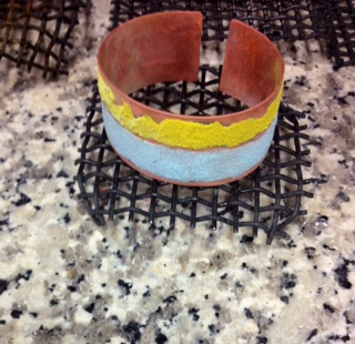
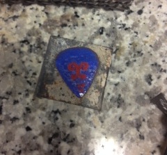
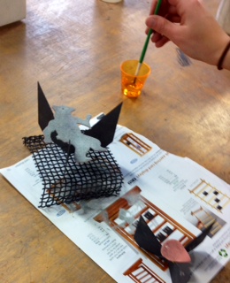
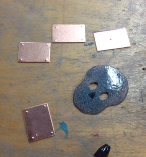
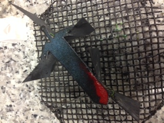
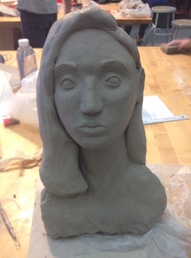
Me, Myself, and I [Process]
3 . 24 . 2014 - 3 . 30 . 2014
This week we continued working on our portrait sculptures. While I think some parts of my sculpture resemble me, as a whole I feel like there's still something missing. I have tried re-working individual features - parts of the sculpture, like my eyes (which I think are too small right now in comparison to the rest of the sculpture), or my mouth (which is the right size for the sculpture, but not in the right place on my face), and I have realized that no matter how good I am at each individual element, the sculpture as a whole does not change significantly enough. This tells me that something is fundamentally missing or wrong. Since I sculpt in silver clay, I know I can do this. I just need to figure out what I am missing. While it is probably good enough for a first try, I think that, for me to be happy with my sculpture, I need to start over.
This weekend I will be taking my sculpture home to work on it. Pictures to come…
National Scholastics Awards [Process]
3 . 17. 2014 - 3 . 23 . 2014
On Monday I waited with bated breath until 12:00 pm, when the National Scholastics Art and Writing Award winners would be posted. I was absolutely thrilled to find my name on the master list, having won a National Silver Medal for my ring, "Nestled." It really is a huge honor to be going to Carnegie Hall in June, and I absolutely can not wait! My hope is that I can also sneak a chance to visit the Metropolitan Museum of Art and the Guggenheim at the very least. So looking forward to an art-filled weekend this summer in the Big Apple!
Me, Myself, and I : Beginnings
3 . 10 . 2014 - 3 . 16 . 2014
This week is our second week working on our portrait sculptures. I think it is coming along well considering I have never worked in this type of clay on a project of this size before. I am hand sculpting the portrait, and I think it does somewhat resemble me so far. I am looking forward to continuing to refine it so that hopefully it will resemble me more and more!
Sketchbook Swirls [Process]
3 . 3 . 2014 - 3 . 9 . 2014
This piece is my first sketch for the nine-weeks! I was inspired by the sharpies on my desk to do something bold and colorful. I created a sense of depth in the piece by cutting out some of the shapes where I added color, and painting them on other pages in my sketchbook. I was able to again use my beautiful new acrylics which make me so happy because they are thick and very bright. I think I will be experimenting more with creating a sense of depth through layering. I love the effect it has on a piece!
pARTnership [Process]
2 . 24 . 2014 - 3 . 2 . 2014
This week I finished our first project, a wire sculpture. I like the whimsical nature of the bird I created. Completing this project in wire wrapping reminded me a lot of the more intricate wrapping I mastered with my cuff bracelets, including my own hand-twisted wire (see below). I am now looking forward to an enameling project next week, as I already know how much fun enameling can be. I will be receiving wax next week as well, to create a lost wax mold for the demo in metal casting we were promised at the end of the workshop. I am hoping to create a piece of jewelry inspired by byzantine art.
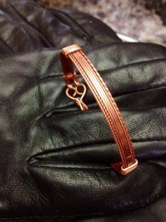
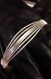
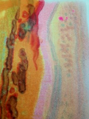
Inspired… [Process]
2 . 17 . 2014 - 2 . 23 . 2014
…by Tom Condon. This piece is actually the back of a drawing I made using crayons on a hot surface. I enjoyed experimenting with this new technique and I was amazed that even the "back" of the piece retained so much depth and beauty. It really goes to show that art can be truly appreciated from any angle!
Walking in Richmond [Experience]
2 . 20 . 2014
The Visual Arts Center
Today, after our first pARTnership class, I decided to take some time to go through the current exhibit at the Visual Art Center - Idiopathic Aura, an installation by Tom Condon. His use of crayons on a hot surface to build beautiful abstract works inspired me to try some of my own. He also used braille in his work, and augmented the statement pieces beautifully with a sparking dust in abstract forms. I was very impressed with his unique style, and I was amazed that the two very different parts of his exhibit meshed so wonderfully together.
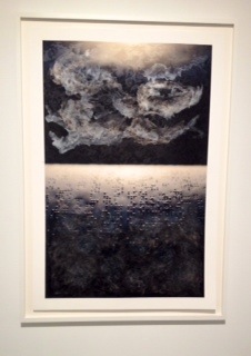
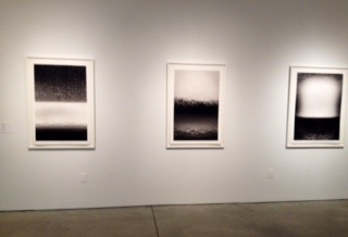
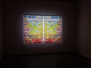
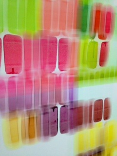
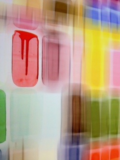
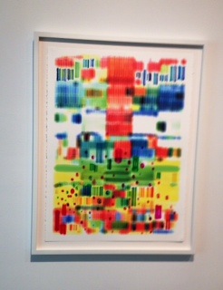
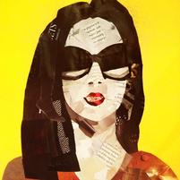
Magazine Me [Process]
2 . 10 . 2014 - 2 . 16 . 2014
My parents were sifting through old magazines this week, and were getting ready to recycle them, when I decided to pull a couple of them to create an image. I thought it would be fun to do a play on a self-portrait, but this time, as a collage using the magazines. The different shades and textures I found in the pages of the magazines helped to create the necessary shading and form.
I loved that I was able to use some of my favorite items in my self-portrait -- boots and jewelry!
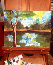
Final Impressionist Painting [Process]
2 . 3 . 2014 - 2 . 9 . 2014
I completed my 7th and final impressionist painting this week, after finally going to buy higher quality paints and new canvases. I am very proud of my end product, as well as all I have learned through this process. Each painting I attempted was a chance for me to gain new insight into the technique required to mimic a Cezanne successfully, and I think I truly captured his mark in the end. I am also especially proud of the depth I created in the piece, and the broken color I achieved. The colors here are more true to the photograph, but given more time, I would play with the colors a bit more.
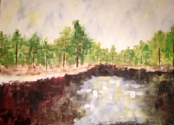
Impressionist Landscape [Process]
1 . 27 . 2014 - 2 . 2 . 2014
Since Winter Break I have been working on our home project for this quarter. I chose the landscape first (see the third picture in my earlier post titled "Impressionism - 13 Shots") and then set out to pick an artist whose style I could mimic for the project. I thought this artist would be Van Gogh, if only for the way he handled his evergreens and his beautiful use of impasto. So, I took a couple days to learn as much as I could about Van Gogh, how he painted, what tools he used, and his step-by-step process when tackling a landscape. I then attempted an oil painting in his style, and quickly found out two things. 1. Oil paint doesn't dry for weeks on end...especially when applied that thickly, and 2. My landscape was not conducive to Van Gogh's mark.
I then went back to study his works and realized that his paintings usually have two bands of color, one of which is busy with a lot of broken color and a lot of impasto, and the other without. He also usually did his landscapes a great distance away from any focal point (like trees, or rolling hills he found interesting etc.). Though I tried one more painting in acrylic using his style, I knew it wouldn't turn out the way I wanted. Because my landscape was much busier in content than his, and because I took the picture from a much shorter distance than he sat when he painted, I knew I had to find another artist.
After studying the many impressionists and their work more closely to find one whose mark would work on my landscape, I came across Cezanne, and saw the many bodies of water he painted. Impasto was used more throughout the piece, and his distance from the scenes he painted matched mine more. I felt better mimicking Cezanne's mark in my landscape and I again set out to learn everything I could about my new artist and his style.
I am in the middle of my fifth impressionist painting, as I have been learning more and more about Cezanne's mark as well as more and more about the different levels of acrylic paints. This one is on a very large canvas. I think Cezanne's mark is more square than the mark I have in this painting, and I think the trees in the background would be less defined if he had done this painting many years ago. So, I will be starting another painting in the coming days, as soon as I get my hands on a new canvas, and some higher quality acrylics. I do really like the colors in this one though.
Update: Below is my 6th painting. I found a small canvas among my supplies and decided to try a Cezanne, again.
I love the colors and the depth.
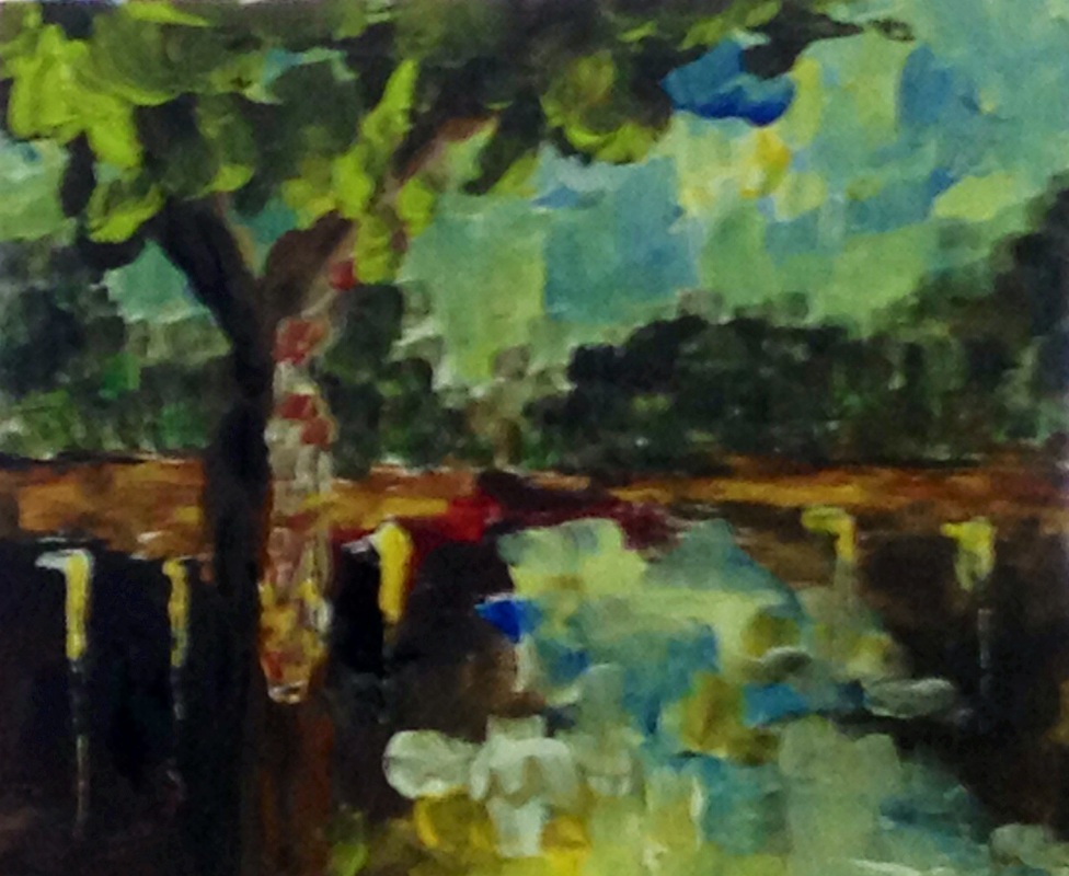
Makeup Is a Form of Art [Awareness]
Article and Pictures from Yahoo Life and Lifestyle:
http://gma.yahoo.com/photos/teen-s-makeup-transformations-are-incredible-1391092082-slideshow/stephanie-fernandez-photo-1391091072517.html
"Teen's Makeup Transformations Are Incredible:
Stephanie Fernandez was 14 and bored, she says, when she first picked up a makeup brush. Now, four years later, the college student is wowing the Internet with the amazing transformations she creates using just drugstore makeup and whatever else she has on hand that inspires her. “Sometimes it takes me seconds to think of an idea, sometimes it takes me months,” said Fernandez, 18, of Shreveport, La. “I use whatever materials I have around me at that moment to portray a visualization of an emotion, thought, or dream that is occurring in my mind.” Fernandez is completely self-taught and does everything her portraits entail, from the makeup to the photography, modeling and editing. “Depending on the makeup concept and its complexity, it can take anywhere from 20 minutes to 5 hours,” Fernandez said. Click through to see some of Fernandez’s amazing transformations yourself."
These are absolutely amazing…she inspires me to try some of my own!
Here are just a few of my favorites from the article:
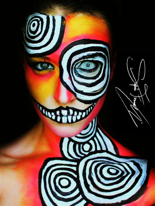
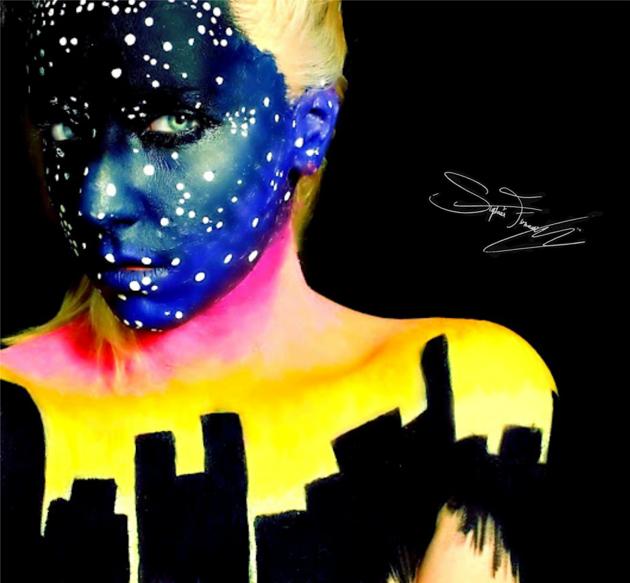
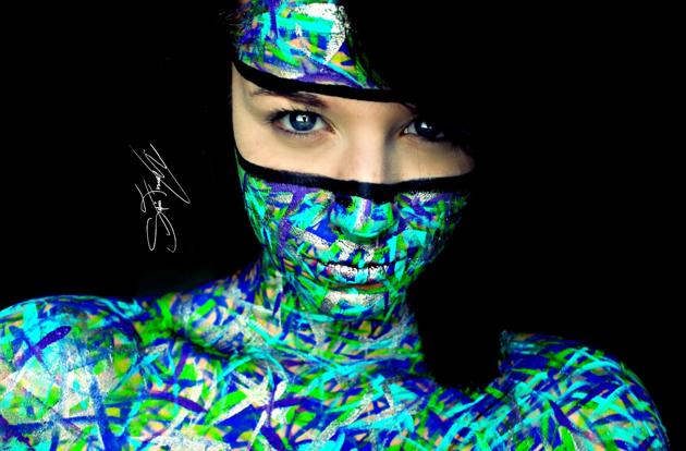
Abstract Challenge and Solution [Process]
1 . 21 . 2014 - 1 . 26 . 2014
To add interest to the piece, my teacher and mentor challenged me to add a pop of color in the form of a line to the abstract. While I liked the idea of the pop of color, the serenity of the piece changed once the line was added. I sat and stared at it for a long, long time, trying to figure out how to bring back the "calm" that I was trying to convey. After creating a couple mock-ups at home and experimenting with different solutions, I finally settled on one I was proud of. I was excited to add a unique element to my piece by painting the sides in a color not used in the piece at all. The red I chose complemented the greens in my painting, as well as brought out the warmth in the yellow stripe. I was especially excited to present the viewer with a piece that had to be looked at from more than one angle to be fully appreciated. I then added an element of chaos in the form of gold paint which was flicked onto the canvas. Despite that I had to give up the feeling of calm, under the circumstances I am very happy with the organized, yet chaotic piece that I have achieved. I feel as though I retained my voice, and therefore my essence as an artist, in the solution I found.
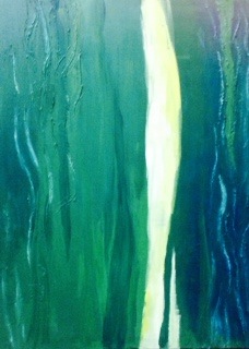
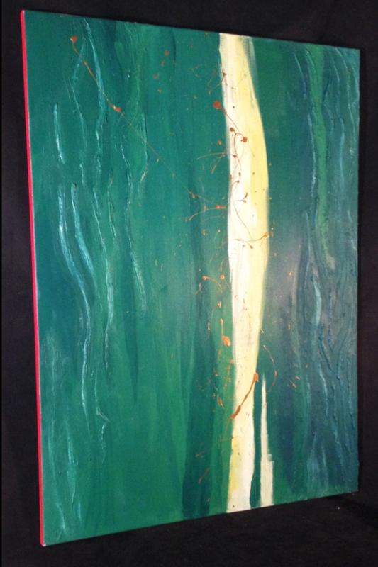
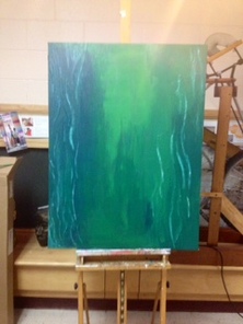
Abstract Expressionism [Process]
1 . 13 . 2014 - 1 . 20 . 2014
We have been working on our abstract expressionist paintings for a couple days now, and at first, I was feeling confined by the paint. I have in mind to use this opportunity to create a piece which will evoke a sense of calm because our busy and harried existence at Maggie Walker doesn't allow us enough calm. I believe that the new colors I have chosen will bring about that sense and I like the way that the darkness and texture on the sides contrast with the lighter center creating a inward draw for the eye, as if you are entering an underwater cave.

Scholastics Submissions [Process]
1 . 6 . 2014 - 1 . 12 . 2014
On Friday I submitted two jewelry pieces, titled "Nestled," and "Crimes Against Humanity," along with my "Chaos and Solidarity" mono-print to the Scholastics Art and Writing competition. I am hopeful that they will do well.
Crimes Against Humanity was a piece submitted in a new category Scholastics offered this year which focused in on world tolerance and overcoming the atrocities of genocide. To enter a piece of art which could be considered for this category, the art needed to “reflect upon the lessons learned from the Holocaust and other genocides, and attempt to raise awareness of the importance of increasing tolerance to safeguard a peaceful society.” I studied and read about each of the genocides which occurred in the countries I represented in my piece, as well as others in the process. Though the piece itself took a week to complete, I found it very liberating to finally create something that would represent my feelings after all that I have learned from my studies of genocide.
In my submission, I summarized my piece by stating:
“The bloodstain of genocide has marred many countries and destroyed the lives of thousands upon thousands people and their families. Among those with a genocidal past are the Jewish people of Germany, the Tutsis of Rwanda, the Ixil people in Guatemala, the people of Darfur in Sudan, the Cambodians by their own government, and the Armenians of Turkey, just to name a few. This raw, fine silver pendant is meant to symbolize the atrocities committed in those countries through the darkness of the brooding dichroic glass cabochon. This is contrasted with the pure white silver countries surrounding it, meant to express my hope that the world will learn from its past and protect all its people in the future so as to create a world in which tolerance becomes the only acceptable solution. I believe that by bringing to the forefront an awareness of genocide in jewelry form, I am opening a discussion and creating a dialogue in places where such art is not typically expected nor seen.”
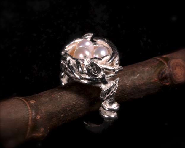
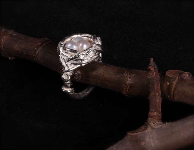
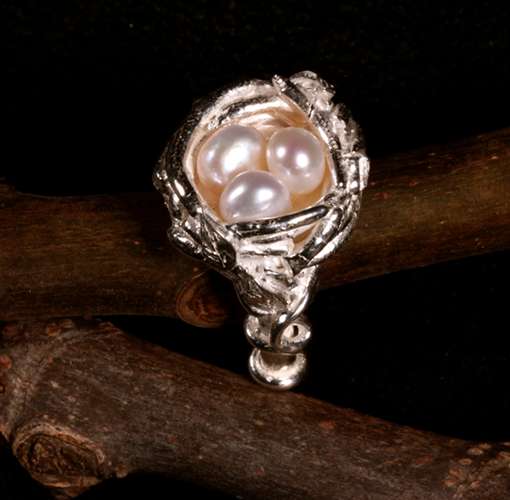
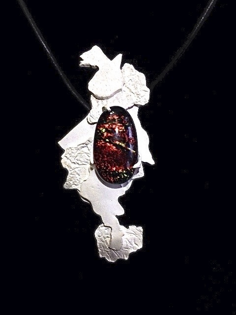
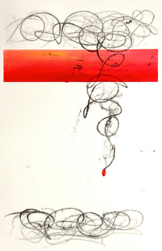
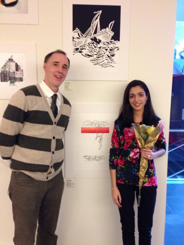
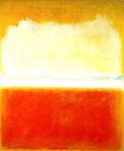
The Abstract Expressionist Painters [Process]
12 . 16 . 2013 - 12. 22. 2013
This week we studied some of the different abstract expressionist painters in preparation for beginning our own abstract expressionist works after winter break. I especially appreciated the works of Kline, Rothko, and Kandinsky for their unique styles and execution.
(To the left is a Rothko I absolutely love)
Mono-print Fun [Process]
12 . 9 . 2013 - 12. 15. 2013
Titled "Reflection," this mono-print was anything but what I had originally anticipated. At each step, I found myself learning something new about the printing process, regrouping, only to carry out my next step and then go back, yet again, to the drawing board. While this might seem frustrating to some, I actually enjoyed the spontaneity of the various elements of the print. It was very interesting to watch my print develop in a way that I had not planned, but to see the same voice I have exhibited in my other works also come out in this one. I love the way the paper lace adds texture to my piece, and the way the white line really defines the space and the separation between colors.
Impressionism - 13 Shots [Project]

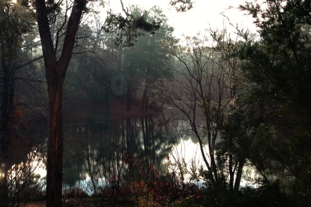
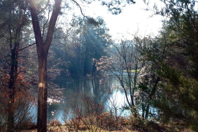
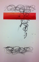
First Mono-print [Process]
12 . 2 . 2013 - 12 . 8 . 2013
Voila! My first (almost completed) mono-print. I have spent this week experimenting with the press. Lesson learned, the press doesn't know your plans for a piece, and can totally change them midway through. I now am working on a series of three prints, and then one print (which was initially one of my three) that I am going to experiment on and do something fun with. Luckily, I was able to create a print that I am happy with. I think I may add a small sphere of color to the piece to balance it out. Printing is definitely a unique experience, but it is also a lot of fun!
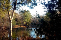
Impressionism [Process] 11 . 25 . 2013 - 12 . 1 . 2013
Revolutionary when it was first introduced, Impressionism is a unique art form in which dense, very distinct brushstrokes are applied to suggest a scene. We have been tasked with creating our own impressionist landscape, and I absolutely can not wait! This week, I have been able to document my backyard (pictured left) throughout the various times of day. I have gotten to analyze the different ways light falls on trees and other objects in my yard during the different parts of each day. It will be fun to be able to document this contrast in an impressionist manner!
Revolutionary when it was first introduced, Impressionism is a unique art form in which dense, very distinct brushstrokes are applied to suggest a scene. We have been tasked with creating our own impressionist landscape, and I absolutely can not wait! This week, I have been able to document my backyard (pictured left) throughout the various times of day. I have gotten to analyze the different ways light falls on trees and other objects in my yard during the different parts of each day. It will be fun to be able to document this contrast in an impressionist manner!
Sometimes, the medium a work is made in, is everything. This is absolutely amazing to watch! [Awareness ]
Mono-print : Planning [Process]
11 . 18 . 2013 - 11 . 24 . 2013
In class next week, we will be starting our non-objective mono-prints. In order to prepare for this, I have drawn many designs for a series of layered prints, and have finally settled on the one shown. I am picturing a solid colored stripe, which I will then contrast with the free-flowing black lines surrounding it. I think they will be simple yet dramatic. Pictures to come!
The Great Wave Off Kanagawa [Process]
Exploring the artistic style of Hokusai
11 . 11 . 2013 - 11 . 17 . 2013
I have always admired this famous work, one of 36 prints in a series called "Thirty-six Views of Mount Fuji." I am amazed at the amount of precision with which Hokusai built up the many layers that make the print so three-dimensional, and so vivid. I decided to "take the print apart" in order to show the layering involved. In my sketchbook, I used an x-acto knife to cut each layer out of a pre-determined square frame. Once all 10 pages are laid on top of each other, the image on the left is formed.
Color Theory - An Introduction [Process]
11 . 4 . 2013 - 11 . 10 . 2013
This week in class, we have been magicians of color, transforming them and creating optical illusions. Though it isn't easy to accomplish, it is truly incredible to see how artists can manipulate colors. Our first assignment was to make three colors look like four. Thus, we had to pick intense grounds to "push" a more soft and neutral figure to undertake two different tones, one on each of the two grounds it was placed on.
I will also be doing more research on Joseph Albers in the coming weeks, as I think he is fascinating for pioneering this study in color theory and the illusions we can form with color.
In thinking about portraits, I came across this brilliant digital finger painting of Morgan Freeman. What I learned? 1. Have patience. 2. Touch and retouch. 3. Layers are key. [Awareness]
Self - Portrait : In Progress [Process]
10 . 28 . 2013 - 11 . 3 . 2013
One of the most daunting things in the world is to draw yourself. There's already an image of exactly what YOU think you look like engrained in your head before even beginning. Thus, it is very difficult to draw what is really seen, instead of what you think you see.
In beginning my portrait, I have learned a lot about vine charcoal. Unlike my old masters copy, I am trying to keep my portrait from getting too much charcoal dust on it, so that I may more closely emulate Boucher's stroke (which is whimsical, yet precise). Vine charcoal is very easily wiped away from the work, making dark values very hard to permanently attain. That being said, I have enjoyed drawing the folds in my dress and the shading around my arms, and am really proud of what I have done so far.
I am really nervous, yet quite anxious, to start on my face. I can't wait to bring myself to life, on paper.
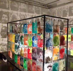
Walking In Richmond [Experience]
10 . 31 . 2013
The Anderson Gallery
Today we visited the Anderson Gallery. It was wonderful, as always, to see the works of various artists and the different ways with which they interpret the world around us, especially when it's so close to home.
This work (pictured left) was an installment I particularly enjoyed. Bohyun Yoon created this arrangement of silkscreened glass panels to reflect his understanding of cultural diversity. 150 of his friends and neighbors from Philadelphia were documented and then arranged according to the way they tilted their heads. He wanted to achieve a "sweeping motion" and "reveal the meaning of who we are, and what we are as neighbors to each other." I am amazed at the foresight he had in order to understand the space inside which his work was going to be displayed, so that the wallpaper effect from the shadows of the glass panels could be created in the room.
Here are some of the other pictures I took as we walked through the other exhibits in the gallery. Loved them all!
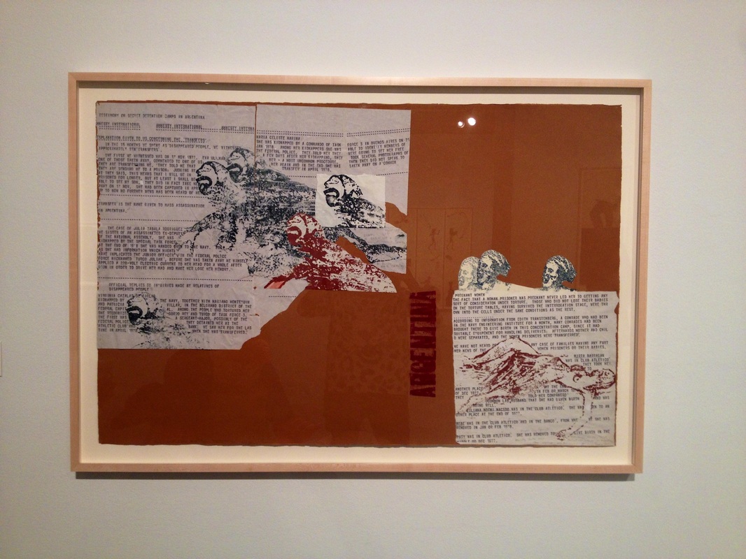
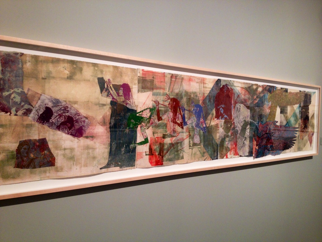
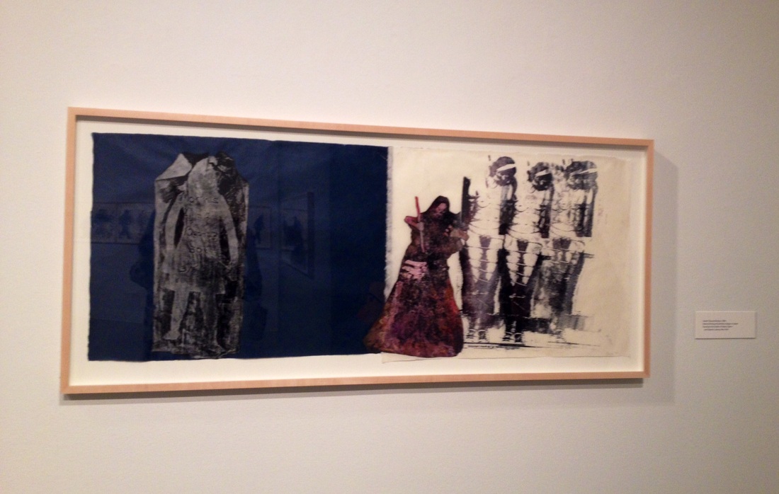
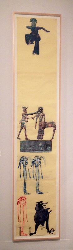
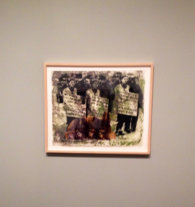
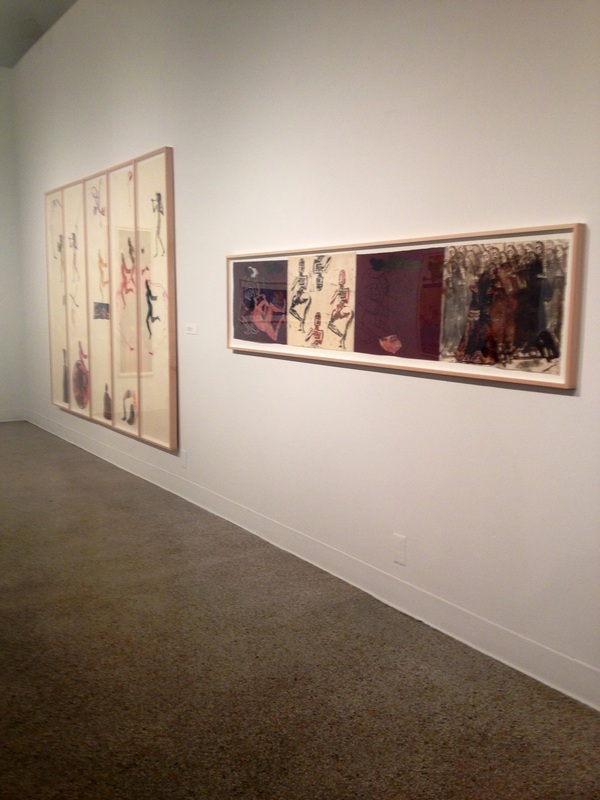
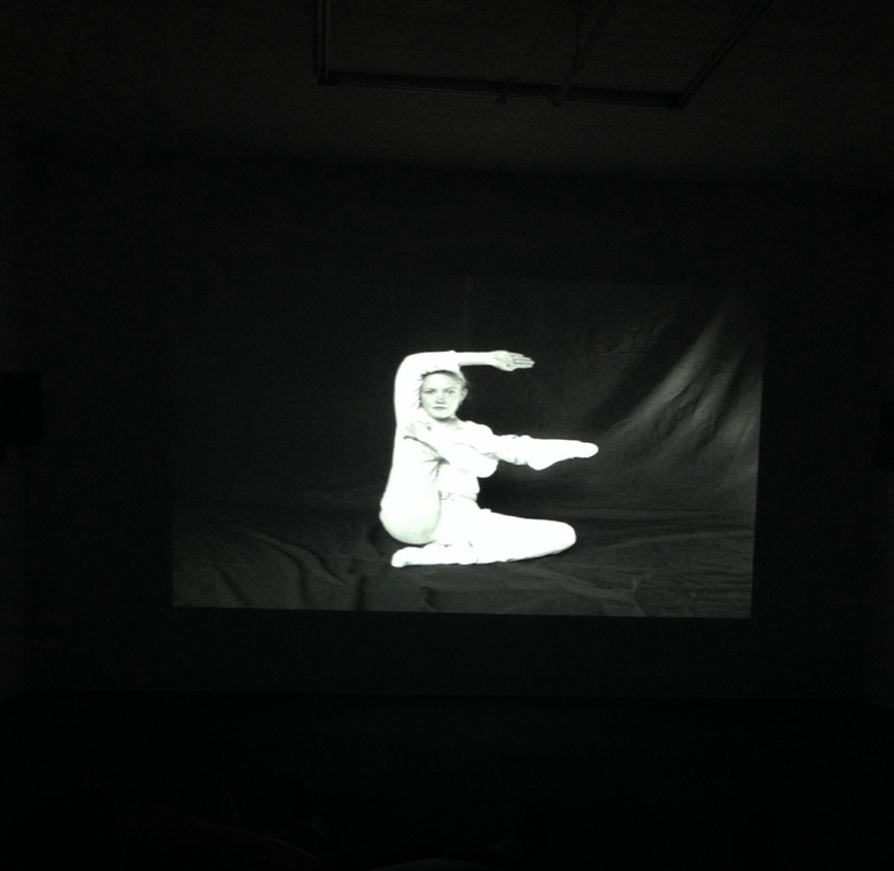
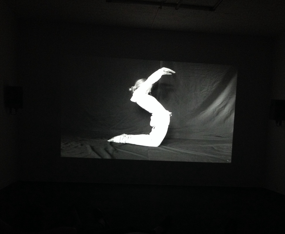
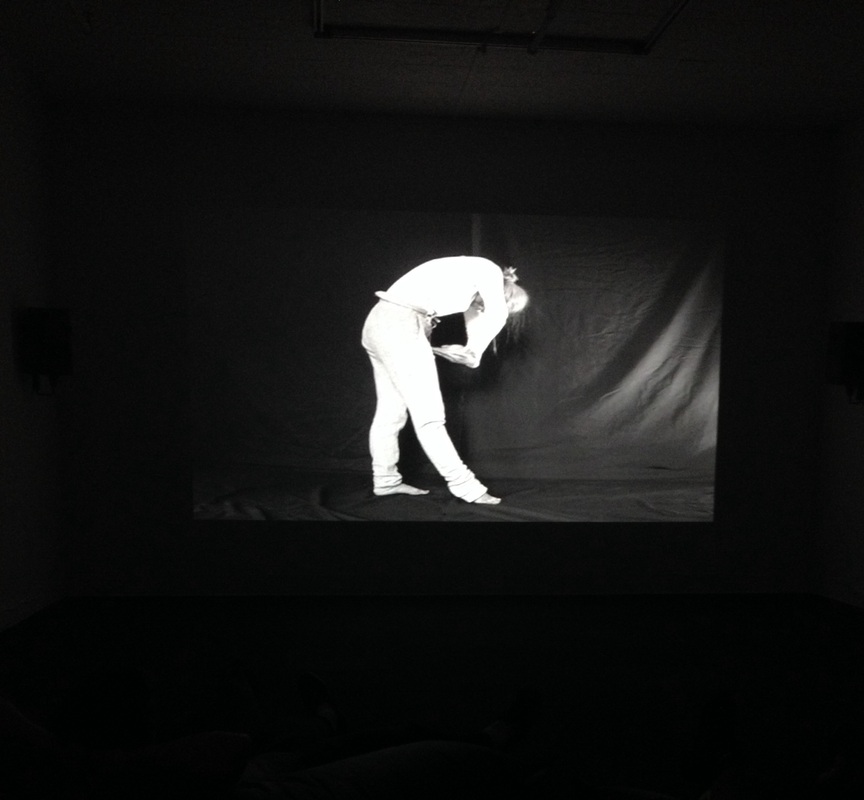
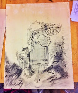
Old Masters Drawing : In Progress [Process]
10 . 21 . 2013 - 10 . 27 . 2013
I have made a lot of progress on my old masters copy. I feel I have "mastered" Boucher's stroke, understanding the wispy, yet clean way he draws lines to form a very natural and innocent figure. It has been an exciting process to see the figure come to life! I am very excited to add the heads and faces to both the woman and her little boy. I hope I can capture the same sweet essence that Boucher did when he sat down to draw this so many years ago.
See the Gallery for the finished piece!
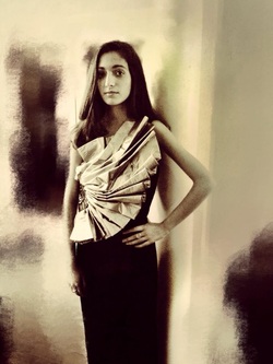
Self - Portrait : Getting Started [Process]
10 . 14 . 2013 - 10 . 20 . 2013
They say a picture is worth a thousand words. Yet, when describing a person's essence, not through words but through a single image, the task is rather daunting. In order to begin my self portrait, I first had to take a picture that I thought would capture that essence, and define who I was. At the end of the day, I think this picture really embodies my style, and my artistic nature. I am somewhat hesitant, but excited, to begin the process of trying to capture that essence in my drawing.
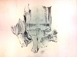
Old Masters Drawing : In Progress [Process]
10 . 7 . 2013 - 10 . 13 . 2013
I am starting to see my Boucher copy come to life, and I am loving recreating something so old, yet so beautiful. The process is very methodical, and very labor-intensive. But, isn't all art? It is soothing, being able to apply the same stroke over and over again, and to create something from nothing.
I am finally starting to feel the way Boucher moved his wrist as he applied every stroke. How magical.
Pizza [Process]
9. 30 . 2013 - 10 . 6 . 2013
The smell of pizza seems to be the pied piper of food. But how to capture it?
Would that I could, I'd bottle the scent. Since I can not, I decided how fantastic it would be to have it somehow embedded in art. Thus, sun dried tomatoes, oregano, basil, chili flakes, and onions make up my piece entitled "Pizza."
Anywhere, anyhow, anytime the mood strikes, art is accessible and doable. It is amazing to watch an artist at work, especially one as creative as Red! [Awareness]
A Project in the Life of Francois Boucher [Process]
Just Getting Started
9 . 23. 2013 - 9 . 29 . 2013
For our first piece of the year, we have been tasked to copy a drawing from an "old master", to learn about their unique mark and, in turn, to learn about their unique style. I chose a piece by Francois Boucher, titled: "Woman and Boy." This week, the process began by selecting a paper suitable for our piece, and choosing tints to enhance the piece itself. I found the choice to be quite difficult actually, as the mood of the piece really hinges heavily on the choice I was about to make. I experimented with grey, a light peach, a sky blue, and shades of brown. I also experimented with tea, an unlikely medium but one I actually felt brought the most life to the piece. It is subtle, but warm and friendly, just the thing I needed for a scene with a mother and child.
Walking in Richmond [Experience]
The Reynolds Gallery and Glavekocen Gallery
9. 17 . 2013
You never know what's in someone's head. Well, until this piece. If you look carefully at this framed canvas, you'll notice that the light strikes it in such a way as to give it a reflective quality which placed my reflection within it!
Taking a walk to visit local galleries is always a treat. I enjoyed both the Reynolds Gallery and the Glavekocen gallery, and found the exhibits to be very intriguing. So many of the pieces were unique in concept and execution, and I was especially struck by the modern approach taken by so many of the artists whose work was displayed. The piece to the left really left me with a new appreciation for collage. I will definitely have to experiment more with collage in my own work.
Below are some of the other pieces I was drawn to. The intricacies in the pieces, as well as the vibrant colors, really struck me.
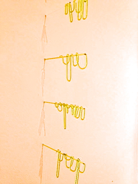
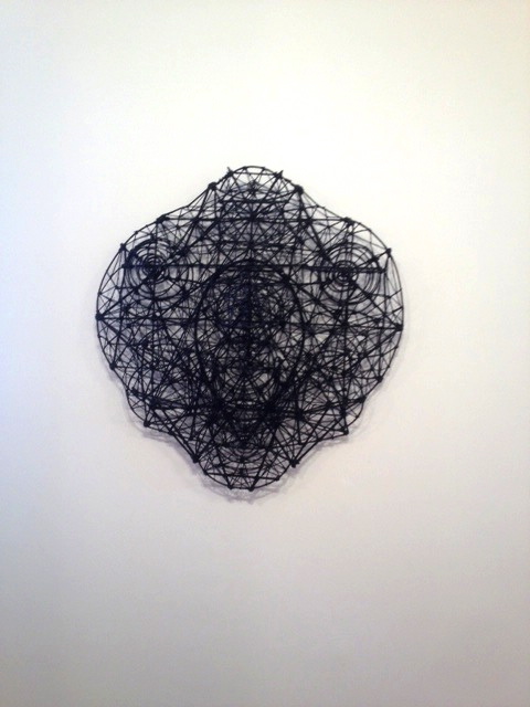
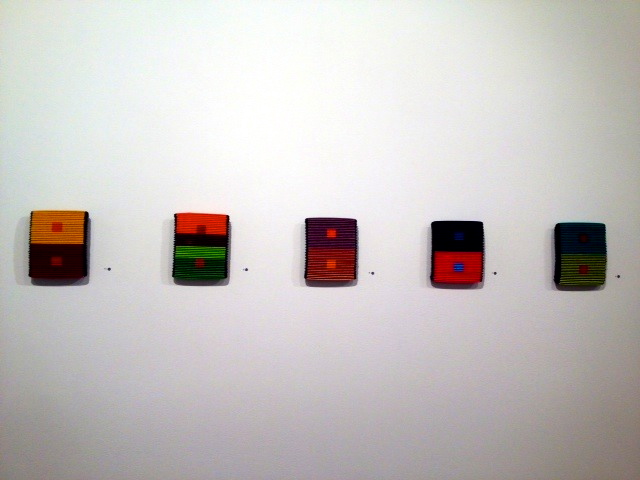
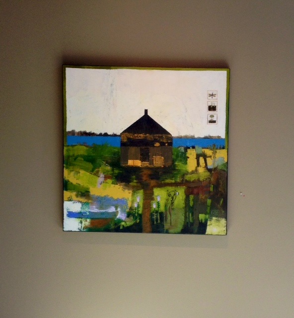
A Trompe D'Oeil, Of Sorts [Process]
9 . 16 . 2013 - 9. 22 . 2013
This week, I explored the making of 3-dimensional art. Art like this never ceases to amaze the viewer, and just like a magic trick, it is hard to comprehend how it is fabricated. Thus, I had to really take apart the process of making something flat look 3-dimensional, and I discovered the true importance of the concepts of value and perspective in doing so.
A Study in Figs [Process]
9 . 9 . 2013 - 9 . 15. 2013
Waiting for figs to ripen is a long, long process. The tree in my backyard fills with these delicacies each summer, but only in the last days of August do we have the pleasure of picking the first few fruits of the year to enjoy. Over the past couple weeks, I have been watching them ripen before my eyes, and each night I experiment with a new fig recipe. Cooking is an art, I thought. And then it hit me. Inspired by the figs, I decided to print a collage of sorts, showcasing the raw beauty of the fruit and of the tree as well. I experimented with composition as well as color, and found that a clustering (such as the picture on the left of the raw fruit and leaves before I printed them) really captures the contrast between the objects. In the print, I chose to place dark colors in a sweeping diagonal of sorts, to take the eye on a delicious journey through the work itself.
